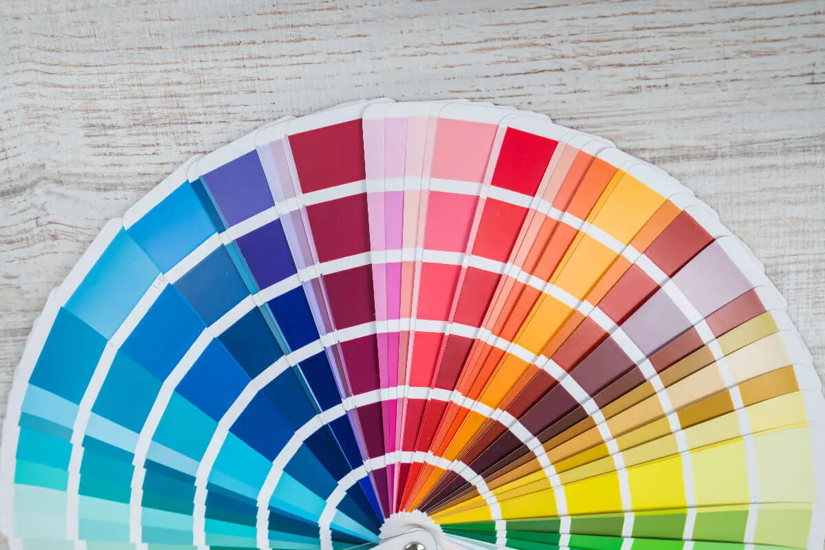
Unlocking the profound symbolism and power of colors begins with an intrinsic understanding of the color palette wheel. As an integral tool in visual expression, it holds the key to interpreting and expressing deep undercurrents of tangible and intangible ideas. From fiery reds, which ignite passion, to tranquil blues that evoke calm, colors articulate our world in rich and diverse tones.
Beyond decorative appeal, the intricate world of colors wields potent influence over emotion, behavior, and even decision-making processes. Discover in this immersive journey the captivating exploration of basic color theory, the structure and application of the color palette wheel, and the extraordinary ways it fuels creativity in art.
Table of Contents
- Exploration of Basic Color Theory
- Understanding the Color Palette Wheel
- Application of the Color Palette Wheel
- Creative Sparks with the Color Palette Wheel
- Related Content
Exploration of Basic Color Theory
Color is a crucial component in visual aesthetics, a delightful dance between light and perception. But beyond the surface exists an entire symphony of color study – color theory. An enthused artist or designer understands that the successful arrangement of hues creates magic in their work and resonates with the viewers.
Born in the labyrinth of human fascination with visual arts, color theory is a fundamental concept illuminating how colors interact, harmonize, and communicate. At its heart, color theory roots itself in the color wheel, an elegant, kaleidoscopic map of primary, secondary, and tertiary colors, setting the stage for myriad color schemes and combinations.
The primary colors – red, blue, and yellow – are pillars of all other hues. When mixed with intent, they birth secondary colors, further blending to reveal tertiary colors. The inspiring journey from primary to tertiary colors is a testament to color theory’s infinite possibilities.
Threaded with a resounding significance in emotion elicitation, colors can spark joy, evoke sadness, inspire tranquility, or stir up excitement. Carefully examining and implementing color theory helps artists and designers tap into this empathetic power of colors.
Delving deeper, the union of a dominant, secondary, and accent color is known as a color scheme. The harmony in an analogous, complimentary, or triadic color scheme is derived from the understanding of color theory. Their judicious application can result in visually pleasing, balanced compositions, striking the right chord with the viewers’ emotions and perceptions.
Beyond palette building, color theory finds its relevance in color psychology. The connection between color and emotion has been studied extensively, equipping us with knowledge like red inciting action and blue instilling calm. The strategic use of these fundamental principles gives rise to compelling works of art, fine-tuned with the audience’s sentiment.
Whether in fashion, interior, or the web, designers leverage color theory to generate context, highlight content, and establish visual hierarchy. In marketing and branding, a deep understanding of color theory enables the construction of powerful visuals to influence consumer behavior.
In essence, color theory empowers creativity to transcend the aesthetic pedestal and engage with the viewer subconsciously. Its proficiency helps narrate stories through artwork, design functional spaces, and even shape consumer perceptions.
Therefore, the fundamental essence of color theory goes beyond coloring within the lines and finds its true importance in weaving emotions, ideas, and messages into the fabric of visual language.
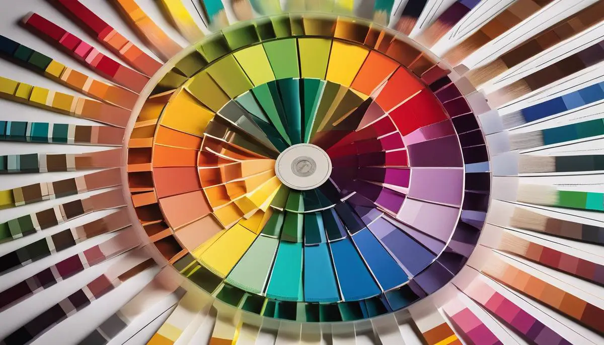
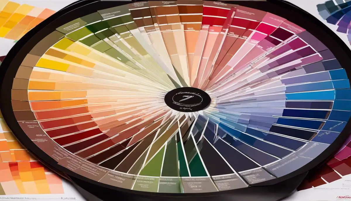
Understanding the Color Palette Wheel
Delve into a world awash with the vibrancy of a thousand hues, where every hue whispers a different story. Let’s unfurl the magic of the color palette wheel, an ingenious device that speaks the language of colors, reflecting their soulful symphony.
Unveiling the Color Palette Wheel
Just imagine a spinning circle of color magic orchestrating a visual symphony. Yes, that’s the color palette wheel for you. Regarded as the backbone of color theory, it treads beyond a mere aesthetic element. It’s a painter’s bible, a designer’s manual, a marketer’s magic wand – an artistic compass that breathes life into creativity.
To understand the color palette wheel is to unravel the mystery of colors themselves—its complexly layered yet harmonious components masterfully interwoven to form an alluring mosaic of hues.
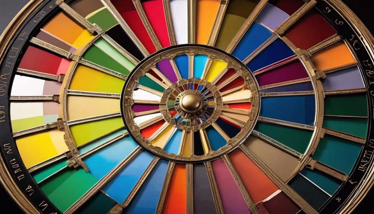
Essential Components of a Color Palette Wheel
A peek into this enchanted circle, and you meet Red, Blue, and Yellow, the primary colors that proudly hold the key to creation. The wheel wouldn’t exist without them, for all other colors are born from them. They assume pivotal positions, influencing and manifesting the complete spectrum of visual expressions.
Secondary colors – Orange, Green, and Purple, engage in a graceful dance as they emerge from the union of primary ones. They complete the kaleidoscope of shades by introducing a new set of colors to the wheel.
Finally, the tertiary colors, the nuanced paragons that blend the primary with the secondary—Yellow-Orange, Red-Orange, Red-Purple, Blue-Purple, Blue-Green, and Yellow-Green, enrich the wheel, making it a complete spectrum, a riot of colors. Ah! The joy it brings to the artist’s palette and the designer’s mood board!
Now, look closer to uncover a profound design element – the harmonious halo of complementary colors. These colors, sitting opposite each other, breathe life into a composition by creating an arresting contrast. Green and Red, Yellow and Purple, Blue and Orange are like two peas in a pod, different and yet inseparable. They challenge, they provoke, but most importantly, they balance each other out exquisitely.
The color palette wheel is more than a circle filled with hues. It’s a sacred scripture of color theory decoded. It’s the unsung hero of the design world, swaying silently behind the beauty of the most iconic paintings, impactful advertisements, fashionable outfits, captivating interiors, and captivating web designs.
It is a timeless, relevant, and indispensable tool in shaping the narrative of creativity.
So, the next time you see a captivating visual design, remember to appreciate the silent force behind it—the color palette wheel. It is not merely holding hues together. It’s penciling the rainbow, rendering vibrancy, and, most importantly, creating works of art that speak directly to the soul.
Application of the Color Palette Wheel
Ah, the magic of the color palette wheel! A tool that artists thirst for, the color palette wheel is an aphorism in itself of the aesthetic and therapeutic world of colors.
As every narrative unfolds in an artist’s mind, this tool births a riot of expressions on canvas. Understanding and learning to apply it practically can make it a valuable resource for any artist.
The color palette wheel often begins with primary colors – red, blue, and yellow – the first building blocks, the “Genesis of Colors,” so to speak. Every brush stroke with these colors starts a symphony that serenades various hues into existence.
Regarding light mixing or additivity, the primary colors are red, blue, and green. These are the ones that we can put into play to create a rainbow on the palette itself.
Secondary colors – green, orange, and purple, or cyan, magenta, and yellow in light mixing – combine the primary colors. Secondary colors bring a new dimension, a midpoint between the primary colors.
Speaking of balance and contrast, these colors bring enthusiasm to the creative process. They are a mark of an experiment in the oeuvre and an expansion of the palette.
Tertiary colors are the offspring of primary and secondary colors. They invariably add more depth and sophistication to the palette and the art. They can bring about a balance, especially when an artwork calls for a more subtle and complex piece.
Drawing on two colors that sit opposite each other on the color wheel provides complementary colors. When applied appropriately, they add dynamism to the artwork. Their vibrant contrast adds visual interest and emotional energy to a piece, allowing it to make a bold statement.
The color palette wheel finds applications in nearly every creative field, whether painting, graphic design, fashion, or interior design. It provides a structured approach to selecting color combinations, particularly for those who aim to follow or break the traditional rules deliberately and effectively.
The ever-relevant color palette wheel breathes life into art. It provides a rich and vast expanse of possibilities. One can play with, challenge, learn from, and eventually reach a sublime moment of creativity.
In conclusion, while rules and tools can indeed guide an artist in the journey of creation, the artist’s eye ultimately sees the magic in the mundane. The color palette wheel needs the artist just as much as the artist needs the color palette wheel – this symbiotic relationship keeps the essence of creativity ablaze!
Creative Sparks with the Color Palette Wheel
Delving deeper into the artistry of color, the color palette wheel isn’t simply a tool; it’s a canvas unto itself, a universe of possibility waiting to be explored. Let’s begin this colorful journey of honing your skills using the color palette wheel.
Post an understanding of color theory, primary, secondary, and tertiary colors, what’s the next stride? The answer lies within practical application and experimentation, and the color palette wheel becomes your guiding compass along this creative odyssey.
Begin by acknowledging the potential held within a single color. Incorporate monochromatic schemes by exploring a single color’s tonal depth and its various shades, tints, and tones.
Dark blues may transport viewers into the fathomless ocean depths, while lighter hues evoke a calm, clear sky. It’s incredible how different tones of the same color stir contrasting emotions.
Next, challenge the narratives of color dictating visual heat. Traditionally, reds and yellows are deemed ‘warm’ and blues and greens ‘cool.’ However, artistry knows no bounds. Experiment by making cooler tones appear warm and vice versa, playing with light and context. This technique can imbue your work with a unique atmospheric depth.
The color wheel’s analog colors – those that sit side by side – create subtler harmonies. They are natural companions in the color wheel’s arrangement. Use these graceful relationships by creating artwork or designs that radiate soft, pleasing aesthetics.
The color palette wheel is not only about harmony, though. Complementary colors, sitting opposite one another on the wheel, create splendid oppositions. Utilizing these colors adds dynamic movement and provocative contrast to an art piece, elevating visual fascination.
The beauty of the color palette wheel intensifies with complex color schemes. Tetradic and square color schemes expand the possibilities exponentially. In these schemes, four colors from the wheel are selected, either in a square or rectangular arrangement. The key here is to let one color dominate and use the others to enhance the overall composition.
This exploration shows that the artist and the color palette wheel share a symbiotic relationship, each shaping the other in profound ways. The color palette wheel remains an essential guide, but the artist breathes life into hues, evoking emotion, creating stories, and shaping perception.
The color palette wheel opens up a realm of creativity, delicately bridging logic with imagination. So, fellow creators, the journey is personal and unique. Let the strokes of color be the guide, exploring the infinite landscapes of artistry held within the color palette wheel. As the creative voyage continues, remarkable, uncharted territories of color, emotion, and expression await discovery.
Mastering the color palette wheel is a game-changer in the broad canvas of creativity. As we broaden our perspectives and understanding of color interactions, our visual language evolves, growing more affluent and nuanced.
The color palette wheel is not merely a tool but a gateway to exploring the fascinating landscape of artistic expression. Immerse yourself into the wide spectrum of hues and tones, and let the vibrancy of colors amplify your creative reach.
Whether you’re learning to add depth to your paintings or express emotions in your photographs, the revelations from our journey through the color wheel promise to inspire and incite your creative sparks.
If you are interested in seeing how Mondoro can help you with your handmade home decor products – we would love to talk to you about how we can help you.
Find out more about how Mondoro can help you create, develop, and manufacture excellent home decor and furniture products – don’t hesitate to contact me, Anita. Check out my email by clicking here or become a part of our community and join our newsletter by clicking here.
Mondoro gives out a FREE Lookbook to anyone interested. You can receive a copy of our latest Lookbook by clicking here.
Listen to our Podcast called Global Trade Gal. You can find it on all major podcast platforms. Try out listening to one of our podcasts by clicking here.
Subscribe to our Mondoro Company Limited YouTube Channel with great videos and information by clicking here.
Related Content
The Tre Natural Color Trend for Home Decor and Home Furniture
Tre means bamboo. But it also helps to symbolize the strength and ability to be resilient. The Tre trend concerns nature as part of your life and home. The Tre natural color palette has a lot of lush green tones. The Tre trend can be used with other home decor and furniture trends.
You can discover more by reading The Tre Natural Color Trend for Home Decor and Home Furniture by clicking here.
Can Cane Furniture Be Left Outside?
Cane furniture is not outdoor weather-resistant; manufacturers produce outdoor weather-resistant furniture from synthetic, not natural, cane materials. Throughout history, cane furniture was in outdoor settings in many parts of the world; during that time, there was no genuinely outdoor weather-resistant furniture.
You can learn more by reading Can Cane Furniture Be Left Outside? by clicking here.
What Is The Difference Between Rattan, Wicker, And Cane Furniture?
Rattan is a type of palm or vine that grows in the jungles of Southeast Asia. Rattan refers to a kind of natural material. Wicker is a type of weave using rattan materials. Cane also refers to a type of weave that is usually woven using rattan material.
You can learn more by reading our blog What Is The Difference Between Rattan, Wicker, And Cane Furniture? by clicking here.