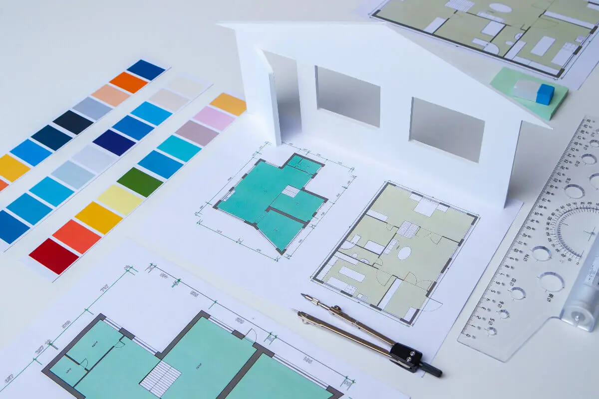
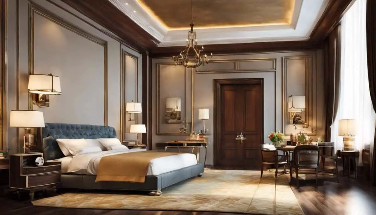
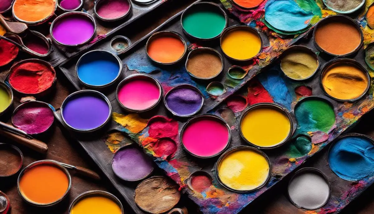
Delving into the world of interior design, we are set to navigate a realm where colors become more than simple aesthetic preferences, transcending to influence mood, balance, lighting, and spatial perception. The psychology behind colors is compelling in the way it instigates different emotions and behaviors, making color selection an important consideration when designing or redecorating a space.
The harmony and contrast of colors have the power to strike an appealing visual balance, while the interplay of color and light can redefine our perception of a particular room. Moreover, the right color choices can significantly impact perceived room size. As the design world evolves, new color trends continually surface to transform contemporary interiors drastically.
Table of Contents
- The Psychology of Colors
- Color Harmony and Contrast
- Color and Light
- Strategic Use of Color in Small Vs. Large Spaces
- Color Trends in Interior Design
- Related Content
The Psychology of Colors
The Kaleidoscopic Impact of Color on Emotion and Behavior in Living Spaces
A palette isn’t simply a tool an artist uses to mix their paints—it can also serve as a metaphor for life, particularly inside the home. Each shade, each hue, and each color holds tremendous power to sway our attitudes, emotions, and behaviors within the boundaries of our living spaces.
The cultural resonance and psychological impact of specific colors have been studied and utilized by great artists across centuries. Understanding this power, we too can wield it and turn our homes into ultimate living masterpieces.
Delving into the world of Chronology, or the psychology of color, reveals how different hues can emotionally charge our environments, affecting our moods and interactions.
Invoking a Sense of Serenity with Blue
A vast clear sky or tranquil sea—blue often walks in tandem with calmness, peace, and serenity. In a living space, blue promotes tranquility and imparts a sense of security, which may explain why many find themselves naturally gravitating towards this shade when seeking solace or peace.
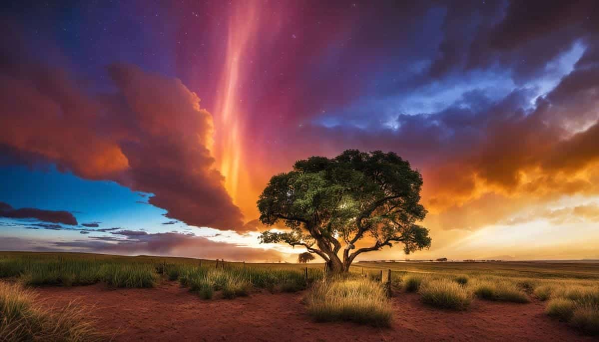
Stimulating Energy with Red and Orange
If heat had a color, it would undoubtedly be red. Known for its dynamic and stimulating qualities, intense shades of red can invigorate spaces, making them appear energetic and inviting. Similarly, orange radiates warmth, comfort, and enthusiasm. These colors might be the perfect brushstroke to add if you’re looking to fuel enthusiasm in shared spaces or home gyms.
Cultivating Growth and Healing with Green
Light-infused forest leaves and sprawling pastures whisper the essence of green. This color symbolizes growth, harmony, freshness, and fertility. Dipping your living space in shades of green can breathe life into a room, stimulate healing, and convey a sense of safety.
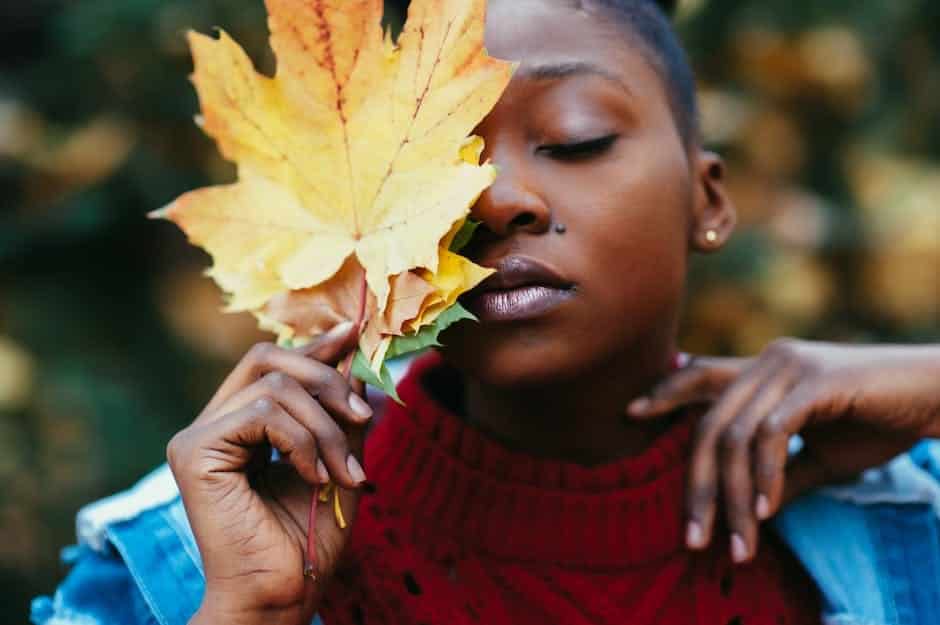
Fostering Happiness and Optimism with Yellow
Yellow weaves tales of sunshine, joy, intellect, and energy. Incorporating elements of yellow within a living space can stimulate mental vigor, encourage communication, and spark creativity. It’s a shot of happiness, making rooms appear welcoming, pleasant, and joyfully relaxed.
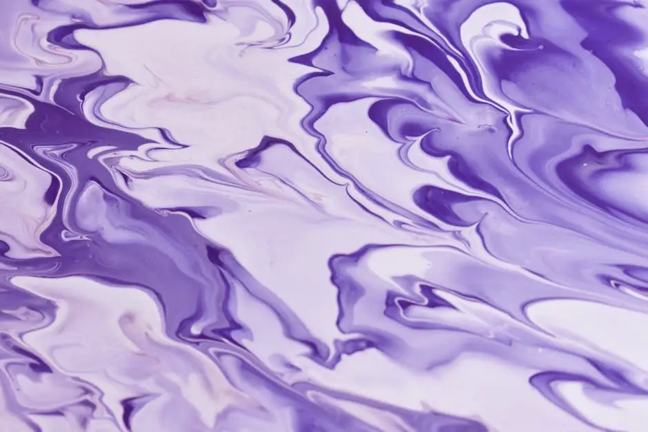
Meditating with Purple
Purple, often associated with luxury, power, and ambition, also radiates undertones of calmness and meditation. Deep or light in a living space, purple can usher in an atmosphere of sophistication and spirituality—a hue for those seeking to infuse their space with a note of mystique and tranquility.
Softening with Pastels
Pastel shades, with their innate softness and subtlety, can help create an atmosphere of calm, uplift, and purity. Ideal for bedrooms or other relaxation spaces, these hues imbue an environment with tranquility, allowing us to connect with our most delicate, harmonious emotions.
Color is pivotal in transforming a living space into a sanctuary that mirrors our emotions and stimulates our behaviors. It’s not just about aesthetics but about creating an emotionally resonant habitat that, like an art masterpiece, allows for self-expression, influences mood, and inspires.
Understanding this language of colors and utilizing it creatively can layer our homes with emotions, setting the backdrop for a home story that’s as vibrant and dynamic as a beautifully painted canvas.
Color Harmony and Contrast
Creating Vibrancy in Living Spaces: A Kaleidoscope of Colors and Contrasts
A simple way to breathe life into any living space, be it a bustling home or an organized office, is to embrace the craft of playing with color harmony and contrasts. This creative dance between hues, shades, and tones truly shapes the rhythmic color symphony that a room projects.
Consider the color wheel, the artist’s constant companion. It provides a rich playground where color harmonies and contrasts come to life. But how exactly can a designer toy with these hues lend depth and allure to interior spaces?
Consider the dynamic of complementary colors – hues opposite each other on the color wheel. In contrast, they create a stimulating and dynamic space, filling it with the zing of a salsa dance. Think of a yellow sunflower against a clear, blue sky or the vibrant combination of red and green during the festive season. Such pairs, with their inherent contrast, form an intense visual interplay, creating a lively ambiance.
Analogous color schemes, or hues adjacent to one another on the wheel, offer another enticing approach. They smoothly transition from one color to the next, fostering an effect that’s harmonious and gentle, much like the blissful hum of a lullaby. Just imagine the tranquil serenity of a sunrise-themed room that graduates from a calming pastel pink to a refreshing morning orange.
Meanwhile, you can also experiment with a monochromatic palette – imagine a varying array of blues in a living room – from cobalt pillows and sky-blue walls to a navy rug. This allows for a sense of visual unity while introducing a range of tones from the same color family to add depth.
The playfulness continues by introducing color temperatures into the mix. A juxtaposition of warm and cool tones can heighten a room’s visual interest. Using warm hues like red, orange, or yellow on a backdrop of cool blues, greens, or purples can create a striking balance. This interplay leads to an engaging mix of energy and tranquility that simultaneously soothes and stimulates the senses.
In addition, a mindful eye to lighting can significantly enhance the depths of color perception. A room draped in soft neutrals can come alive under a different light, marrying color tones and contrasts subtly.
Playing with color gradations is also a noteworthy strategy. Ombre effects with graduated hues, from the most intense to the most muted of a particular color, can create an artistic and relaxing atmosphere.
The key? The right blend of balance and tension. Be bold; experiment fearlessly! And follow how the play of color speaks to the unique rhythm of life within your spaces. Let the symphony of color harmonies and contrasts sing out loud in your living quarters, inviting a dynamic conversation between your environment and those who inhabit it. The result is certain to be a space that is as stimulating, soothing, and remarkable as an artist’s canvas.
Color and Light
Immersing Ourselves in the Spectrum of Light
As Picasso artfully stated, “Colors, like features, follow the changes of emotions.” We’ve delved into the powerful influences of hues and their amplifying effects on our moods; now, let’s unravel the simple yet complex phenomenon that brings colors to life: light. An unseen but indispensable component, let’s ponder upon the effect of lighting on colors and understand how it not only evokes emotional response but also impacts room dynamics.
Let there be Light.
Take the room as an open canvas and the light, an invisible brush, working conscientiously to sway the experience. Predominantly, light determines how we perceive color. Envision an obsidian backdrop cut by a blazing crimson sun; the intense light alters the perception of color. Similarly, the colors adorning our rooms are visibly transformed by the interplay of light.
Soft or Warm Glow – Not Just About a ‘Feeling’
A soft glow creates an atmosphere that resonates with the comfort of cozy cocoons. For instance, a warm yellow light softly intensifies a rust-colored wall and exudes warmth, transforming the room into a welcoming haven. Harmony is the game; warm light partners well with warm paint shades, amplifying their intensity while bestowing a nurturing ambiance.
In stark contrast, a crisp white light on cool tones gives the space a spacious, airy feel, stimulating clear thinking and sparking creativity. Thus, a sea-blue wall under bright illumination simulates an open-sky ambiance, fostering tranquility, openness, and serenity.
Observing Nature’s Showreel
One can take cues from Mother Nature’s dramatic presentation of light and colors. Initial morning rays bring out the best in cool colors, while the evening’s golden hour breathes life into warm tones. The subtle notes of light’s effect on colors not only offer insight into an ideal color choice but inspire to adapt and switch lighting as per the day’s rhythm.
And the Spotlight is on…
The placement of light also affects the way colors are perceived. Direct light can heighten the room’s drama by intensifying colors, while indirect light brings a subtler change, allowing colors to merge with the surroundings softly.
Artificial Lighting – Not Just a Light Bulb Moment
The world of artificial lighting is vast and varied, from LED and fluorescent to incandescent bulbs, and each affects the color differently. While incandescent bulbs emit a pleasing warm glow coaxing yellows, reds, and oranges, LED or fluorescent lights accentuate blues and greens, visually cooling a room.
To Dabble or Not
To make informed color decisions, it’s crucial to observe color swatches at different times of the day under various lighting conditions. Specific hues may appear drastically different under distinct lighting, so a purist artist or a color enthusiast might consider installing adjustable lighting solutions.
In Conclusion, Illuminating Insights
Artists poetically term light as the music of colors, a silent yet powerful symphony that plays on our emotions. Understanding the relationship between color and light, experimenting with different lighting scenarios, and being attuned to nuances can elevate design experiences.
From a cozy nook to a vibrant living room, be it any space, lighting’s impact on color and space remains undeniable and intriguing. Remember, when light, color, and emotions align, magic ensues. Let’s embrace the dialogue of light with colors and witness an artistic revelation.
Strategic Use of Color in Small Vs. Large Spaces
Enhancing Perceived Space with Color: Optical Illusions in Room Design
Color is more than just a visual delight; it catalyzes perceived spatial transformations. In interior design, it can become an optical illusionist’s tool, offering a dynamic way to tweak perceptions of size and spaciousness inside rooms.
Light and Dark: The Dichotomy of Space Perception
Born from countless observations, instincts, and perceptions formed over millennia, our brains harbor an arsenal of associations between light, dark, space, and size. Have you ever noticed how an expanse of sky or a large body of water extends endlessly into the horizon? This is no accident. It’s a direct result of the inherent lightness of these spaces.
Bring this concept into your home with lighter colors. Pale colors reflect more light, thus amplifying the sense of space and freshness. Small rooms adorned with light tones seem more airy and open, stretching the perceived dimensions.
On the flip side, dark colors absorb light, creating an illusion of compactness and closeness. Rooms decked in deeper shades feel more cozy, snug, and petite. However, this same effect can lend depth and gravity to a larger space.
Saturation and Spatial Influence
But size perception isn’t solely decided by color value. Saturation is the fulcrum. It’s tempting to assume bold, saturated colors biologically exude spacial contraction. That is not necessarily accurate. Despite being arresting and visually heavy, when used thoughtfully, these captivating colors can also create a strikingly spacious feel, especially on feature walls, tricking the eye and making the room feel deeper.
In contrast, softer, less saturated hues tend to blur boundaries, creating an illusion of infinite space, stretching confines, and pushing walls away.
Color Placement: An Architectural Wand
Just as a dramatic cape enhances a magician’s charm, strategic color placement amplifies the conjurer’s effect. Light colors on ceilings draw the eye upwards and create the illusion of increased height.
On the other hand, extending wall color onto the ceiling, forming an ‘infinity edge,’ blurs the division line, visually opens up the space and elicits a sense of expanded size.
Additionally, painting trim and molding in tones lighter than the walls helps the walls appear further back, making the room feel larger and more spacious.
Color and Light: A Symbiotic Relationship
Remember, room size perception is not just a response to color but also light. Use light cleverly; highlight a light wall, and the room will seem to expand. Conversely, highlighting a dark wall will make the room feel smaller, as the darkness curtails reflected light and visually pulls the wall closer.
Although impressive, color’s ability to transform space perception is not standalone magic. It’s a symphony, a carefully orchestrated balance of color, light, room function, and personal aesthetics.
So step forth, let experiment and experience be your guide, unleash the artist within, and transform your spaces with the charm of colors. Be your space illusionist, painting magic into every corner.
Color Trends in Interior Design
Stepping into the arena of new colors, we find, as if on cue, new chromatic trends guiding the paintbrush. There has been a surprising surge in popularity for bold and rich colors traditionally considered outside the typical color palette.
Exciting developments within this domain shimmer with intrigue, inviting design lovers to expand their horizons and venture deeper into the fascinating world of color.
“Dusk Blue” is a new superstar – an intriguing, sophisticated blend of cobalt and navy. Evocative of the enchanting twilight sky, this color bridges the gap between darkness and light, immersing spaces with calm and poise.
As a dominant hue, it can add a layer of enigmatic charm to a room but also works excellently as an accent color, interjecting a burst of depth and drama.
Equally dramatic yet incredibly different, “spicy mustard” has emerged as a distinct theme, delivering a tangy twist to interiors. With its vibrant energy, this striking hue defies tradition, adding an unexpected twang that electrifies a space.
It stands brilliantly against neutral backgrounds and can stir a delightful contrast when juxtaposed against more excellent blues and greens.
Emblematic of serene landscapes, “tea green” is another new darling making a statement. This subtle, restful hue brings an organic feel to the design, fostering a refreshing bond between the human habitat and the natural world. It radiates healing energy, reminding its audience of sprawling tea fields in soft, filtered sunlight.
Now, step back and bask in the luminous charm of “millennial pink.” Yes, you read that right! This tranquil blend of rose and peach is sweeping the design industry beyond millennial fascination. It gently counterbalances the intensity of other trendy colors, affording spaces a nurturing warmth and innocence that charms the eye and soothes the soul.
In stark contrast to the reigning popularity of pastels, the bold and assertive “charcoal black” is regaining ground. Donned as the sophisticated cloak of the darkness, its sultry undertones add an air of refinement to any space. Combined effectively with metallic accents, it contributes a luxurious and timeless elegance to the design narrative.
While colors weave their way into the heart of design with incredible variety, their role extends beyond merely visual impact. Coupled with understanding the tricks of the light and nuances in saturation, color trends allow for versatility and creativity in spatial planning.
So, stroke your canvas with these inspiring shades and witness the magical transformation that envelopes your space. Embrace the evolving color trends, leveraging them as your tool to create your very own artistic masterpieces within your living spaces. Be bold, be different, be colorful!
Through thoughtful use of color, you not only craft an aesthetically pleasing space that aligns with current design trends, but you also influence the very mood and feel of the home. Color can change our perception of a room’s size, enhance or dampen the effects of natural and artificial light, and create an innate sense of harmony.
As trends continually shift and evolve, maintaining an informed understanding of color in interior design will allow you to adapt your living spaces dynamically to the changing aesthetic tide while also building a home that directly enhances your well-being and daily experience.
Find out more about how Mondoro can help you create, develop, and manufacture excellent home decor and furniture products – don’t hesitate to contact me, Anita. Check out my email by clicking here or become a part of our community and join our newsletter by clicking here.
Mondoro gives out a FREE Lookbook to anyone interested. You can receive a copy of our latest Lookbook by clicking here.
Listen to our Podcast called Global Trade Gal. You can find it on all major podcast platforms. Try out listening to one of our podcasts by clicking here.
Subscribe to our Mondoro Company Limited YouTube Channel with great videos and information by clicking here.
Related Content
12 Living Room Home Decor Wall Ideas For Your Empty Walls
Scandia’s furniture design, designer aesthetics, and philosophies have remained influential since its emergence in the 20th century. The critical focus of Scandia’s design lies in the harmonious blend of form and function, ensuring that beautiful products are not merely eye candy but also practical for everyday use.
You can learn more by reading our blog, 12 Living Room Home Decor Wall Ideas For Your Empty Walls by clicking here.
Scandia Design Furniture And Designers: Pioneers Of Simplicity
Scandia’s furniture design, designer aesthetics, and philosophies have remained influential since its emergence in the 20th century. The critical focus of Scandia’s design lies in the harmonious blend of form and function, ensuring that beautiful products are not merely eye candy but also practical for everyday use.
To learn more, you can read Scandia Design Furniture And Designers: Pioneers Of Simplicity by clicking here.
Wabi-Sabi: Embracing Imperfection And Transience In Design
In an era where everything is mass-produced to perfection, where symmetry is celebrated, and where glossy, flawless finishes are the norm, the ancient Japanese design philosophy of Wabi-Sabi offers a breath of fresh air. Instead of striving for perfection, Wabi-Sabi celebrates imperfection and sees beauty in the simple, rustic, and imperfect life and design choices.
You can discover more by reading Wabi-Sabi: Embracing Imperfection And Transience In Design by clicking here.