Each year Mondoro will look at the color trends and then do some trend color palettes. So it is interesting to learn that color palettes have different color palette types.
Colors are the silent narrators of our world. They convey emotions, set moods, and communicate ideas without uttering words. When choosing colors for any project, whether it’s interior design, graphic design, or fashions essential to understand the underlying principles of color palettes. Today we’ll explore the four primary types of color palettes and delve deep into their attributes.
Table of Contents
- Monochromatic Color Palettes
- Analogous Color Palettes
- Complementary Color Palettes
- Triadic Color Palettes
- The Significance Of Colors In Product Development And Interior Design
- Frequently Asked Questions
- Related Content
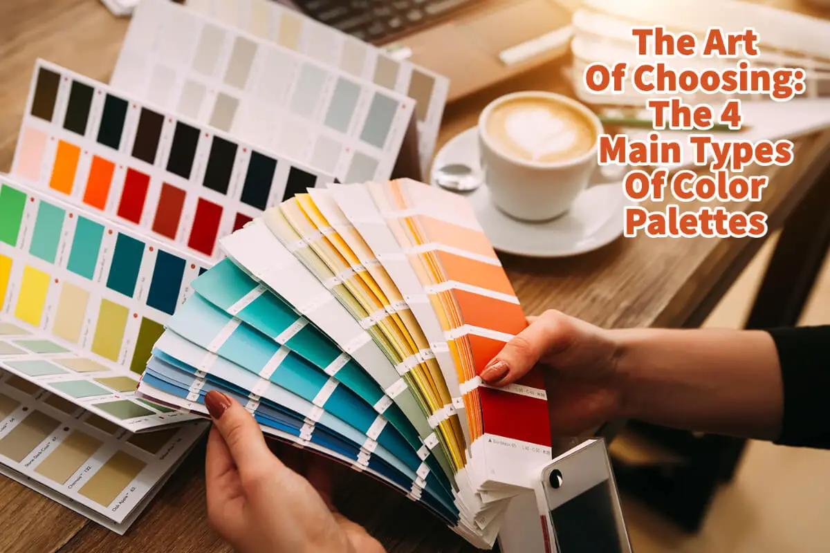
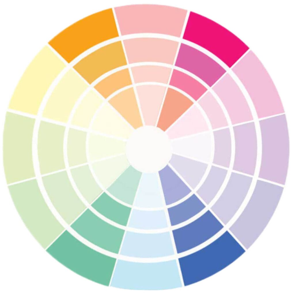
Monochromatic Color Palettes
A monochromatic color palette draws from a single hue and employs its various shades, tints, and tones.
Attributes Of Monochromatic Color Palettes:
- Simplicity: A monochromatic palette is straightforward to create. Choose a hue and adjust brightness, saturation, and tone to get your desired range.
- Harmony: A single hue’s shades and tints naturally blend and harmonize, creating a soothing visual experience.
- Depth and Dimension: Even with a single hue, the different shades and tints can create depth and dimension, making designs look multi-layered.
- Focus: Monochromatic palettes can help to highlight a focal point in a design or space sinthere’se’s no competition between colors.
- Flexibility: These palettes can fit various moods and themes, from sad and muted to vibrant and lively, depending on the chosen hue and its range.
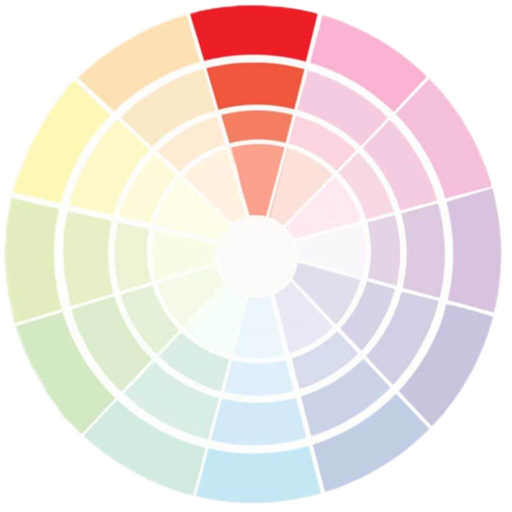
Analogous Color Palettes
Analogous color palettes use hues adjacent to one another on the color wheel, creating a harmonious blend.
Attributes Of Analogous Color Palettes:
- Natural Appeal: Analogous colors often mirror the shades we see in nature, like the transition of colors during sunset or the green hues in forests.
- Balanced Contrast: These palettes provide a more vibrant contrast than monochromatic ones yet maintain harmony.
- Variety: With more hues, designers have more options without the risk of clashing colors.
- Warm or Cool Dominance: Analogous palettes lean towards the warm or cool spectrum, creating a unified mood.
- Adaptable: While they have a broader range than monochromatic palettes, they can still be adjusted in saturation and brightness to fit various needs.
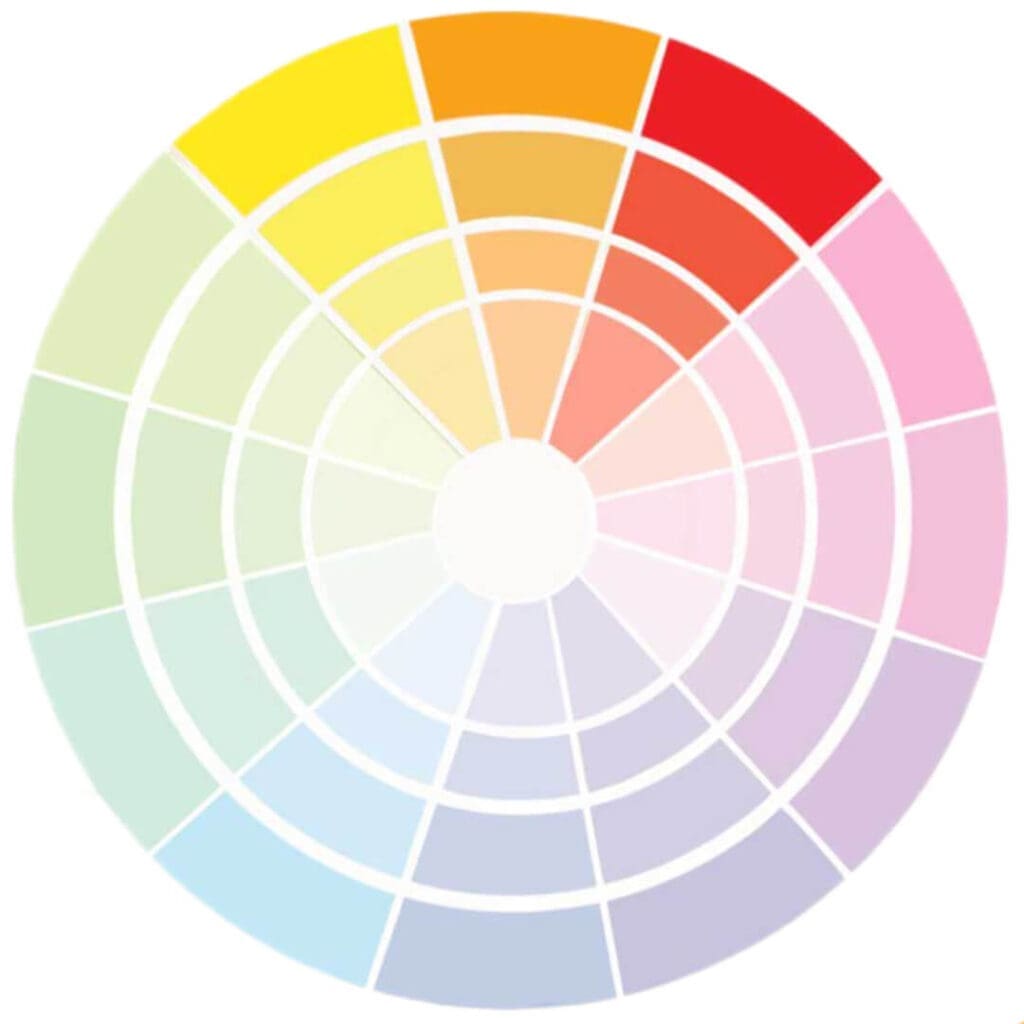
Complementary Color Palettes
Complementary color palettes consist of colors that sit opposite each other on the color wheel, bringing a striking contrast.
Attributes Of Complementary Color Palettes:
- Bold Contrast: Complementary colors create a dynamic visual impact due to their inherent contrast, making designs pop.
- Balance: Even with the contrast, there’s a natural balance as every color has its opposing match.
- Versatility: These palettes can be subdued or vibrant. The key lies in the chosen shades of the opposing colors.
- Attention-grabbing: Complementary colors are ideal for highlighting and drawing attention due to their contrasting nature.
- Energetic: This palette exudes energy and liveliness, making it perfect for designs or spaces that excite or inspire.
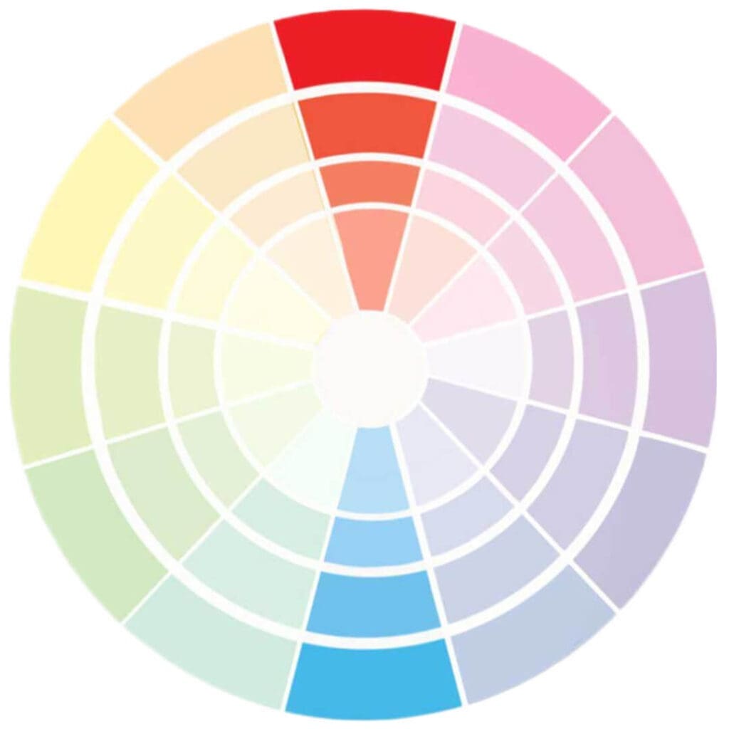
Triadic Color Palettes
Triadic palettes are formed by choosing three evenly spaced colors around the color wheel, offering rich contrasts while maintaining harmony.
Attributes Of Triadic Color Palettes:
- Vibrant Contrast: With three distinct colors, triadic palettes are lively and vibrant, even when using pale or unsaturated versions of the hues.
- Harmonious Diversity: Despite the variation, the equal spacing on the color wheel ensures a sense of cohesion.
- Adaptive: Tpalette’se’s mood can shift dramatically based on the dominant color, accommodating different themes.
- Stimulating: The rich diversity can evoke multiple feelings and ideas, stimulating the viewer.
- Complexity: Triadic palettes can add complexity to a design, making it suitable for intricate designs needing diverse yet harmonious colors.
Color isn’t just a visual element; they’re a powerful tool that evokes emotions, tells stories, and creates atmospheres.
The Significance Of Colors In Product Development And Interior Design
Colors possess an inherent power that goes beyond mere visual appeal. They can influence emotions, drive behaviors, and shape perceptions. In product development and interior design, understanding and harnessing the power of colors is paramount. Let’s delve into why colors are pivotal in these fields.
Psychological Impact
Colors can evoke a spectrum of emotions and feelings. For instance, blue is often associated with tranquility and reliability, red with passion and energy, and green with nature and calmness.
- Product Development: When launching a new product, its color can dictate its reception. A fitness gadget might use vibrant colors to denote energy, while a sleep aid device might employ softer hues to convey relaxation.
- Interior Design: The color of a room can dramatically affect the mood. A bedroom painted in soft lavender or pale blue can evoke feelings of rest, while a bright yellow kitchen might inspire vibrancy and creativity.
Branding And Identity
Colors play an integral role in brand recognition. They can reflect the brand’s ethos, target demographic, and market positioning.
- Product Development: The product’s color can become synonymous with a brand, like the iconic Tiffany Blue or the red soles of Christian Louboutin shoes.
- Interior Design: Commercial spaces use colors to enhance brand identity. For example, tech companies often use open spaces with neutral tones complemented by pops of vibrant colors to reflect innovation and creativity.
Functionality And User Experience
Colors are not just about aesthetics; it can also serve functional purposes.
- Product Development: Color can denote the function of buttons on a gadget or help in easy identification. Think about the color-coded wires or the red recording button on devices.
- Interior Design: Colors can demarcate spaces, guide navigation in large interiors, or even affect the perceived temperature of a room. Cooler colors might make a room feel colder, while warmer tones can make it feel cozy.
Market And Cultural Sensitivities
Different cultures and demographics perceive colors differently.
- Product Development: When launching a product in a global market, understanding the cultural connotations of colors is crucial. While white might be associated with purity in some cultures, it represents mourning in others.
- Interior Design: Sensitivity to such color perceptions is vital in designing spaces for global clientele or diverse cultures. For instance, while red might be seen as optimistic in Asian cultures, it might be perceived as aggressive or intense in others.
Trends And Evolution
Like fashion, colors also follow trends.
- Product Development: Being in tune with trending colors can make a product seem contemporary and in demand. For example, Pantone’s Color of the Year influences product design across industries.
- Interior Design: Interior spaces can be refreshed or made to appear cutting-edge by incorporating the latest color trends, ensuring the design feels current and relevant.
Colors are not merely decorative but communicative, functional, and influential. Whether in the tactile realm of product development or the spatial art of interior design, colors bridge the gap between functionality and emotionality.
They shape experiences, tell stories, and, most importantly, connect products and spaces to those who use them. Embracing the power of color is not just about aesthetics but about understanding human psychology, culture, and behavior.
When you’re painting a room, designing a website, or choosing an outfit, understanding the types of color palettes and their attributes can help in making informed, impactful decisions.
Dive into the world of colors and let them enrich your creations!
Find out more about how Mondoro can help you create, develop, and manufacture excellent home decor and furniture products – don’t hesitate to contact me, Anita. Check out my email by clicking here or become a part of our community and join our newsletter by clicking here.
Mondoro gives out a FREE Lookbook to anyone interested. You can receive a copy of our latest Lookbook by clicking here.
Listen to our Podcast called Global Trade Gal. You can find it on all major podcast platforms. Try out listening to one of our podcasts by clicking here.
Subscribe to our Mondoro Company Limited YouTube Channel with great videos and information by clicking here.
Frequently Asked Questions
1. What are color palettes, and why are they important in design?
Color palettes are carefully selected combinations of colors used in various design projects. They play a crucial role in evoking emotions, creating harmony, and conveying messages without words. Understanding color palettes is essential for effective design in fields like interior design, graphic design, and fashion.
2. What are the four main types of color palettes, and how do they differ?
The four main types of color palettes are monochromatic, analogous, complementary, and triadic. They differ in terms of the color relationships within each palette. Monochromatic uses variations of a single color, analogous combines neighboring colors on the color wheel, complementary pairs opposite colors, and triadic uses three equidistant colors.
3. How does Mondoro incorporate color trends into its color palettes?
Mondoro annually analyzes color trends to stay current and relevant. By identifying popular and emerging colors, Mondoro creates trend color palettes that resonate with contemporary aesthetics, ensuring that their designs remain fresh and appealing.
4. What emotions or moods do different color palettes convey?
Each color palette has a unique emotional impact. Monochromatic palettes are often calming and sophisticated, analogous palettes create harmony and warmth, complementary palettes offer contrast and vibrancy, while triadic palettes can be dynamic and energetic.
5. Can you provide examples of where monochromatic color palettes are commonly used in design?
Monochromatic color palettes are often used in minimalist designs, modern interiors, and elegant branding. These palettes create a sense of simplicity and sophistication by utilizing different shades, tones, and tints of a single color.
6. How do designers balance creativity and practicality when choosing a color palette?
Designers balance creativity and practicality by considering the project’s goals, target audience, and the emotions they want to evoke. While creativity allows for unique expression, practical considerations ensure that the chosen palette aligns with the project’s purpose.
7. Are there any rules for combining colors within a palette, or is it purely subjective?
While there are guidelines for creating harmonious color palettes, much of it is subjective and depends on the designer’s intent. Understanding color theory, contrast, and balance helps in making informed decisions, but creativity often involves pushing boundaries and experimenting.
8. How can color palettes influence consumer perceptions in fashion design?
Color palettes in fashion design can significantly influence how consumers perceive a brand or a collection. Warm and vibrant colors may convey energy and boldness, while cool and muted tones can suggest sophistication and subtlety. Understanding these perceptions is crucial for successful fashion branding.
9. How do trends in color palettes evolve over time, and what factors contribute to these changes?
Color trends evolve in response to cultural shifts, societal changes, and emerging design movements. Influences can come from art, technology, nature, or even global events. Designers and trend forecasters closely observe these factors to predict and respond to shifts in color preferences.
10. How can individuals use the knowledge of color palettes in their everyday lives, beyond professional design?
Understanding color palettes can enhance personal aesthetics in various aspects of life, such as home decor, wardrobe choices, and even event planning. Applying basic color principles can lead to more visually pleasing and harmonious environments, contributing to a positive and intentional lifestyle.
Related Content
12 Living Room Home Decor Wall Ideas For Your Empty Walls
Scandia’s furniture design, designer aesthetics, and philosophies have remained influential since its emergence in the 20th century. The critical focus of Scandia’s design lies in the harmonious blend of form and function, ensuring that beautiful products are not merely eye candy but also practical for everyday use.
You can learn more by reading our blog, 12 Living Room Home Decor Wall Ideas For Your Empty Walls by clicking here.
Scandia Design Furniture And Designers: Pioneers Of Simplicity
Scandia’s furniture design, designer aesthetics, and philosophies have remained influential since its emergence in the 20th century. The critical focus of Scandia’s design lies in the harmonious blend of form and function, ensuring that beautiful products are not merely eye candy but also practical for everyday use.
To learn more, you can read Scandia Design Furniture And Designers: Pioneers Of Simplicity by clicking here.
Wabi-Sabi: Embracing Imperfection And Transience In Design
In an era where everything is mass-produced to perfection, where symmetry is celebrated, and where glossy, flawless finishes are the norm, the ancient Japanese design philosophy of Wabi-Sabi offers a breath of fresh air. Instead of striving for perfection, Wabi-Sabi celebrates imperfection and sees beauty in the simple, rustic, and imperfect life and design choices.
You can discover more by reading Wabi-Sabi: Embracing Imperfection And Transience In Design by clicking here.