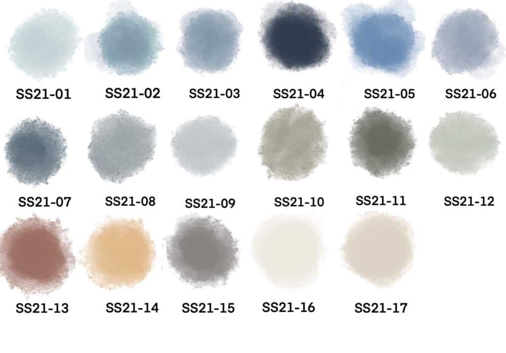
Calm, Serene, Comfort, Trust, Constancy, True Blue Serenity Sphere is our home decor color trend. This home decor trend builds on our home decor trend that features the color blue as the main focus.
The Serenity Sphere home decor trend description words include calm, serene, comfort, trust, constancy, and true blue. This home decor trend has in its color palette many shades of blue. Blue is a color that signifies trust and also helps to keep us calm. This added calmness helps improve our creativity.
Table of Contents
The Serenity Sphere home decor trend also has a cream, oatmeal, and a mustard yellow color. All of these colors go hand-in-hand with this palette of blue color tones.
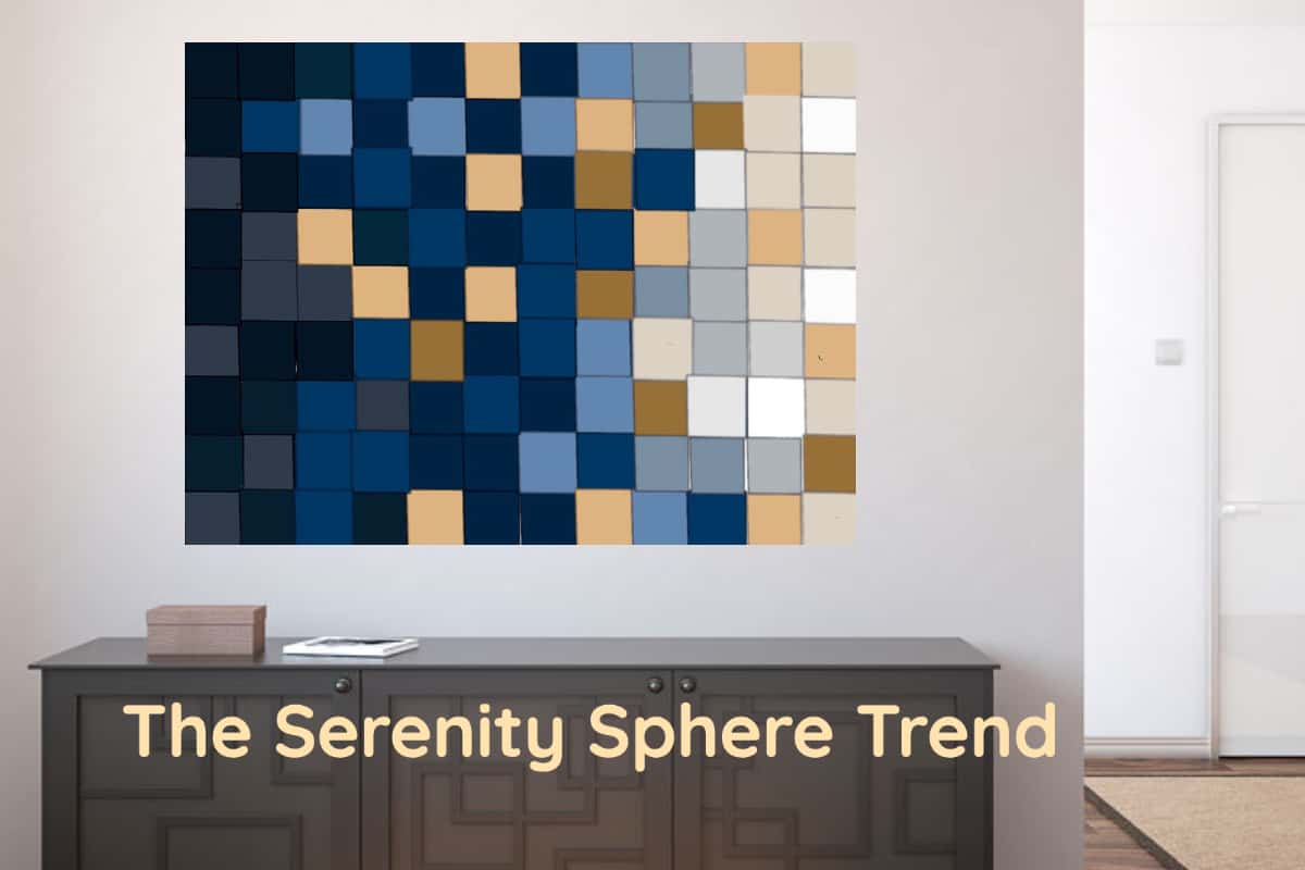
The Serenity Sphere Trend – A Blue Color Palette
The Serenity Sphere Blue Color Trend has brought unprecedented changes in our lives. We are no longer able to travel as freely as we once were. We’ve had to work from home and shelter in place. Masks have become the norm to wear in a public place.
It is not surprising that many of the home decor color trends focus on a color palette that invokes our thoughts with words like calm, serene, comfort, trust, constancy, and true blue.
The colors in the Serenity Sphere Home Decor color trend are filled with all kinds of blue color tones. Present in the color palette is the ever trusty navy blue color.
In speaking of the blue colors for home decor, Jennifer Guerin, a California interior designer and a color expert from jgcolor.com said this to the Washington Post:
“One of the most popular colors in the United States is blue. Blues are soothing, and navy has a classic sense to it that complements almost all hard and soft furnishings. It looks good with warm browns and cool whites. It works in historic homes and uber-modern spaces. It sings with metallics in accessories and goes with the matte black hardware trend.”
Washington Post
This is why our Serenity Sphere home decor color trend includes the ever navy blue as one of the color trends. We love the Navy Blue color in a matte navy blue color as it looks great paried together with some gold accent accents.
This Serenity Sphere home decor color palette includes many shades of blue from a very light blue to a medium blue to a brighter blue and even an nice teal. All of these blue tones help us to to feel calm and serene especially during a time when many may feel stressed or unsure.
The Psychology of Blue
There are psychological reasons why we feel comfortable, serene, and even trustworthy when we see the color blue. The words True Blue actually have a deeper meaning than just the color blue.
True Blue is one of the reasons why the majority of police uniforms are blue. The blue color blue inspires trust in a person when someone wears blue, especially navy blue. Also when a person wears blue we see them as non-invasive and as someone who is objective. This is why navy blue is such a popular color choice for police, military, and other uniforms.
Blue is linked to creativity. One reason why people believe blue helps creativity is that the color blue is known to lower our blood pressure and slow down our heart rate. When our blood pressure is low and a heart rate is relaxed we have less stress, and this all allows our creative juices to be able to freely flow.
The darker shades of blue such as a deep navy blue are thought to help improve our brain processes. Lighter shades of blue are shown to help our level of concentration.
Blue and all color tones of the blue color will continue to be an important trend in the years and beyond. This is because the color blue is a color that is here to stay for the design and product development in home decor and home furniture products.
The Oatmeal and Cream Colors
In our Serenity Sphere, the home decor color palette includes a very nice cream color and an oatmeal kind of creamy colorway. These colors continue to show up in all kinds of color trends. This is because these colors are wonderful neutral colors that can be paired together with any color in the Serenity Sphere color palette.
Oatmeal in particular looks really great when paired together with a navy blue or even a medium blue color. The cream color is a classic color that can fit with any kind of color or home decor product. These colors will remain important throughout the years and beyond.
The Mustard Yellow Color
The mustard yellow is a great accent color in the Serenity Sphere home decor color palette. Yellow has always been one of my favorite colors. Maybe this is because yellow signifies happiness and cheerfulness.
With my Swedish roots, I have always loved yellow and blue paired together. This mustard yellow and the navy blue are two colors that will look great together.
The Serenity Sphere home decor trend has a color palette that signifies me calmness, comfort, and trust. The trusted blue tone in this trend’s color palette help to bring this calmness,comfott and trust into our homes.
At Mondoro we LOVE to help you create, develop, and manufacture amazing home decor and furniture products. We have showrooms and offices in Asia. For more information please contact Anita by clicking here.
Find out more about how Mondoro can help you create, develop, and manufacture excellent home decor and furniture products – don’t hesitate to contact me, Anita. Check out my email by clicking here or become a part of our community and join our newsletter by clicking here.
Mondoro gives out a FREE Lookbook to anyone interested. You can receive a copy of our latest Lookbook by clicking here.
Listen to our Podcast called Global Trade Gal. You can find it on all major podcast platforms. Try out listening to one of our podcasts by clicking here.
Subscribe to our Mondoro Company Limited YouTube Channel with great videos and information by clicking here.
Other Home Decor Trends and Color Palettes
The Peaceful Sanctuary Home Decor Color Palette and Trends
The Peaceful Sanctuary home decor trend is about bringing nature into your home. It is about using natural elements in your home decor. The trend has brought with it many changes as many people’s lives have changed in unprecedented ways. Activities like camping gardening and baking are more popular than they have ever been.
You can find out more by reading our blog The Peaceful Sanctuary Home Decor Color Palette and Trends by clicking here.
The Zen Pleasures Home Decor Color Palette and Trends
The Zen Pleasure home decor trend color palette is filled with neutrals and other warming colors. This trend color palette helps to invoke a peaceful and tranquil home decor environment.
You can learn more by reading our blog The Zen Pleasures Home Decor Color Palette and Trends by clicking here.
The Sanguine Outlook Home Decor Color Palette and Trends
The Sanguine Outlook home decor color palette is a color palette filled with bright, fun colors. The Sanguine Outlook home decor color palette is about optimistic, positive, upbeat, cheerful, and happy colorways. It is a home decor trend that will last throughou the years and beyond.
You can discover more by reading our blog The Sanguine Outlook Home Decor Color Palette and Trends by clicking here.