In the vibrant world of art, colors play a crucial role in conveying emotions, setting the mood, and bringing a piece to life. With its refreshing and serene tones, light blue holds a significant place in this diverse palette, often used to invoke tranquility, expansiveness, and inspiration.
This exploration delves deep into light blue, unfolding its rich symbolism, impact in different art styles, effective color harmonization, and practical utilization in artistic creation. Whether you’re an aspiring artist or a passionate art enthusiast, this comprehensive guide promises to provide a vivid insight into the intriguing world of light blue in art.
Table of Contents
- Understanding Light Blue Tones in Art
- Harmonizing Light Blue with Other Colors
- Influential Artworks & Artists Utilizing Light Blue
- Practical Guide to Creating Art with Light Blue
- Related Content
Understanding Light Blue Tones in Art
The Language of Light Blue: Unraveling Art’s Emotional Spectrum
As twilight softly disarms the bold hues of the day, the sky morphs into hues of light blue, and we find ourselves immersed in a tranquil serenade.
This universal experience speaks volumes about the emotional impact of color— specifically, light blue — ) in art. The color of the serene sky and the tranquil ocean convey nuanced emotions and profound meanings in our artistic expressions.
A stroll through an art gallery is akin to an emotional journey guided through the subtly rendered color palette. Light blue, a favored member of this palette, often communicates calm, peace, and serenity.
That gentle whisper of color, humbly resting on the canvas, cradles the viewer in a cocoon of tranquility. Yet, it is not passive; it is an active participant that mediates between the artwork and the onlooker, whispering into the ears of the viewer and inviting introspection.
However, light blue is not a one-trick pony limited to lulling audiences into quiet reflection. It also works as an exceptional amplifier of depth and distance.
When artists apply strokes of light blue onto their canvas, they subtly manipulate the viewer’s perception of space. It’s the language of the horizon, expansive skies, and endless seas. Thus, it can inject a sense of vastness into a confined canvas.
Moreover, light blue’s spectrum includes an evocation of freshness and rejuvenation. Position it next to yellows, and one begins to sense the breezy charm of a spring morning. Pair it with greens, and it feels like the rustle of a lively river. This dimension of the light blue’s significance in art makes it a conduit for optimism and new beginnings.
Just as light blue represents trust and loyalty in numerous cultures, it also carries these symbolic meanings into art.
As observed in various religious and historical paintings, artists have utilized light blue to depict truth, faith, and divinity. Light blue is an emotional signifier drawing upon the universal human experience and shared cultural understanding.
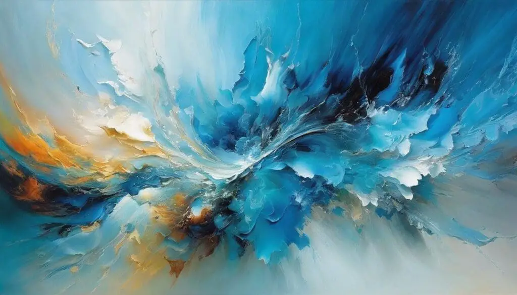
Moving on to the abstract realm, where artists break free from realistic limitations, light blue continues to weave its magic.
It can become the emotion communicated through abstraction, imbued with many feelings and moods, ranging from melancholy to joy, from rumination to liberation. Light blue becomes a chameleon in abstraction, ever willing to adapt and represent the artist’s impulse.
Though seemingly innocent and tranquil, light blue is multifaceted, carrying within it a spectrum of emotion and meaning. Its versatility allows it to be as soothing as a lullaby or as stirring as a sonnet, depending on where and how it exists on a canvas. In art, light blue is more than just a color—it’s an emotion, a state of being, a story ready to be told.
Harmonizing Light Blue with Other Colors
The Nuances of Artistry: A Study of Harmonizing Light Blue
Creating art is a visual symphony of colors interacting harmoniously to invoke feelings and thoughts and narrate a unique story. Among the vast color palette, light blue is particularly intriguing.
Besides its innate psychological implications, this treasured hue derives its enchantment from a fascinating kaleidoscope of interactions with other colors. Its very essence molds into an eloquent partnership, transforming the emotional landscape of any art piece.
When adorned on the canvas with white, light blue gives birth to an ethereal atmosphere. This tonal harmony resembles gazing upon vast skies, conjuring an ambiance of infinite possibility and awakening an artist’s raw sense of wonder.
Paired with earthy hues such as brown or beige, light blue assumes a rustic charm, generating a serene blend reminiscent of a quiet beach or a rugged mountain scene.
Juxtaposing light blue with dark colors like black or navy is a well-versed tactic. It summons an appealing contrast, pushing the reflective quality of light blue, urging it to shimmer and shine unapologetically.
It’s a testament to resilience and tenacity, an artistic motif stirring notions of lighthouses standing strong amidst the stormy sea.
The harmony of light blue is not confined to its excellent kin. Unity with warm colors forms intriguing dynamics, making its duality clear. Next to red or orange, light blue undertones become more defined and pronounced.
The tension between the fiery red and serene light blue evokes a visually enticing drama, narrating dynamic tales of ice and fire, war and peace, chaos and calm.
Moreover, light blue’s alliance with green is an enchanting color symphony that breathes life into artworks, echoing nature’s palette. This harmonious blend establishes a tranquil yet vibrant environment, rousing emotions of renewal and growth and a visual communion of earth and sky.
Not to forget how light blue fares with yellows and golds are meant to dazzle viewers with an appealing vibrancy. Artists often employ this eye-catching combination to depict jubilant summer skies, creating a reminiscent portrait of warmth and merriment.
Ultimately, the amalgamation of light blue with colorful colors in pop art or surrealistic compositions intrigues the sightline. The vibrancy of multiple hues bouncing off the soothing light blue backdrop creates a bold and audacious visual statement.
Each color alliance forged with light blue offers a nuanced narrative or emotion to an artwork’s visual tapestry. Light blue’s harmonious interactions illustrate its capability to prompt and respond to unique color dialogues in artworks, making it a cornerstone in the art world’s chromatic symphony.
Together, these hues create stunningly diverse artistic expressions, proving that, in art, as in life, our interactions define us, making us more than the sum of our parts.
Influential Artworks & Artists Utilizing Light Blue
Art Throughout History: Admiring the Infinite Potentials of Light Blue
Diving into the discretion of fine arts, one finds the pools of genius are filled with myriad hues. Among the sea of colors, light blue is notable for its substantial usability and aesthetic appeal, as utilized by prominent artists throughout history.
This alluring shade has given birth to timeless masterpieces marked by their subtlety, tranquillity, and other motifs unique to this soothing color.
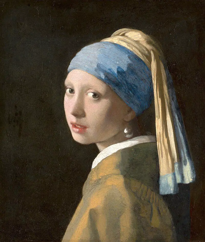
Johannes Vermeer’s masterpiece “The Girl with a Pearl Earring” (c. 1665) illustrates light blue’s compelling capabilities. The artist’s adept use of lapis lazuli to render the signature ultramarine blue turban is remarkable.
The light blue hue impeccably punctuates the mysticism and unspoken curiosity permeating the canvas, making it an enduring icon in art history.
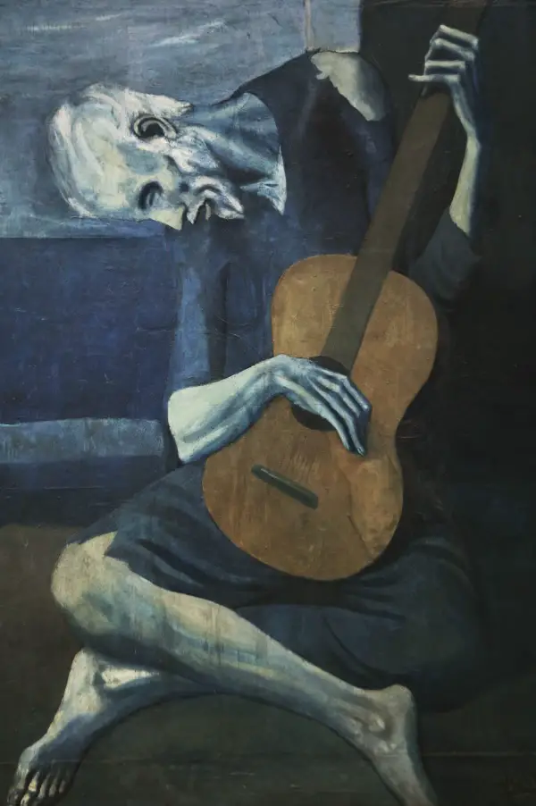
Pablo Picasso’s “Blue Period covers 1901-1904, allowing us to explore an extensive ensemble of light blue masterpieces. Affected by the suicide of his intimate friend, Picasso expelled his sorrows using primarily light blue in his creations.
Claude Monet, the renowned Impressionist, explored light blue’s brilliance in replicating changing light and weather conditions.
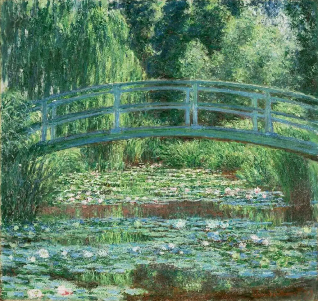
“Water Lilies and Japanese Bridge” (1897-1899), housed in Princeton University Art Museum, masterfully employs various hues of light blue to catch reflections in the pond beneath a pale, blue sky. The piece exudes serenity, emphasizing Monet’s skillful manipulation of light blue to evoke desired emotional responses.
A powerful tool in the artist’s palette, light blue’s traverse through art history has charted an enriching journey. From triggering deep-seated emotions, emphasizing relatability, and crafting enigmatic atmospheres to pushing the boundaries of perception, light blue’s potential truly knows no bounds.
An artist’s love affair with light blue endures, eager for the next creation that will leave the art community and the general audience spellbound in the color’s tranquil embrace.
Practical Guide to Creating Art with Light Blue
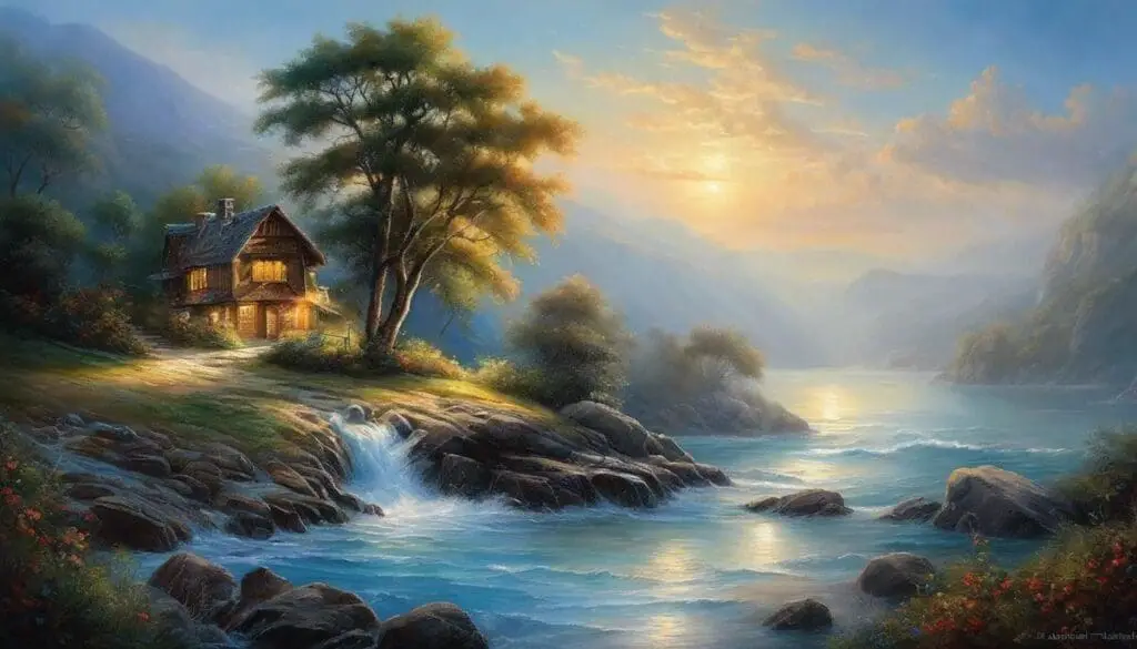
Delving into technique, light blue emerges as an indispensable player in landscape painting, effortlessly conferring the natural freshness of a clear sky or an idyllic ocean vista.
With its intrinsic association with the sea and the heavens, its impression can oscillate between a sense of boundless expansion and a fantastic, tranquil retreat. Herein lies the beauty of light blue; it is not confined by perception; it navigates flawlessly between subjective experience and objective rendition.
A light blue background in portraiture can serve as a gentle, harmonious setting, allowing the subject to emerge through contrast without overpowering the image.
Similarly, incorporating light blue into clothing or accessories within a portrait adds a touch of tranquility. Given light blue’s symbolism, it infuses a deeper layer, often amplifying the significance of the figure portrayed.
Modern usage of light blue illuminates its unique role in color field painting, where it can critically texture and layer the image without introducing aggressive disruption.
It can also be applied to gradients or transitions, enabling fluid dialogue between other hues and adding a serene radiance that subtly shifts the viewer’s focus across the canvas.
Beyond the traditional canvas, light blue has an impressive track record in digital art and graphic design. It provides a calming background, enhancing readability and user experience, especially in app development and website design.
Light blue banners, icons, or hyperlinks captivate users’ attention effortlessly, infusing a sense of trust and reliability – the harmony it strikes between aesthetic appeal and utility is commendable.
It’s incredible how this serene hue transitions easily from traditional media like oil or watercolor to the innovative frontiers of digital art, adapting to each medium’s unique constraints and opportunities.
Moreover, light blue is gaining significance in installation art and sculpture, bringing an ethereal touch of the sky or sea into stark gallery spaces or confronting viewers with the ambiguity of depth and flatness.
In the world of fashion design, light blue weaves an air of ease and approachability, becoming a favored choice for spring and summer collections. Its gentle, unassuming nature allows it to couple up with bolder hues, creating striking ensembles that vibrate between soft tranquility and assertive personality.
Even in culinary art, light blue is not far behind. Artful displays of light blue on candy, cakes, and cocktails speak to a sense of fun and whimsical elegance and highlight the integral role of color in the entire spectrum of our senses.
Light blue’s nearly universal, timeless application across many artistic disciplines speaks to its fundamental versatility.
Provided with such insights, one might say the real art lies not just in using light blue but in understanding its profound language and harnessing its full potential to illuminate, inspire, and influence each canvas we encounter, each story we endeavor to narrate.
It’s more than just a hue – an open avenue for self-expression and communication that leads us toward uncharted depths of creativity and cultural dialogue.
Mastering light blue in art is nothing short of embarking on a visually rewarding journey. From understanding its profound meaning and influence in various art styles to grasping its harmonization with other colors and implementing it in practice, you’re now equipped with the knowledge and appreciation of this relaxed and calming hue.
As you navigate your artistic path, don’t forget to experiment and express with light blue, using its calming influence to enhance your work. With the wisdom garnered from great artists and your creative flair, your canvas awaits adorned in strokes of captivating light blue. Stay inspired and continue exploring the ethereal beauty of colors in art.
If you are interested in seeing how Mondoro can help you with your handmade home decor products – we would love to talk to you about how we can help you.
Find out more about how Mondoro can help you create, develop, and manufacture excellent home decor and furniture products – don’t hesitate to contact me, Anita. Check out my email by clicking here or become a part of our community and join our newsletter by clicking here.
Mondoro gives out a FREE Lookbook to anyone interested. You can receive a copy of our latest Lookbook by clicking here.
Listen to our Podcast called Global Trade Gal. You can find it on all major podcast platforms. Try out listening to one of our podcasts by clicking here.
Subscribe to our Mondoro Company Limited YouTube Channel with great videos and information by clicking here.
Related Content
Minimalist Interior Design Explored: Embracing The Trend
For quite some time, we’ve been dwelling in a society driven by excess, where more is often equated with better. However, the trend of minimalism stands in stark contrast to this ethos. Emphasizing the philosophy of ‘less is more,’ minimalism endorses choosing quality over sheer quantity. It encourages us to create interior spaces with an air of simplicity and tranquility rather than overwhelming opulence and clutter.
By clicking here, you can learn more by reading our blog, Minimalist Interior Design Explored: Embracing The Trend.
Wabi-Sabi: Embracing Imperfection And Transience In Design
In an era where everything is mass-produced to perfection, where symmetry is celebrated, and where glossy, flawless finishes are the norm, the ancient Japanese design philosophy of Wabi-Sabi offers a breath of fresh air. Instead of striving for perfection, Wabi-Sabi celebrates imperfection and sees beauty in the simple, rustic, and imperfect life and design choices.
To learn more, you can read Wabi-Sabi: Embracing Imperfection And Transience In Design by clicking here.
12 Living Room Home Decor Wall Ideas For Your Empty Walls
Filling the void with the right blend of style, function, and personality is crucial for setting the tone of your living room; this is where wall décor comes in, offering endless possibilities to transform your blank walls into an enticing visual narrative. Read on as we delve into twelve creative ideas for your living room wall decor, incorporating elements such as wall art, mirrors, artifacts, hanging plates, and more.
You can discover more by reading 12 Living Room Home Decor Wall Ideas For Your Empty Walls by clicking here.