As the sun claims its dominion in the sky and the days welcome a gentler warmth, the palette of light summer colors emerges as a visual serenade to the season. With hues that whisper of early morning sun rays and the tranquil repose of dusky beaches, this palette captures the essence of summer in a symphony of relaxed, understated tones.
A quiet harmony is found within these colors, a soft melody that plays to the rhythm of summer’s serene and unhurried pace. As we journey through the nuances of these colors, we will unearth the secrets they hold and how they effortlessly paint our world with the brush of light summer’s tender touch.
Table of Contents
- Understanding Light Summer Colors
- The Psychology of Summer Colors
- Incorporating Light Summer Colors in Art Projects
- Related Content
Understanding Light Summer Colors
Embracing the Whimsy of Light Summer Colors in Art
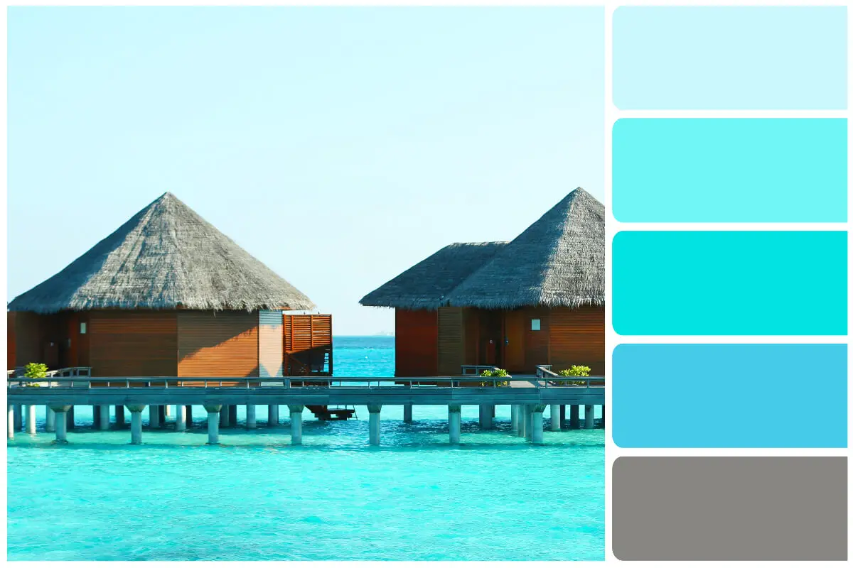
When the embrace of warmth nudges the blooms to unfurl and the sky to brighten, a palette is born that’s as vivid as life itself—the light summer color palette. This collection of hues is as much a sensation as a sight. Delicate, fresh, and airy, it captures the essence of early summer mornings, the kiss of sunlight through dew-specked petals, and the whisper of a balmy breeze.
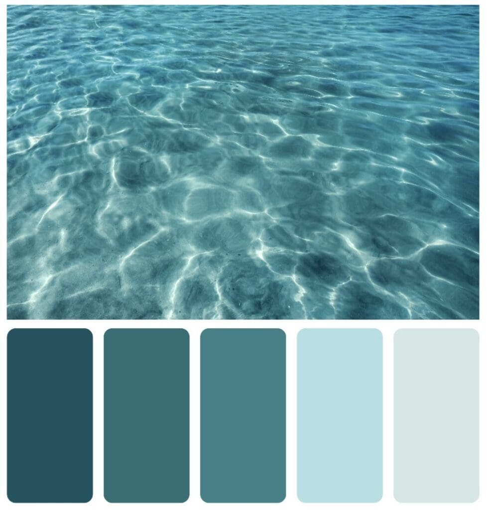
The light summer color palette is characterized by its soft, muted tones, drawing inspiration from nature’s subdued side. Imagine the gentle hues of a tranquil dawn, the pale flush of early summer fruits, and the tender tints of blooming flowers. These colors beckon to be used in whispers rather than shouts, offering a caress of color rather than a burst.
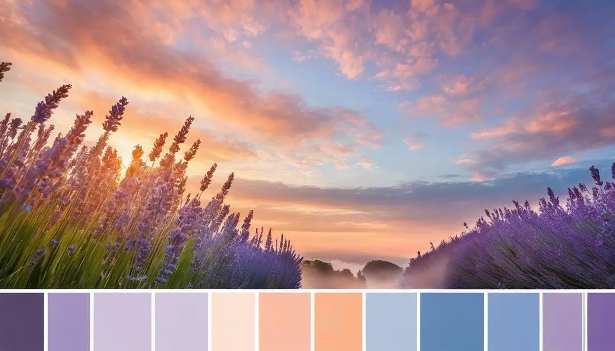
The protagonists of the light summer palette are cool-toned, with an underlying blue or pink base, rather than a summer sunset’s warm, golden undertones. This is where you find the soft lavender of wisteria, the pale blue of a clear sky, and the emotional grays that remind us of summer rain. Light pinks, cool beige, and the faintest coral are the blush on the cheeks of this palette. Each color is like a breath, barely spoken—a gentle reminder of the season’s serene side.
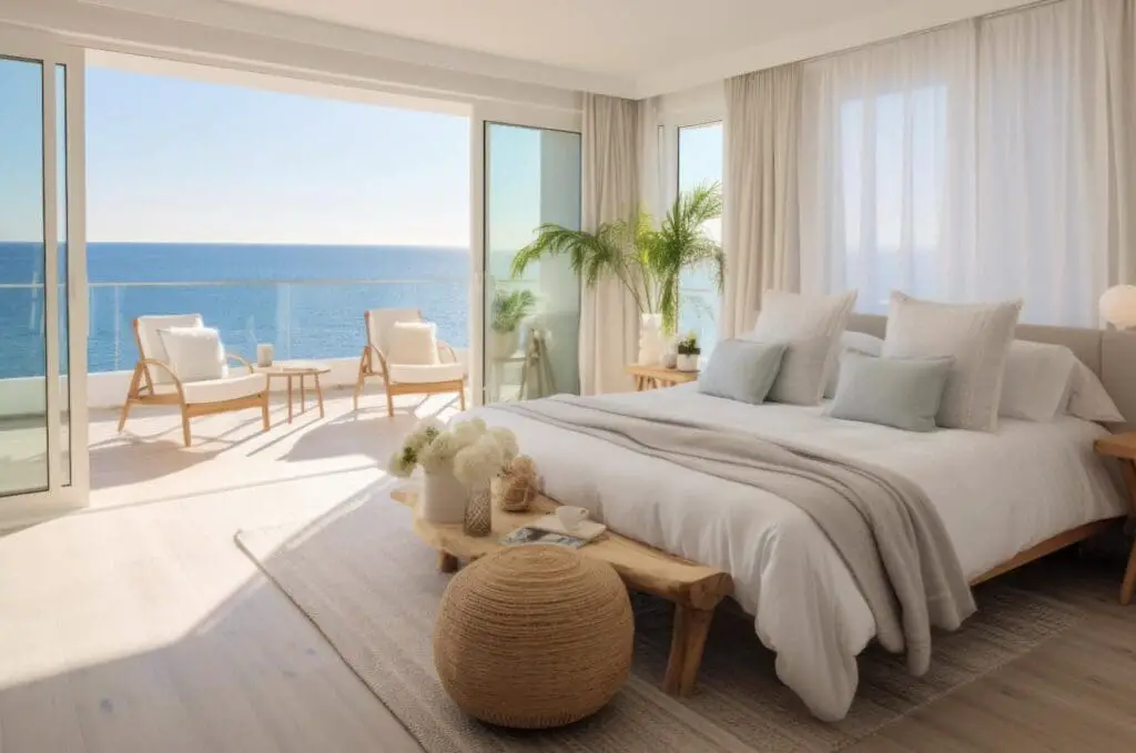
In this palette, white plays a pivotal role—acting not only as a canvas for other colors but also as a standalone hue that evokes the crispness of summer linens flapping in the breeze. Whites in the light summer palette have an excellent cast, avoiding creamy or warm ivory tones, steering toward the freshness of a morning chill.
Artistic endeavors that call upon the light summer color palette are often ethereal and soothing. They can transform a space, granting it an atmosphere of calm and lightness. The colors lend themselves to various media, from watercolors, where their transparency can be celebrated, to pastels and colored pencils, where layering can create depth without overpowering.
Due to its subtlety, mastery of the light summer color palette demands a gentle hand and a discerning eye for undertones. Artists who embrace these colors are magicians of nuance. They understand that within these quiet tones lies the power to evoke the fleeting moments between spring and summer, encapsulating the coolness of the shade and the softness of morning light.
These colors complement and illuminate, casting everything in a dreamlike quality simultaneously grounded in the natural world. Artists, designers, and creators who engage with the light summer color palette capture the splendor of a season dedicated to life, growth, and gentle beginnings.
Embracing these colors is less about making a bold statement and more about whispering a poetic truth that invites contemplative moods and celebrates the understated beauty of the season’s tender side.
The Psychology of Summer Colors
Illuminating Spaces with Light Summer Colors: Mood and Perception
The power of light summer colors extends far beyond mere aesthetic appeal; they profoundly influence the mood and perception of those who encounter them. As an artist, the subtle manipulation of these hues can yield a canvas that whispers seasonal warmth and speaks to the viewer’s emotional state.
There is an immediate sense of openness and serenity when a room is bathed in the soft radiance of pastel blues, gentle lavenders, or effervescent peaches. These hues mimic the tranquil sky or a serene water surface on a balmy summer day.
They can uniquely calm the mind and provide a feeling of cleanliness and renewal. Incorporating these shades into living spaces invites reflection and peace, often leading to increased creativity and productivity.
Furthermore, light summer colors can dramatically affect the perceived temperature of an area. Colors on this end of the spectrum naturally evoke sensations of coolness, providing a psychological respite from the heat.
Picture the fresh feeling of an ocean breeze as you gaze upon a canvas washed with turquoise and pale yellow. This psychological cooling effect can be efficient in warm climates or during the summer, making spaces feel more comfortable and inviting.
These airy hues can also alter the perception of size. Lighter colors expand a space visually, making smaller rooms feel more spacious and breathable. This optical illusion is a tool that artists and interior designers alike use to their advantage, manipulating spatial perception to craft environments that feel more freeing and less constricted.
The mood-boosting properties of light summer colors are not to be underestimated. There’s an inherent optimism in colors that suggest sunlight and clear skies. A soft pink or a muted green can evoke the freshness of early summer blossoms and new growth—symbols of prosperity and freshness.
This is the palette of new beginnings, daybreak, and the essence of hope, a theme artists have explored throughout the centuries.
In terms of fashion, applying light summer colors is strategic and stylish. Light fabrics in these hues don’t absorb as much heat, providing a cooling effect as practical as it is fashionable. Moreover, they can enhance natural features, casting a flattering light on skin tones and bringing out warmth in eyes and hair.
Interestingly, a compelling interaction between light summer colors and natural light ignites a certain magic within artworks. As the day progresses and natural light shifts from the crisp clarity of morning to the golden hue of late afternoon, artworks imbued with light summer colors respond dynamically.
They capture and reflect the changing light, evolving visually with time and thus maintaining an ongoing dialogue with the viewer.
In digital spaces, light summer colors have a role to play as well. Leveraging these hues in design and visual content can render a more inviting and user-friendly experience. Websites and apps that utilize these colors often feel more accessible and easier on the eyes, encouraging more extended engagement and more enjoyable interaction.
From the refreshing coolness they imbue to the expansion of space and optimism they inspire, light summer colors are a formidable catalyst for positive environmental and psychological effects.
Whether on the canvas, in the wardrobe, or across digital platforms, these hues are more than mere reflections of summer—they are tools at the disposal of creatives who understand how to wield them in stirring the soul and enchanting the eye.
Incorporating Light Summer Colors in Art Projects
Exploring the Synthesis of Summer: Techniques for Weaving Light Colors into Creative Works
As the days grow long and the air breathes warm, light summer colors beckon artists to innovate their palette. While the introductory exploration of the light summer color palette has set the stage, it’s time to delve into the practical application of these hues in various artistic mediums. Each dab and stroke of summer-inspired colors can reflect a unique approach to creation, integrating these ethereal tones into everything from canvas to the digital screen.
For example, the light summer palette lends itself magnificently to breezy fabrics in textiles. Imagine throws, scarves, or curtains, each ripple revealing a soft peach, lavender, or sky blue dance.
Artists may use natural dyes to convey authenticity, harnessing the fleeting beauty of summer blooms or the delicate twilight hues to imbue their work with ephemerality. The light play of these colors across the fibers creates an intriguing visual texture that can transport viewers to a serene, sun-kissed meadow.
In illustration, mainly watercolor, the translucent character of these pastels can be layered to form gradients that mimic the tender blush of dawn or the calm of twilight skies. Achieving a translucent effect—not unlike stained glass—allows light to transform the artwork throughout the day, giving the piece a dynamic quality that continually engages its audience.
In sculpture, these lighter shades provide an unexpected contrast to the typically solid medium. By integrating light summer colors into three-dimensional works, sculptors bring an air of lightness to their creations.
Whether through tinted glass, painted wood, or mixed media incorporating elements like semi-precious stones, these hues can play with light and shadow to evoke the whispers of a summer breeze across an undisturbed surface.
Theatre set designers can evoke the tranquility of the season by painting backdrops and scenic elements with a light summer palette. These colors can transform a stage into a visual poetry that whispers rather than shouts, allowing the audience to feel the heartbeat of summer during the performance.
When summer’s palette meets photography, it ignites within the frame, encouraging photographers to chase the golden hour, where light filters through perfectly harmoniously with these hues. Lightly tinted filters may push the boundaries, giving even the most mundane subjects a veneer of summer’s fleeting magic.
For those curating gallery spaces or home interiors, the light summer palette is crucial in setting the ambiance. Pale walls become canvases, reflecting natural light and exuding an openness that invites onlookers into the room.
Art in light summer tones in such an environment whispers a narrative of serenity and space, harmonizing the room’s architecture with the colors.
Lastly, the light summer palette provides users with a soothing experience in digital art and web design, which is vital in our screen-centric lives. These soft tones can reduce visual fatigue and establish a calming digital environment, whether a wellness app’s background or an eBook layout’s coloring.
As the seasons turn, so do the palettes of the creative spirit. The light summer colors, with their whispers of dawn and dusk, offer myriad ways to be woven into creative endeavors.
They are a muse in themselves, challenging artists to capture the airy lightness of summer and translate it into works of art that continue to speak long after the leaves have fallen and the skies have darkened. The creative soul yearns to share this ethereal chapter of color, inviting every piece into a moment captured, a summer held softly in the hands of art.
The light summer color palette is more than just a collection of pigments; it’s a narrative painted with the colors of serenity and unspoken joy—one we are all invited to author in our creative endeavors. As you step away from the canvas of this discussion, may you carry with you the cool breezes and soft tones that these hues emanate.
Let them inspire your art, fashion, and living spaces with as much ease and grace as a summer’s day transitioning into a twilight. With the understanding and appreciation of these gentle colors, your palette is now a gateway to endless possibilities for creation, as limitless and uplifting as the summer sky.
Find out more about how Mondoro can help you create, develop, and manufacture excellent home decor and furniture products – don’t hesitate to contact me, Anita. Check out my email by clicking here or become a part of our community and join our newsletter by clicking here.
Mondoro gives out a FREE Lookbook to anyone interested. You can receive a copy of our latest Lookbook by clicking here.
Listen to our Podcast called Global Trade Gal. You can find it on all major podcast platforms. Try out listening to one of our podcasts by clicking here.
Subscribe to our Mondoro Company Limited YouTube Channel with great videos and information by clicking here.
Related Content
90s Color Palettes And Designs Explored: A Return To Nostalgia
As we moved away from the excesses of the 80s, the 90s ushered in a mixed bag of aesthetics ranging from the minimal to the extravagant to the glamorous. Today, the iconic elements of 90s design are making a triumphant comeback, not just as a nod to nostalgia but also as a fresh reinterpretation for a new generation.
You can discover more by reading 90s Color Palettes And Designs Explored: A Return To Nostalgia by clicking here.
What Is The Mother Of Pearl Shell Used In Home Decor Products?
Mother of pearl, which is also known by the scientific name of nacre, is a pearl layer on the inner layer of the oyster shell. This pearl layer of the oyster is taken off the outer oyster shell. Then, the leftover inner pearl shell is cut into various small shapes and sizes to be then glued onto multiple home decor products such as mirrors, boxes, trays, and lamp bases.
You can learn more by reading What Is The Mother Of Pearl Shell Used In Home Decor Products? by clicking here.
Why Do People Like To Have Nice Furniture?
People want to have nice things in their homes, including furniture, as it will improve their surroundings and boost their mental health and mood. Nice furniture will help show others that you have good taste and care about your home. It can feel good to have nice furniture in your home.
You can learn more by reading our blog Why Do People Like To Have Nice Furniture? by clicking here.