The ethereal world of interior design is imbued with an array of hues, each possessing the ability to impact the design’s experience and perception profoundly. This association transcends mere aesthetic appeal; it cradles within it a deep-seated connection to our psychology, subtly swaying our moods and feelings.
The color theory in interior design, a captivating nexus of psychology and art, offers precious insights into how primary, secondary, and tertiary colors should be harmoniously combined to forge evocative spatial experiences. Beyond color theory, an intriguing study on the psychological implications of regularly used design colors such as red or green reveals how significant a color choice can be.
Table of Contents
- Color Theory in Interior Design
- The Psychological Impact of Colors
- Trending Color Schemes for Interior Spaces
- Case Studies on Successful Usage of Colors in Interior Design
- Related Content
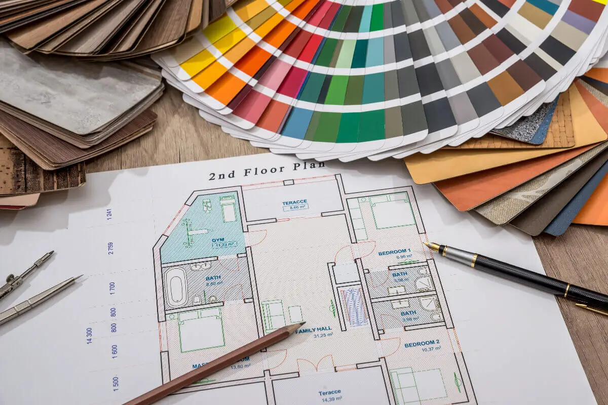
Color Theory in Interior Design
Harnessing Color Theory: Aesthetic Alchemy in Interior Design
Artistry – it’s a word most link to the canvases, marble cast-offs in a sculptor’s studio, or the sinewy adornments of a dancer’s performance. Fewer minds might jump to the compositions within the walls, windows, and roof of a dwelling. Yet interior design is every bit the art form its more traditional siblings are.
It requires a delicate balance between functionality and beauty and the sure hand of an artist to master its many elements. Among these, color remains the pivotal cornerstone – the primal call harmonizing the structural symphony to win an audible and visible hum.
At first glance, learning color theory might call to mind days of primary school, when triadic rings of red, blue, and yellow were first explained. However, a proper comprehension of color theory potentiates aesthetic sensibilities, especially in the vibrant sphere of interior design.
By understanding the rhythmic dance that colors play on the wheel, the language of hues, tints, and shades can be harnessed to conjure a bespoke atmosphere for living spaces.
Color theory studies how colors interact, complement, contrast, and influence one another. Its roots reach back to Sir Isaac Newton’s color wheel, yet the understanding we draw from it today informs interior design through foundational concepts. It enables an ambiance crafted with visual depth, harmony, or stark contrasts to accentuate a living space.
Concepts of color harmony, for instance, are crucial in creating a unified aesthetic within any space. By employing analogous colors (those adjacent to the color wheel) or complementary colors (those opposite), striking scenes of cohesion or drama can be curated.
Whether it’s a serene ocean-inspired room bathed in blues and greens or a lively retro diner throwback bursting with teal and orange, color harmony compels the room towards a distinct emotional charge.
As indispensable aspects of color theory, warm and cool colors can manipulate the perceived temperature within a room. Warm hues, like oranges and reds, can infuse a space with an intimate, comforting atmosphere.
Whereas cool shades, from greens to purples, often foster a feeling of spaciousness and tranquility. A fascinating psychological interplay between our visual senses and emotional response transforms an area from merely existing to positively living.
Moreover, the value and saturation of color in the interior design context can contribute significantly to the overall aesthetics. A refreshing splash of rich, bold color counteracts muted neutral tones, sparking life within the space. Or, the delicate dance of pastels can soften a room, crafting an ethereal sanctuary of quiet and calm.
In the masterful hands of an interior designer, color theory transforms from abstract concepts into aesthetic reality. Their understanding influences not just the visual appeal of a space but its entire ambiance and energy.
After all, when it comes to painting a living panorama, color is every artist-designer’s striking symphony, potent poem, and grand novel, complete and unabridged.
Artistry within the home isn’t only about the right furniture or the perfect lighting; it’s also about effectively understanding and using color theory. It’s about that ineffable magic that blooms when the science of color theory meshes with the artistry of design, breathing life, depth, and personality into the everyday mundane.
The Psychological Impact of Colors
Unveiling the Mystery of Colors in Interior Design; Discover How They Influence Life within a Space
The age-old saying “Beauty is in the eye of the beholder” genuinely holds water in the world of interior design. However, we can subtly sway the beholder’s perception by deliberately selecting and incorporating colors into our spaces.
It is not merely combining exotic hues but a strategic endeavor to mold the essence of the area we breathe life into. It is here that color psychology plays a significant yet under-appreciated role.
Color psychology is the study of hues as a determinant of human behavior. Even though the results and observations vary from culture to culture, few aspects remain constant. Colors can impact our mood, perception, and choices. Hence, they are pivotal when designing spaces where we live, work, or play.
So, you might ask what kind of influence each color carries. Here is a curated list reflecting standard colors and how they subtly manipulate our psychological states within a space.
The key lies in understanding our requirements and selecting a color palette that matches those needs. A careful study of color psychology and a touch of creativity can conjure spaces that are as beautiful to live in as they are to look at.
The dance of colors within a space is a fascinating exploration beyond aesthetics. It’s a journey through psychological landscapes that profoundly influence our well-being and lifestyle.
So next time you pick a color for that accent wall or choose a fabric for your couch, remember that you are creating a visual delight and weaving an unseen impact on the dwellers’ minds within that space. It’s more accurate than ever- a color is more than just a color; it’s an experience.
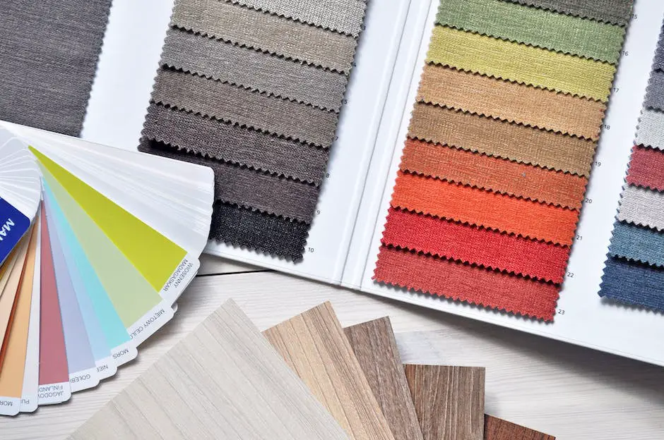
Trending Color Schemes for Interior Spaces
In the vast world of interior design, trends come and go, but the masterful use of color remains paramount. Today’s trendsetters utilize unique and powerful color schemes, pushing beyond the traditional norms and creating spaces that inspire, invigorate, and intrigue.
As we enter the new decade, the emerging color trends demonstrate a delicate interplay between novelty and nostalgia. Rich, earthy hues, serene pastels, striking juxtapositions, and subdued neutrals all find their way into the latest and most sought-after spaces.
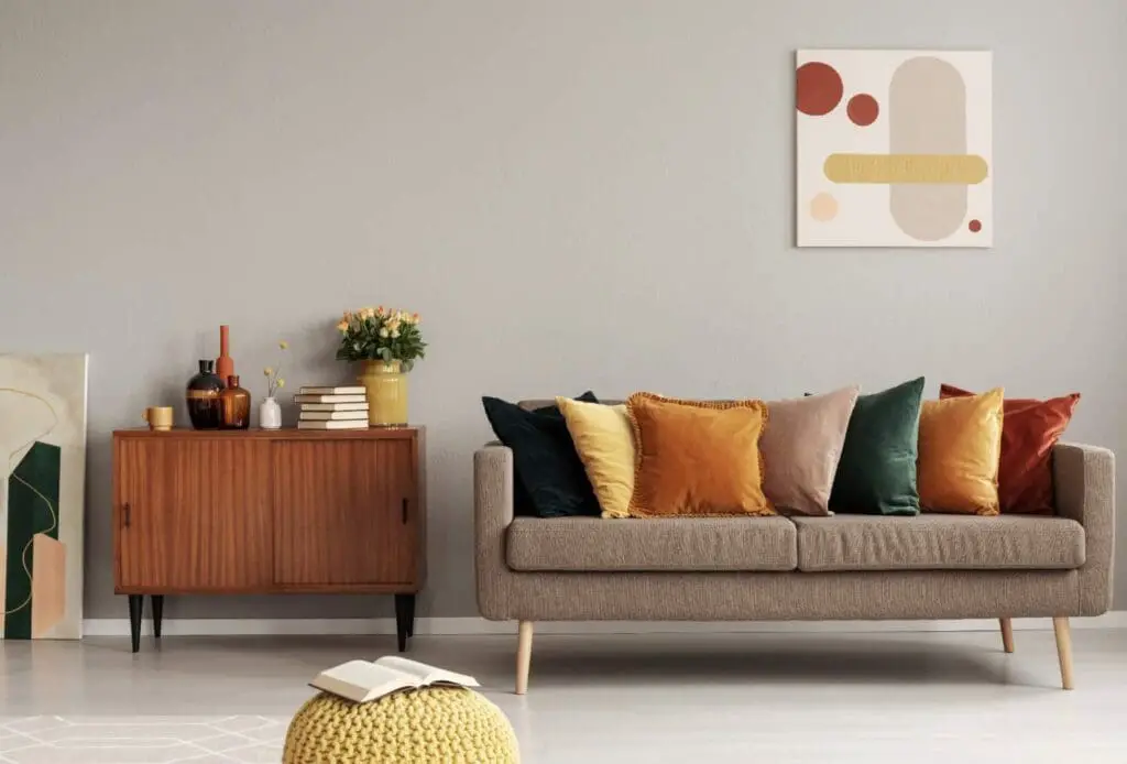
There is no escaping the allure of earthy tones, featuring gorgeous shades such as olive green, burnt orange, and mustard yellow. These hues are rooted in nature’s genuine beauty and tranquility, serving as a subtle reminder of our connection to the earth and its rewarding simplicity.
One trait of this color trend in action is blending greens with natural materials such as wood and stone, thereby mimicking an indoor sanctuary that reflects the diverse palette of the outdoors.
On the other end of the spectrum, architects and designers also gravitate towards soft pastels. These gentle hues, such as blush pink, baby blue, mint green, and lavender, impart a calming, serene aura within spaces. They are perfect for creating a soothing atmosphere, such as those needed in bedrooms or personal offices, encapsulating a sense of peace and tranquility.
Another rising trend is making a daring leap away from the safety of neutrals, juxtaposing bold, opposite colors. The use of dichromatic schemes like black and white or complementary hues such as blue and orange provides an element of drama that redefines the space. This trend involves an intelligent play between balance and contrast, keeping all elements in harmony while offering a compelling visual interest.
While exploring the vibrancy of colors, let’s not forget the power of neutrals. Neutrals offer endless possibilities, as a canvas for bold color accents or even stand-alone to exude minimalist elegance.
This year, cooler neutrals like greys and blues are making way for warmer, earth-toned neutrals – think shades like oatmeal, beige, taupe, or off-white. These colors create a soothing ambiance, injecting a feeling of lightness and expansiveness into the room.
In applying these trending color schemes, there’s a need to understand not just the aesthetic effects but also the consequent psychological effects. It’s an art to blend these current trends with the overall vibe required of the space.
Remember, color is not just about what is trendy; it’s a powerful tool that shapes the character and soul of a space. It evokes emotions, manipulates perceptions, and, most importantly, tells a story. So, let the colors in your design narrate a story as unique and captivating as art itself.
Case Studies on Successful Usage of Colors in Interior Design
The artistic dance of color and space in interior design paints a story of aesthetics, functionality, and emotion, which comes to life through celebrated trends that leverage color to create revolutionary designs.
Successful incorporation of color trends forms an intimate relationship with our sensory and emotional selves, carving an instinctive bond with space that transcends the visual appeal, creating a unique dialogue that evokes specific emotions, lifestyle inclinations, and every aspect of our personal experience.
Historically power-packed, specific colors such as red and orange unleash riotous enthusiasm and energy. Celebrated interior spaces have welcomed these colors in a more muted tone or as strategic accents, diffusing an overt, symbolic overload. Instead, they weave in the vitality and excitement of these colors without becoming overwhelming.
Many avant-garde restaurants and creative studios have skillfully adopted these controlled bursts of color energy to enhance creative stimulation, warmth, and a sense of appetite.
Blue and green, hues that borrow from nature’s palette, strike an ethereal note, their soothing influence no secret amongst designer colloquia. These colors have been utilized successfully in bedrooms, wellness spaces, and offices that align with the cause of mental tranquillity.
A fascinating play of these hues can also be seen in ‘outdoors indoors’ interior design trends, which entertain a generous infusion of greens and blues, impeccably merging with more organically inclined design elements.
Neutrals – the silent yet potent performers in a color palette- have seen an exciting plot twist with more excellent whites and grays stepping down from their reigning positions, now taken up by warmer, earthier neutrals.
Beige, taupe, ivory, and similar shades provide timeless elegance and sophistication, curating an inviting and comforting space. Neutrals have a knack for seamlessly blending into varied design narratives – minimalistic, vintage, or contemporary, underscoring their versatility.
Finally, the charm of pastels in interior designs is in their soft, understated elegance. Skilfully manipulated pastels induce calmness, augmenting the serene and peaceful moods. Hence, pastel-themed interior spaces resonate automatically with wellness spaces, children’s bedrooms, and feminine-themed designs.
With the ability to set the ambiance and create visually engaging interiors, color trends play an essential role in the landscape of interior design. Successful employment of color trends in interiors is less about a blinding array of colors and more about blending the colors that align with the space’s functional and psychologically fulfilling energy.
Immersing ourselves in interior design color theory unfurls an exciting terrain of creative opportunity. To adeptly apply the theoretical knowledge, a comprehensive view of current color trends and their execution in real-life settings works wonders.
By diligently examining various case studies showcasing successful color usage, much can be gleaned about how colors contribute to a space’s overall charm. Each one is a lesson, encouraging us to harness these insights, mix and match the trends per our space’s unique requirements, and create a scenic kaleidoscope of colors that evoke the exact ambiance and energy we desire.
Find out more about how Mondoro can help you create, develop, and manufacture excellent home decor and furniture products – don’t hesitate to contact me, Anita. Check out my email by clicking here or become a part of our community and join our newsletter by clicking here.
Mondoro gives out a FREE Lookbook to anyone interested. You can receive a copy of our latest Lookbook by clicking here.
Listen to our Podcast called Global Trade Gal. You can find it on all major podcast platforms. Try out listening to one of our podcasts by clicking here.
Subscribe to our Mondoro Company Limited YouTube Channel with great videos and information by clicking here.
Related Content
Scandinavian Interior Design Description – Contemporary Living Spaces
Ever since my time in Sweden, I’ve developed a deep affection for Scandinavian design. Scandinavian design is a clean yet significant-looking trend.
Its minimalist yet compelling aesthetic has a timeless quality and continues to make waves globally. Far from being a fleeting fad, this design style has a lasting influence. Keep reading as we explore the subtleties that make Scandinavian interior design unique.
By clicking here, you can learn more by reading our blog, Scandinavian Interior Design Description – Contemporary Living Spaces.
Home Decor Vs. Interior Design: A Detailed Comparison
Home decor and interior design are two different aspects of design. These fields differ significantly in their scope, methodology, and objectives. Grasping these subtleties can optimize your domestic or commercial spaces. Read on as we explore some of the unique differences between home decor and interior design and define what each means.
To learn more, you can read Home Decor Vs. Interior Design: A Detailed Comparison by clicking here.
12 Living Room Home Decor Wall Ideas For Your Empty Walls
Filling the void with the right blend of style, function, and personality is crucial for setting the tone of your living room; this is where wall décor comes in, offering endless possibilities to transform your blank walls into an enticing visual narrative. Read on as we delve into twelve creative ideas for your living room wall decor, incorporating elements such as wall art, mirrors, artifacts, hanging plates, and more.
You can discover more by reading 12 Living Room Home Decor Wall Ideas For Your Empty Walls by clicking here.