I think about Pantone’s color of the year Classic Blue and wonder if Pantone really understood what the world would be going through during 2020. How a virus as the Coronavirus would affect and change the lives of so many around the world and make us all start to rethink how we do business.
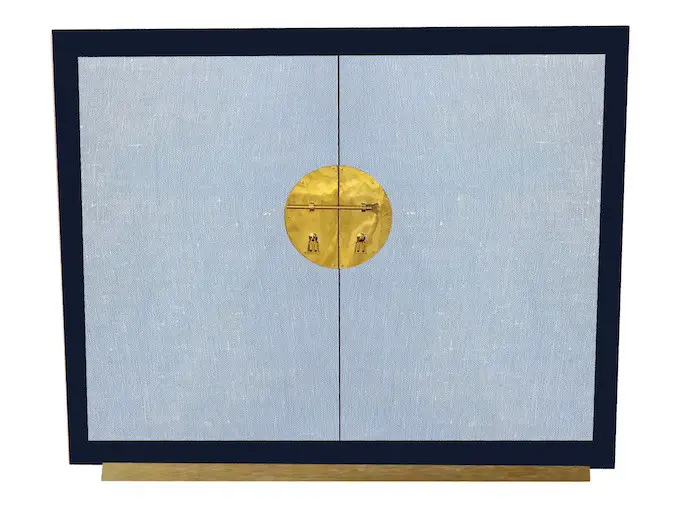
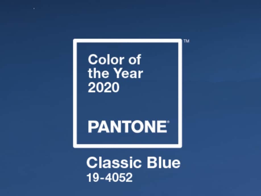
Pantone’s Color of the Year for 2020 is Classic Blue (Pantone 19-4052). Many of the other companies that set color trends also set the color blue as their color of the year. The characteristics and psychology of the blue color is a color that is calm, serene, and tranquil. The blue color trend for home decor and home furniture is a trend that will continue through 2020 and beyond.
The Blue Color Trend for 2020
Pantone’s color of the year is called classic blue. Many other companies also choose a color similar or another shade of blue for their color choice of the year.
Here is Pantone’s Color of 2020 – Classic Blue:
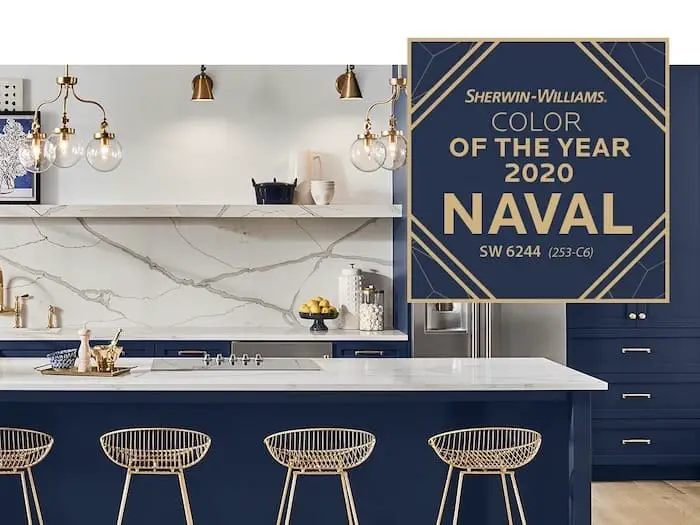
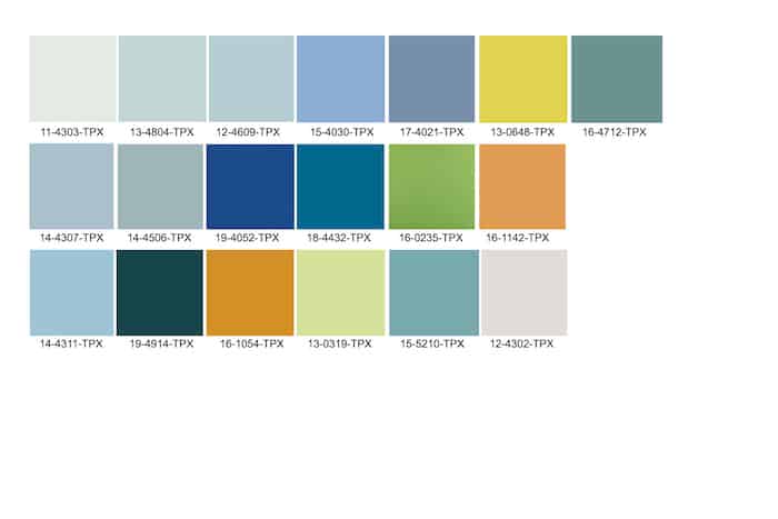
Here are some examples of the other 2020 Colors of the Year
Sherwin William’s Paint Color of the year is Naval Blue
Pittsburgh Paint and Stains Color of the Year is Chinese Porcelain
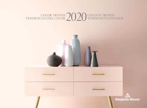
Benjamin Moore did not choose blue as their color of the year, though their color palettes have a lot of blues. Instead, they choose a warm rosy pink named – First Light
Why Did Pantone Choose the Classic Blue Color?
Blue and especially the classic blue is a color of comfort, peace, calm and tranquility. But blue is also a color that highlights things like credibility, dependability, and trustworthiness. I think about the classic blue blazer that never quite goes out of fashion.
In speaking of their choice for the color blue as the Color of the Year, Leatrice Eiseman, the Executive Director of the Pantone Color Institute said this about Pantone’s choice to choose Classic Blue as their color of the year:
“We are living in a time that requires trust and faith. It is this kind of constancy and confidence that is expressed by Pantone 19-4052 Classic Blue, a solid and dependable blue hue we can always rely on. Imbued with a deep resonance, Classic Blue provides an anchoring foundation. A boundless blue evocative of the vast and infinite evening sky. Classic Blue encourages us to look beyond the obvious to expand our thinking; challenging us to think more deeply, increase our perspective and open the flow of communication.”
leatrice eiseman
As we live with diseases that are out of our control. the race of new technology and the pace of the world, we as human beings need to be able to process all this and deal with it. It is easy to understand why we would all want to have something that is familiar, something reassuring and something classic as the Classic Blue color. We want to be surrounded by colors, objects, and decor in our life that we can depend on, that are honest and also offer us some protection and care.
Psychology of the Color Blue
When looking at the color blue and how it will affect the design trends of home decor and home furniture here is some information about the color blue’s psychology.
The Psychology and Characteristics of The Color Blue:
- Blue is the color that is most often found in nature.
- Blue is known to represent trust, respect, and dependability. This is why many companies use blue in their logos such as Facebook, Ford, Dell, LinkedIn, and Twitter.
- Blue is most often described as calm and serene, this can be because the ocean is blue which many people associated with calmness and tranquility.
- Blue has been associated with intelligence and it is thought to enhance understanding and communication.
- Blue is seen as a color of confidence and authority in a non-threatening way.
- Some colors of blue can give off a feeling of coolness or aloofness as some people see blue as icy and cold.
- Blue is the color that is most often viewed as non-threatening, conservative and traditional, and also most often preferred by men.
- Blue is used a lot in office decor as research has shown the people are more productive in blue rooms.
- Blue is one of the more unappetizing colors around. Besides blueberries and some candy, there are not many foods that are blue.
Classic Blue and Other Blue Color Tones
We see this trend of the Classic Blue to not only be a trend that will continue but will bring with it the use of many shades of blue in the home furniture and home decor industry. I have always loved Indigo and will use Indigo instead of black in a lot of my paintings. I have found indigo to be a softer substitute for the harshness of black.
So whether you love blue or hate blue, the one thing that most people can agree on is that the color blue is a trend that will continue.
Blue is a predominant color choice that is here to stay throughout 2020 and beyond. In times when we are feeling stressed, upset or are not quite sure if we understand all that is going on in the world around us, we can look to the color blue to reassure us, comfort us and give us some much-needed hope and serenity.
Related Questions
What are the New Colors for Home Decor in 2020?
The new colors for Home Decor in 2020 as we see them are:
- All Kinds of Blues – All kinds of blues will be a major force in 2020. But many of the blues will have with its pops of color like an orange-red or red.
- Warm Pastels – Pastels will have added warmth to the pastel colors. Mixed in this will be some pinky tones.
- Earthy Tones – As with the pastels the earthy tones will be more of a warm than a cool color with shades of browns, yellow ochre along with red clay tones.
- Black and White Contracts – expect to see some continued black and white contrasts.
- Greys – Grey has become a new neutral color, so expect grey tones to continue.
- Greens – There is a real green emergence with all tones of green from olive green to deeper green tones.
What Are Some of the Home Decor Trends That are Outdated?
Here are some of our home decor trends that we see are now outdated. We hope that some of these will never come back.
- Tiled bathroom sinks and countertops -They are not the cleanest type of countertops or sink surfaces. There are just better options out there.
- Shag Carpets – They may be comfortable but no longer considered stylish and besides I think hardwood floors with carpets are so much nicer.
- Dark Wood Paneling and Interiors – There is something very depressing about heavy dark wood interiors that always make a space look like it is nighttime.
- Word Art – This art is on its way out maybe in part since it has been way overdone.
- Wallpaper Borders – This is a trend that should have gone out in the ’90s.
- Platform Beds and Mirror Ceilings – I am still wondering why anyone would want a mirror on their ceiling or even over their bed?