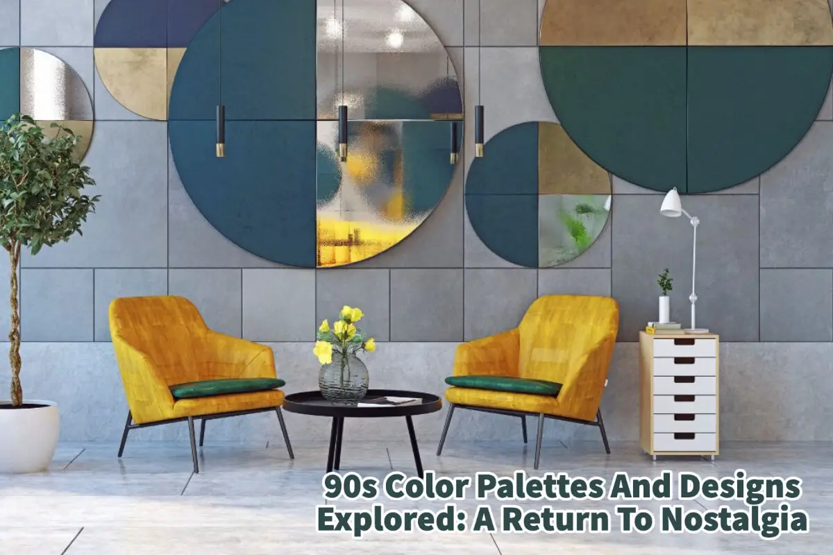
A dramatic shift in global consciousness, technological advancements, and cultural transformation marked the 1990s. This was when technology started making its presence felt in our daily lives, pop culture was at its zenith, and fashion and design trends were as varied as they were vibrant.
As we moved away from the excesses of the 80s, the 90s ushered in a mixed bag of aesthetics ranging from the minimal to the extravagant to the glamorous. Today, the iconic elements of 90s design are making a triumphant comeback, not just as a nod to nostalgia but also as a fresh reinterpretation for a new generation.
Table of Contents
- 4 Major 90s Color Palettes Explored
- 5 Key 90s Design Elements
- 90s Color Palattes And Designs Today Explored
- Related Content
4 Major 90s Color Palettes Explored
The cyclical nature of design trends often brings past decades back into the spotlight, and recently, the vibrant 90s have made an impressive resurgence. With a unique blend of bold, understated, and whimsical elements, 90s design aesthetics hold a charm that appeals to nostalgia and novelty.
I remember the designs of the 90s well as I remember designing for brands as Bob Timberlake’s cottage and distressed-looking furniture, lamps, and accessories. I remember the colors, such as forest green and even distressed white. It was a great time in the home decor and home furnishing.
Read on as we delve into the iconic 90s color palettes and designs and speculate how they might resurface in contemporary times.
1. Primary Colors
In the 90s, primary colors – red, green, blue, and yellow – were all the rage. These were typically paired with secondary and tertiary colors to create vibrant and energetic designs.
Think of the bright, bold colors of popular TV shows like “Fresh Prince of Bel-Air.” As for its modern return, these bold hues are used more restrained and strategically. A single primary color is used as an accent in an otherwise muted palette, adding a striking pop without being overwhelming.
2. Neon Hues
The 90s saw an explosion of neon hues, influenced heavily by the burgeoning rave culture and the advent of techno music.
Hot pinks, electric blues, and acid greens were commonplace. Today, neon colors are back in vogue, particularly in graphic and digital design, adding a playful, futuristic vibe.
3. Pastels
On the opposite end of the spectrum, pastels were another staple of the 90s color palette, bringing in a soft, serene quality. Pastel pink, mint green, and baby blue were used in everything from fashion to interior design.
With the recent “cottage-core” and “soft aesthetics” trends, pastels are returning in a big way, offering a comforting and calming alternative to the vibrant neons and primary colors.
4. Metallics
Metallics, particularly gold and silver, were any of the 90s glamour and glitz. They were prevalent in fashion, homeware, and technology design.
Metallics are used more understatedly as accents rather than dominant hues, adding an elegant touch to minimalist designs.
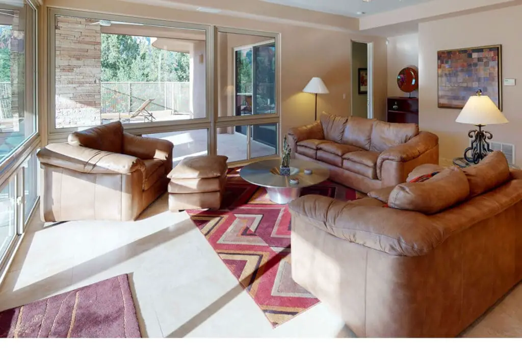
5. Earth Tones
Inspired by the grunge movement and the rise of eco-consciousness, earth tones were also popular in the 90s. Rich browns, mossy greens, and deep burgundy hues lent designs a grounded, natural feel.
These colors are currently experiencing a revival, particularly in interior design, as a move towards more sustainable and nature-inspired aesthetics.
5 Key 90s Design Elements
The rebirth of 90s aesthetics in the realm of design demonstrates the enduring power of this influential decade. As we revisit this era’s bold color palettes and iconic designs, we witness a creative amalgamation of the past and present, where nostalgia meets modernity.
The return of 90s design is about recapturing a bygone era and drawing inspiration from it to create fresh, contemporary aesthetics that resonate with today’s audience.
When it comes to 90s designs, several key elements stand out:
Geometric Patterns
The 90s were known for bold, abstract patterns, often featuring geometric shapes. These patterns are being reintroduced today as more streamlined and simplistic, often in muted color palettes.
Motifs From Pop Culture
Characters from famous 90s cartoons, video games, and TV shows were commonly used as design elements. Currently, these motifs can be seen in various forms of nostalgic art and merchandise, appealing to the sentimentality of those who grew up in the 90s.
Grunge Aesthetics
The 90s grunge aesthetic, characterized by distressed textures and rebellious imagery, countered the decade’s otherwise vibrant and glossy looks. Today, this aesthetic is reflected in the distressed fonts and textures in graphic design.
Tech-inspired Design
The 90s was the dawn of the digital age, reflected in that era’s tech-inspired design. Early computer graphics and pixel art were critical elements of this aesthetic. As we’re currently in the digital age, pixel art, and 8-bit designs are gaining popularity, especially in gaming and digital art.
Minimalist Design
While the 90s had its share of bold and striking designs, it also saw a shift towards minimalism towards the end of the decade. This trend has exploded recently, emphasizing clean lines, simple shapes, and functionality.
Predicting the comeback of these 90s colors and design trends is exciting, but it’s also essential to note that their return is not an exact replication of the past. Instead, it’s a reinvention, tweaking what worked in the past to fit into modern aesthetics.
This is evident in the shift towards more muted versions of the bright 90s colors, the streamlined reinterpretation of geometric patterns, and the mature, sophisticated application of the grunge aesthetic.
90s Color Palattes And Designs Today Explored
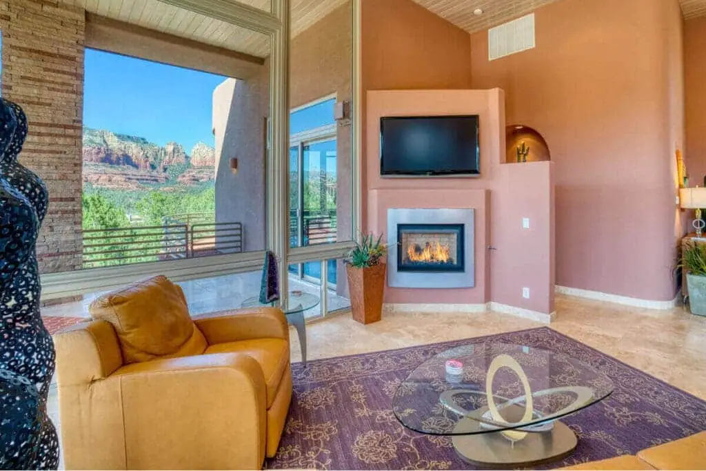
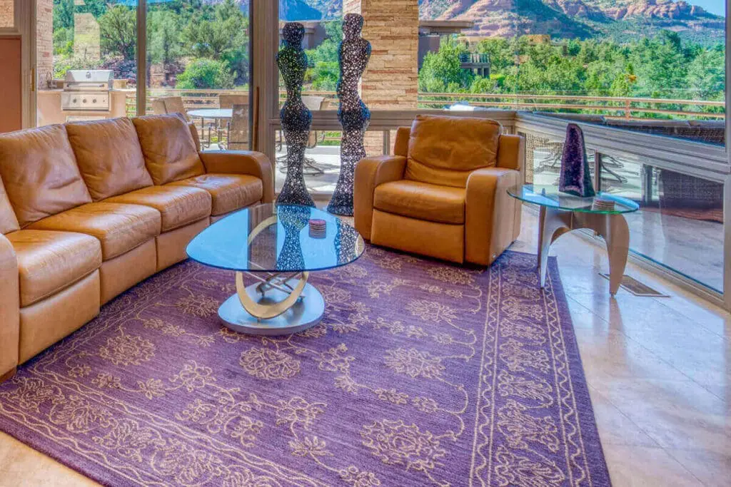
So, what could a 90s-inspired design look like in contemporary times? In interior design, imagine a living room with muted primary colors on a modern minimalist canvas, a single neon-hued accent piece, or a nod to nature with earthy tones and textures.
In graphic design, envision a poster with a digitalized 90s cartoon character, a website with tech-inspired pixel art, or a logo with a modern take on 90s geometric shapes.
The resurgence of 90s color palettes and designs is more than just a cyclical fashion trend; it’s a celebration of a decade that pushed boundaries and paved the way for the bold, eclectic aesthetics we see today.
It’s an homage to a decade that, in many ways, was ahead of its time. As we continue to explore and reinvent these iconic styles, we’re reminded that good design is timeless, transcending generations and continually finding relevance in an ever-evolving world.
Find out more about how Mondoro can help you create, develop, and manufacture excellent home decor and furniture products – don’t hesitate to contact me, Anita. Check out my email by clicking here or become a part of our community and join our newsletter by clicking here.
Mondoro gives out a FREE Lookbook to anyone interested. You can receive a copy of our latest Lookbook by clicking here.
Listen to our Podcast called Global Trade Gal. You can find it on all major podcast platforms. Try out listening to one of our podcasts by clicking here.
Subscribe to our Mondoro Company Limited YouTube Channel with great videos and information by clicking here.
Related Content
What Is The Modern Farmhouse Interior Design Style?
The modern farmhouse interior design style has become increasingly popular as people look to create a warm and inviting home that reflects a more straightforward, rustic way of life. Combining classic farmhouse elements with contemporary design touches, this style blends the old and the new to create a comfortable and stylish living space.
You can discover more by reading What Is The Modern Farmhouse Interior Design Style?, by clicking here.
The Traditional Home Decoration Style Explored
The traditional home decor style is characterized by classic, elegant, and sophisticated elements that create a warm and inviting atmosphere in the home. This style is about comfort, familiarity, and a sense of tradition.
You can learn more by reading The Traditional Home Decoration Style Explored by clicking here.
Spring Color Palette – The Delft Blue Home Decor Trend
The spring color palette of the Delft Blue home decor trend is significant and easy to see why. The Delft Blue trend is filled with all kinds of blue tones and colors that evoke the beauty of the Netherlands, where the famous Delft Blue pottery originated. But the colors also remind us of spring and the beautiful spring season.
You can learn more by reading our blog Spring Color Palette – The Delft Blue Home Decor Trend, by clicking here.