
Choosing the right color palette for your living room is akin to selecting the perfect ensemble for a momentous occasion—it must align with the space’s ambiance, dimensions, and illumination.
While seemingly straightforward, this process involves carefully considering various factors, from the room’s natural lighting to the emotional atmosphere you wish to create. As we navigate through the nuances of color selection, remember that the ultimate goal is to fashion a space that resonates with your style and comfort.
Table of Contents
- Choosing the Right Color Palette
- Trending Living Room Colors
- Accent Walls and Color Blocking
- Incorporating Color Through Decor
- Related Content
Choosing the Right Color Palette
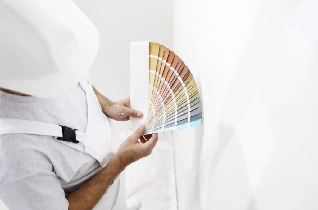
Choosing the right color palette for your living room is like picking the perfect outfit – it has to fit the room’s mood, size, and lighting. Start by considering the room’s natural light. Bright, sunny rooms can handle more fabulous, subdued shades like sage green or soft lavender, which might lose their subtlety in a darker space. North-facing rooms often get less light, calling for warmer tones like peachy pinks or honey yellows to cozy them up.
Colors aren’t just pretty; they have the power to make us feel. Blues and greens create a calm, soothing atmosphere, perfect for relaxation after a long day. Want to spark creativity and conversation? Oranges and yellows bring energy and brightness, making them ideal for a living area.
The key to a balanced room is harmonizing your colors well. Enter color theory – it’s not as daunting as it sounds. Pick a dominant shade for walls or significant furniture pieces, then select secondary colors for accents like cushions or artwork. Want a blue living room? A navy sofa against lighter walls becomes the focal point, with soft yellows or greys for harmony.
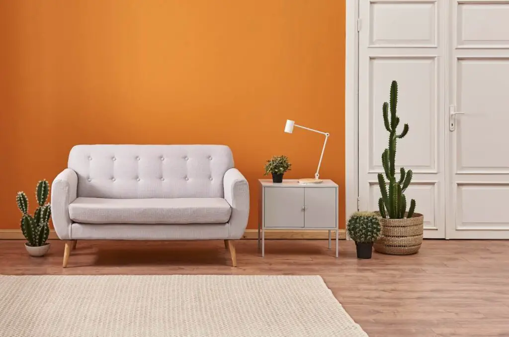
Don’t avoid bold colors; they can be game-changers if used wisely. An accent wall in rich ruby or deep emerald can add depth and interest without overwhelming. Balance them with beige, grey, or white neutrals to keep things from feeling chaotic.
Textures and materials play their part, too. Velvet throws or shiny metal decor can transform how colors look and feel in the room. Silk pillows on a leather couch create a layered, sophisticated look, affecting the overall color impression.
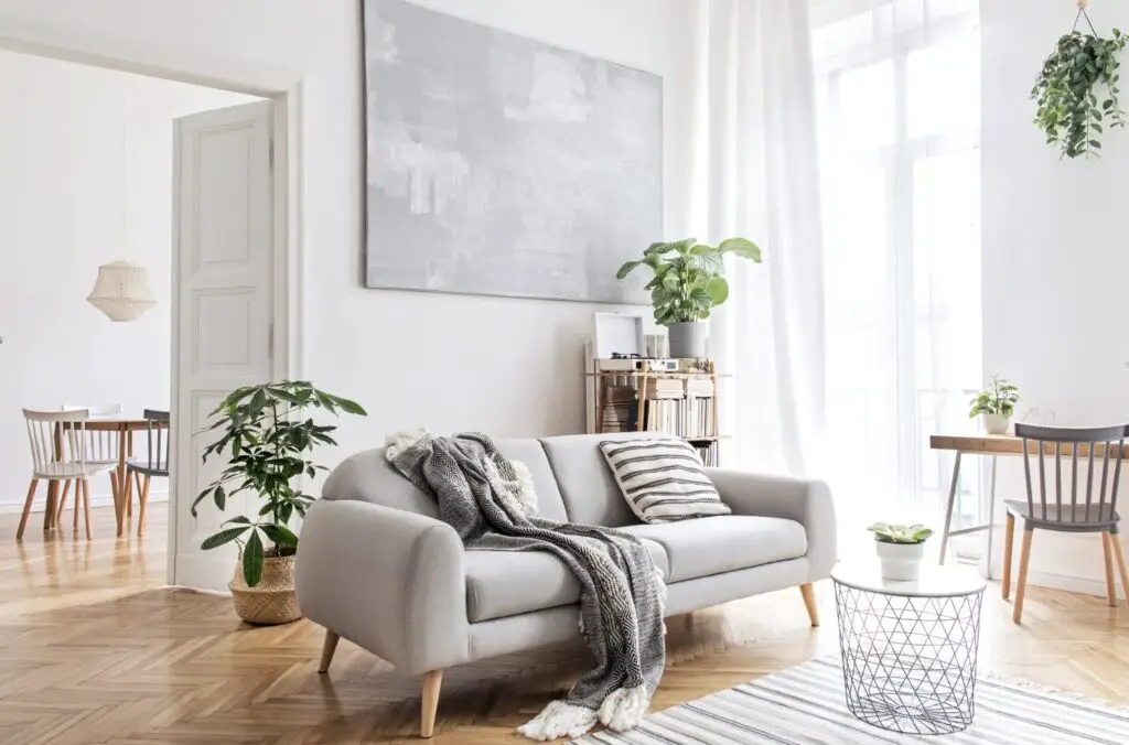
Finally, your color choice should reflect you and your style. You’re the one living with it, after all. Want a serene retreat? Soft pastels can set the stage for your escape. Do you prefer something livelier? Splashes of bold color can mirror your energetic lifestyle. Remember, it’s all about creating a space where you feel comfortable and happy.
Trending Living Room Colors
The trend towards soothing greens in living room paint colors will rise in 2023. Olive, sage, and mint greens not only provide a connection to nature but also bring a refreshing vibrancy to the space. These shades pair beautifully with wooden furnishings and plants, enhancing a tranquil and organic ambiance. Whether opting for a subtle wash of mint or a deeper olive tone, green hues promise a revitalizing backdrop for daily living.
- Earthy neutrals are asserting their dominance with their understated elegance. Warm sand, soft taupe, and rich terra cotta create a sophisticated and grounded environment. These colors act as a versatile base, allowing for layers of texture and pattern to come into play through decor and furniture. These hues bring a sense of calmness and belonging, ideal for a cozy and inviting living room.
- Vibrant jewel tones, indicative of amethyst purples, ruby reds, and sapphire blues, infuse living rooms with boldness and character. These colors make standout statements or work harmoniously together for an eclectic mix. Applying these tones can transform the living space into a dynamic and energizing area, perfect for entertaining or unwinding with family.
- Combining these trending colors with metallic accents like gold or bronze can elevate the luxurious feel of the room. Imagine a sapphire blue wall illuminated by soft, golden lighting fixtures; it brings depth and luxury to the space. Conversely, integrating pastel versions of these jewel tones can soften the look for a more muted yet still vivid charm.
- Transitional style rooms benefit significantly from this year’s color trends. Pairing soothing greens or earthy neutrals with sleek, modern furniture creates a balanced and harmonious space. It manifests a bridge between comfort and contemporary aesthetics, appealing to various tastes.
2023’s paint color trends open new doors for experimentation and personal expression in living room designs. Whether you gravitate toward the peace and serenity of greens and neutrals or the daring and zestful energy of jewel tones, there’s ample room for creating a space that resonates with your desired mood and style.
This palette range invites homeowners to craft living areas that are not only stylish but are havens for comfort, creativity, and connection.
Accent Walls and Color Blocking
Choosing the right wall for an accent is crucial in upgrading your living room’s design. Pick a wall that draws attention, perhaps housing a fireplace, a large window, or behind the main seating area. This choice ensures that your accent wall enhances the room’s focal point rather than competing with it.
When it comes to color blocking, select complementary or contrasting colors that create visual interest and dynamic compositions. For instance, a deep navy blue adjacent to a soft, pastel yellow can bring balance and vibrancy to the space, evoking a sense of calm and cheerfulness.
Accent walls and color blocking aren’t just about painting; they can highlight architectural features or aesthetically divide an open-plan space. Imagine using bold geometric patterns or stripes on an accent wall to underscore the ceiling’s height or architectural elements like niches or alcoves. Such techniques add layers of depth and intrigue to your living room.
Employ color blocking to differentiate various areas within an open-plan living room without erecting barriers. For example, use a rich, warm color to define the dining area and a cooler, serene shade for the lounge area. This subtle distinction maintains an open feel while visually separating functional spaces.
Incorporating texture within your accent wall or color-blocked sections can elevate the design. Consider using textured wallpaper, wood panels, or a mix of matte and glossy paint finishes to add complexity and tactile appeal to your living room. These elements work together to create a more engaging and inviting space.
Furthermore, integrating mirrors or reflective surfaces on or near an accent wall can amplify its impact, making the room appear larger and more luminous. Strategic placement of lighting can also accentuate the wall’s texture and the chosen color’s true hue, enhancing the room’s overall ambiance.
Finally, remember that using accent walls and color blocking in your living room design aims to create a cohesive, balanced space that reflects your taste. Don’t avoid trying bold combinations or unique design elements—these decisions make your living room distinctively yours.
Incorporating Color Through Decor
Selecting the right rug can completely transform your living space’s feel. Imagine combining a cobalt blue carpet with gray sofas, introducing a burst of energy while keeping the overall vibe grounded. For a more subtle approach, choose a rug with hints of colors found in your existing decor, tying the room together harmoniously.
Throw pillows offer an effortless way to introduce color and texture. Layer pillows of varying shades of the same color for a monochromatic look, or go bold with contrasting colors for a more dramatic effect. This adds depth and allows for easy updates according to season or mood.
Curtains are not just for privacy; they frame your windows and significantly influence your living room’s color scheme. Flowing draperies in soft lavender can add a touch of serenity, while vibrant tangerine curtains can bring warmth and excitement. Remember, the fabric’s opacity can affect the color’s intensity throughout the day with natural light.
Incorporating art into your living space is a beautiful way to bring color. Whether a large abstract piece with splashes of color or a series of small, monochromatic prints, the artwork reflects the personality and can become a focal point in your living room. Position these pieces strategically to catch the eye and anchor different zones within the room.
Using decorative items as color accents can bring an unexpected pop to your living space. Consider cobalt votive holders, emerald vases, or even a collection of books with colorful spines. These elements act like punctuation, adding visual interest and guiding the eye through the room.
Remember, infusing color into your living room doesn’t require a complete overhaul. Even the most straightforward additions, like brightly colored coasters or unique lamp shades, can significantly impact. This approach allows for flexibility, making updating your living space with current trends or changing personal tastes easy.
Juxtaposing colored pieces against a neutral backdrop makes each item stand out, celebrating individuality while maintaining a cohesive look. Whether it’s a boldly colored ottoman or subtler, tinted glass decorative objects, each choice contributes to the narrative of the space.
It’s important to consider how different light sources at various times of day influence how colors appear in your living room. Experimentation is vital; move items around at different times to see how sunlight or artificial light transforms their impact.
Varying textures can also affect color perception in your living space. A glossy finish will make colors appear more vibrant, whereas matte textures tend to soften hues. This interplay between texture and color adds layers of complexity, enriching the overall decor narrative.
Ultimately, these strategies aim to create a vibrant, cohesive living space full of personality and warmth. Through mindful selection and placement of textiles, artwork, and accessories, you can achieve a visually engaging and inviting atmosphere that perfectly captures your aesthetic and makes your living room feel like home.
In conclusion, the essence of creating a vibrant and cohesive living space lies in the thoughtful selection and placement of colors. By harmonizing shades with your living room’s natural characteristics and personal preferences, you can cultivate an environment that reflects your style and enhances your daily living experience.
Remember, the most crucial aspect is that your chosen palette makes you feel at home, comfortable, and happy. After all, the best spaces invite us in and make us never want to leave.
Find out more about how Mondoro can help you create, develop, and manufacture excellent home decor and furniture products – don’t hesitate to contact me, Anita. Check out my email by clicking here or become a part of our community and join our newsletter by clicking here.
Mondoro gives out a FREE Lookbook to anyone interested. You can receive a copy of our latest Lookbook by clicking here.
Listen to our Podcast called Global Trade Gal. You can find it on all major podcast platforms. Try out listening to one of our podcasts by clicking here.
Subscribe to our Mondoro Company Limited YouTube Channel with great videos and information by clicking here.
Related Content
90s Color Palettes And Designs Explored: A Return To Nostalgia
As we moved away from the excesses of the 80s, the 90s ushered in a mixed bag of aesthetics ranging from the minimal to the extravagant to the glamorous. Today, the iconic elements of 90s design are making a triumphant comeback, not just as a nod to nostalgia but also as a fresh reinterpretation for a new generation.
You can discover more by reading 90s Color Palettes And Designs Explored: A Return To Nostalgia by clicking here.
What Is The Mother Of Pearl Shell Used In Home Decor Products?
Mother of pearl, which is also known by the scientific name of nacre, is a pearl layer on the inner layer of the oyster shell. This pearl layer of the oyster is taken off the outer oyster shell. Then, the leftover inner pearl shell is cut into various small shapes and sizes to be then glued onto multiple home decor products such as mirrors, boxes, trays, and lamp bases.
You can learn more by reading What Is The Mother Of Pearl Shell Used In Home Decor Products? by clicking here.
Why Do People Like To Have Nice Furniture?
People want to have nice things in their homes, including furniture, as it will improve their surroundings and boost their mental health and mood. Nice furniture will help show others that you have good taste and care about your home. It can feel good to have nice furniture in your home.
You can learn more by reading our blog Why Do People Like To Have Nice Furniture? by clicking here.