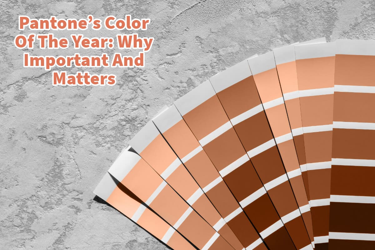
Pantone announces its Color of the Year every year, sparking widespread media coverage from leading news outlets eager to share the chosen hue and the rationale behind its selection.
Why is the yearly announcement of the Color of the Year important? Is there a real significance to it? Since 1999, Pantone’s Color Institute has dedicated itself annually to exploring and understanding specific color trends that will emerge as significant for the upcoming year.
Table of Contents
- Understanding Pantone’s Color Of The Year
- Why Pantone’s Color Of The Year Matters
- Pantone’s Color Institute And The Color Of The Year
- Pantone’s 2024 Color Of The Year – Pantone 13-1023, Peach Fuzz
- Related Content
Understanding Pantone’s Color Of The Year
Pantone’s Color of the Year is not just a random pick from the color wheel; it’s a carefully forecasted trend that signals which color is expected to play a pivotal role in the upcoming year’s consumer products and design industries. This decision isn’t made lightly; it results from countless hours of meticulous research and analysis, examining various factors that might influence the chosen color’s relevance and importance.
The selection process involves looking at global, cultural, social, and economic trends, among other aspects, to determine a color that resonates with the current or upcoming zeitgeist. The Color of the Year aims to encapsulate a mood, attitude, or reflection of the world’s state at that time, making it a valuable tool for designers, marketers, and brands across multiple industries.
Why Pantone’s Color Of The Year Matters
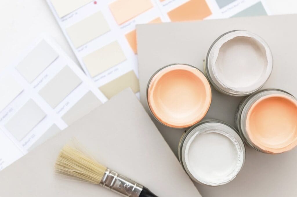
The significance of Pantone’s Color of the Year extends beyond mere aesthetics. It is a guiding light for product development, design strategies, and marketing campaigns. Here are a few reasons why it matters:
Color Trend Forecasting
Selecting the Color of the Year is a critical process that influences the direction of design and product development across various industries, from fashion and beauty to home decor and industrial design. This choice predicts and sets the stage for emerging color trends, allowing designers and businesses to align their creations with forthcoming styles.
By incorporating the Color of the Year into their products and designs early, companies can position themselves as leaders rather than followers in their respective markets. This foresight into color trends ensures relevance and appeal in a rapidly evolving consumer landscape.
Color Trends Marketing And Branding
The Color of the Year transcends its visual appeal by embodying the prevailing spirit of the time, making it a potent tool for marketers and brand strategists. This color can encapsulate emotions, aspirations, and societal moods, enabling brands to communicate more effectively and emotively with their audience.
Adopting the Color of the Year in branding and product development can evoke a sense of immediacy and relevance, resonating with consumers emotionally. This strategic use of color enhances brand identity and consumer engagement, making products more appealing and marketable.
Color And Cultural Reflection
The Color of the Year selection goes beyond aesthetic considerations to mirror global cultural trends and social shifts. This color reflects society’s collective mood and attitudes at a given time, capturing the essence of the zeitgeist.
Pantone’s choice reflects and influences cultural trends by identifying and promoting a color that resonates with the current societal atmosphere and public sentiment.
This nuanced understanding of color’s role in culture underscores its importance in fostering a deeper connection between products and their societal context.
Pantone’s Color Of The Year And Innovation And Inspiration
The Pantone announcement of the Color of the Year catalyzes creativity and innovation within the global design community. This influential decision encourages designers to experiment with new color combinations and integrate the selected color uniquely and creatively into their work.
The Color of the Year inspires designers to push the boundaries of traditional color usage, exploring fresh and innovative applications that can redefine aesthetic norms. This spirit of innovation enriches the design industry and stimulates consumer interest and excitement about new trends and products.
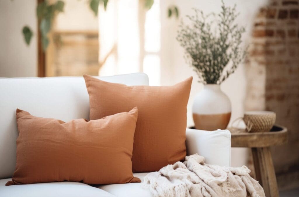
The Color of the Year selection by Pantone’s Color Institute is a multifaceted decision that shapes industry trends, influences marketing and branding strategies, reflects and impacts cultural dynamics, and inspires innovation and creativity within the design world. Each aspect underscores the importance of this annual color declaration in guiding and reflecting the evolving landscape of design, culture, and consumer behavior.
Pantone’s Color of the Year transcends simple color forecasting; it reflects our global society’s pulse, capturing and influencing the zeitgeist in a way that resonates across industries and cultures. This annual announcement anticipates consumer behavior and inspires creators and innovators to explore new design and product development vistas.
Pantone’s Color Institute And The Color Of The Year
Pantone’s Color Institute plays a pivotal role in the design and color selection industries by annually selecting the “Color of the Year.” This process involves a thoughtful and strategic analysis of color trends across various sectors, including fashion, interior design, product packaging, and graphic design.
The institute’s experts scout the globe for new color influences, drawing inspiration from a wide array of sources such as the entertainment industry, emerging artists, fashion, all forms of design, popular travel destinations, new lifestyles, socio-economic conditions, and new technologies, materials, textures, and effects that impact color.

Pantone’s Color Institute influences product development and purchasing decisions in multiple industries and reflects the current global cultural climate.
The annual selection of the Color of the Year is more than just a prediction about design trends; it’s a statement about the mood and attitude of the world at that moment, making it a vital aspect of contemporary design and culture.
Pantone’s 2024 Color Of The Year – Pantone 13-1023, Peach Fuzz
PANTONE 13-1023 Peach Fuzz embodies our yearning to care for ourselves and those around us. This soft, velvety peach shade radiates a comforting and inclusive energy that nourishes the mind, body, and soul.
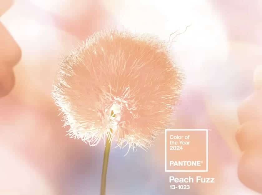
Here is what Pantone said as to why they chose this color for 2024
“In seeking a hue that echoes our innate yearning for closeness and connection, we chose a color radiant with warmth and modern elegance. A shade that resonates with compassion, offers a tactile embrace, and effortlessly bridges the youthful with the timeless.”
Leatrice Eiseman
Executive Director, Pantone Color Institute
Pantone’s Color of the Year is significant. This selection holds considerable weight for product designers, fashion designers, and many others within the creative industries.
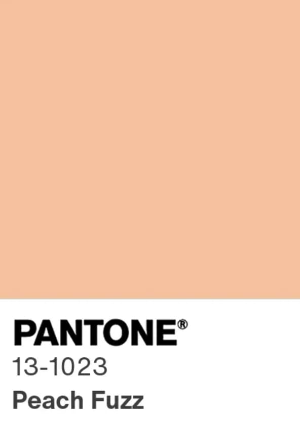
This annual announcement is not just a routine event; it’s a momentous occasion eagerly anticipated by professionals and enthusiasts alike, keen to discover which hue Pantone has determined will shape trends and influence design directions in the year ahead.
This is why the revelation of the Color of the Year generates such excitement and discussion—it’s more than a mere color choice. It’s an influential decision that significantly influences the global aesthetic and thematic directions for design and consumer products.
Listen To Our Podcast About Color Chronicles: Pantone’s Palette Picks and Global Trends
Below or By clicking here.

Find out more about how Mondoro can help you create, develop, and manufacture excellent home decor and furniture products – don’t hesitate to contact me, Anita. Check out my email by clicking here or become a part of our community and join our newsletter by clicking here.
Mondoro gives out a FREE Lookbook to anyone interested. You can receive a copy of our latest Lookbook by clicking here.
Listen to our Podcast called Global Trade Gal. You can find it on all major podcast platforms. Try out listening to one of our podcasts by clicking here.
Subscribe to our Mondoro Company Limited YouTube Channel with great videos and information by clicking here.
Related Content
Scandinavian Interior Design Description – Contemporary Living Spaces
Ever since my time in Sweden, I’ve developed a deep affection for Scandinavian design. Scandinavian design is a clean yet significant-looking trend.
Its minimalist yet compelling aesthetic has a timeless quality and continues to make waves globally. Far from being a fleeting fad, this design style has a lasting influence. Keep reading as we explore the subtleties that make Scandinavian interior design unique.
By clicking here, you can learn more by reading our blog, Scandinavian Interior Design Description – Contemporary Living Spaces.
Home Decor Vs. Interior Design: A Detailed Comparison
Home decor and interior design are two different aspects of design. These fields differ significantly in their scope, methodology, and objectives. Grasping these subtleties can optimize your domestic or commercial spaces. Read on as we explore some of the unique differences between home decor and interior design and define what each means.
To learn more, you can read Home Decor Vs. Interior Design: A Detailed Comparison by clicking here.
12 Living Room Home Decor Wall Ideas For Your Empty Walls
Filling the void with the right blend of style, function, and personality is crucial for setting the tone of your living room; this is where wall décor comes in, offering endless possibilities to transform your blank walls into an enticing visual narrative. Read on as we delve into twelve creative ideas for your living room wall decor, incorporating elements such as wall art, mirrors, artifacts, hanging plates, and more.
You can discover more by reading 12 Living Room Home Decor Wall Ideas For Your Empty Walls by clicking here.

