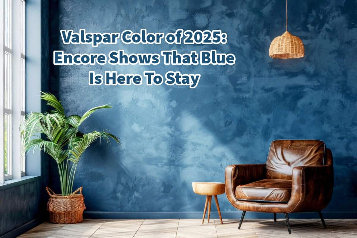
Blue has been a staple in home décor for years, celebrated for its versatility and timeless appeal. At Mondoro, we’ve always been passionate about the myriad shades of blue and the unique ambiance each can bring to a space.
Blue is a popular color, but it is now right on trend. From the softest sky blues to the deepest navy, blue makes interiors feel serene, sophisticated, and inviting. In 2025, this enduring love for blue is more evident than ever, with many leading paint companies highlighting shades of blue in their trend forecasts. Among them, Valspar has boldly selected Encore, a deep, rich blue, as their Color of the Year for 2025.
Table of Contents
- Why Did Valspar Choose Encore Blue as the 2025 Color of the Year?
- The Role of Blue Tone Colors in 2025 and Beyond
- Related Content
Why Did Valspar Choose Encore Blue as the 2025 Color of the Year?
Valspar’s choice of Encore as the Color of the Year for 2025 is a testament to the staying power of blue in interior design. According to Valspar, Encore symbolizes a return to the classic appeal of blue, underscoring the color’s resurgence in modern décor.
However, we at Mondoro believe that blue never really fell out of favor—it’s just that its popularity has reached new heights, cementing its status as a go-to color for designers and homeowners alike.
The beauty of blue lies in its versatility. It can be bold and dramatic, like a deep navy, or soft and soothing, like a pale sky blue. In recent years, we’ve seen a growing trend towards using deep blues as an alternative to black.
This shift suggests that blue has evolved beyond just a secondary color choice and has firmly established itself as a primary option in color palettes. Deep blues, such as Encore, offer the depth and sophistication of black but with the richness and warmth that black sometimes lacks.

About Valspar’s Encore: The 2025 Color Trend
Encore is not just another blue; it is a deep, rich hue with a unique saturation that sets it apart. What makes Encore particularly intriguing is the subtle hint of violet that it carries. This violet undertone adds a layer of complexity to the color, allowing it to bridge digital and physical spaces seamlessly.
In today’s world, where virtual experiences are increasingly integrated into our daily lives, Encore captures the essence of this dual existence. Its crisp, cool shade mimics the mood of digital spaces, creating a calming yet dynamic atmosphere in the home.
Under low lighting, the violet undertone becomes more pronounced, easing our transition from screen time to the real world. This characteristic makes Encore ideal for rooms with paramount relaxation and focus, such as home offices, bedrooms, or living spaces.
The Impact of Encore Blue on Interior Design
The selection of Encore as Valspar’s Color of the Year reflects a broader trend in interior design where deep, saturated colors are taking center stage. These colors are visually striking and carry emotional and psychological weight. Encore embodies this trend perfectly, offering a grounded and transformative color.
Incorporating Encore into your home can significantly impact the mood and tone of a space. Its deep blue hue can create a sense of calm and stability, which is particularly important in a chaotic world.
At the same time, the violet undertone adds a touch of creativity and inspiration, making it an excellent color for spaces where you want to encourage innovation and out-of-the-box thinking.
Encore is also incredibly versatile. It can be used as a statement color on walls, providing a dramatic backdrop for art and furniture.
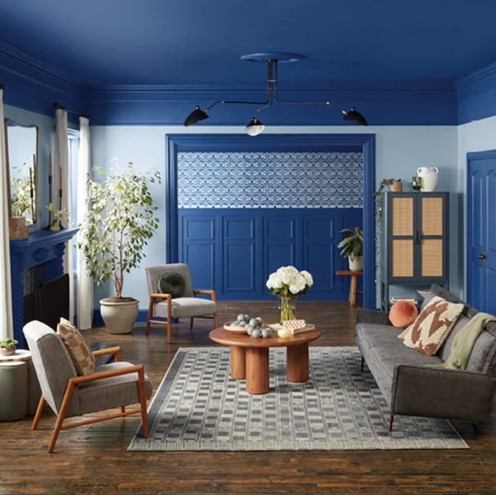
Alternatively, it can be incorporated through accents, such as throw pillows, rugs, or artwork, to add depth and interest to a room. This flexibility makes Encore an excellent choice for various design styles, from modern and minimalist to traditional and eclectic.
Valspar’s Color Pairings: Lavender Escape and Sprig of Sage
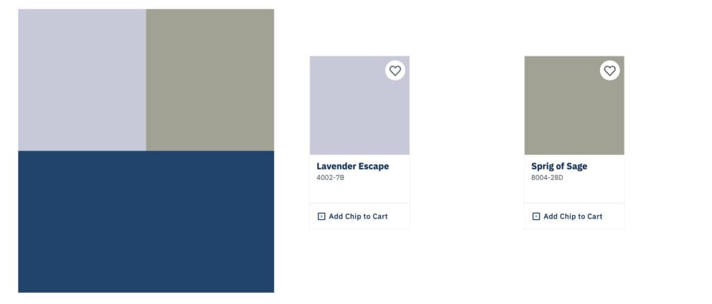
One of the most exciting aspects of Valspar’s 2025 color forecast is how they’ve paired Encore with other complementary colors. Valspar has chosen Lavender Escape and Sprig of Sage, two hues harmonizing beautifully with Encore. This trio creates a balanced and sophisticated palette that can be used in various ways throughout your home.
Lavender Escape 2025 Trend Color
Lavender Escape is a soft, muted lavender that adds a gentle touch of color without overwhelming the senses.
It pairs beautifully with Encore, offering a subtle contrast that enhances the richness of the deep blue while bringing a sense of calm and serenity to the space. This combination is perfect for bedrooms or bathrooms with a desired restful, soothing environment.
Sprig of Sage 2025 Trend Color
Sprig of Sage is a soft green with earthy undertones that complement Encore’s cool hue. This color brings a touch of nature indoors, creating a fresh and rejuvenating atmosphere.
Sprig of Sage adds warmth and balance when paired with Encore, making the overall color scheme feel grounded and inviting. This combination works particularly well in living rooms, dining areas, or kitchens where you want to create a welcoming and harmonious space.
Valspar’s decision to pair Encore with these two colors reflects a thoughtful approach to color coordination.
By offering tintable Valspar products, they make it easy for homeowners to incorporate these hues into their interiors, whether through coordinating walls, trim, or even furnishings and décor. This approach ensures that the colors look good together and create a cohesive and aesthetically pleasing environment.
The Role of Blue Tone Colors in 2025 and Beyond
As we move into 2025, it’s clear that blue will continue to play a significant role in interior design. Encore’s selection as Valspar’s Color of the Year underscores its enduring appeal and ability to adapt to changing design trends.
Whether you’re drawn to the deep, rich tones of Encore or the softer, more muted blues that have been popular in recent years, there’s no denying that blue is a color that is here to stay.
One reason blue remains so popular is its versatility. It can be used in virtually any house room and pairs well with many other colors. Blue can adapt to your needs, whether you want to create a bold, dramatic space or a soft, serene retreat.

In addition to its aesthetic appeal, blue also has psychological benefits. It is known to have a calming effect, helping to reduce stress and promote relaxation. This makes it an ideal color for spaces where you want to unwind and recharge, such as bedrooms, living rooms, or even home offices.
The Influence of Digital Spaces on Color Trends
Another exciting aspect of Valspar’s selection of Encore is how it reflects the growing influence of digital spaces on interior design.
As our lives become increasingly intertwined with technology, the lines between the virtual and physical worlds continue to blur. This trend influences how we design our homes and the colors we choose to use.
With its subtle violet undertone, Encore captures this intersection between the digital and physical worlds. Its cool, crisp shade mimics virtual environments’ clean lines and sleek aesthetics.
At the same time, it brings a sense of depth and warmth that helps to ground the space, making it feel more connected to the real world.
This digital and physical elements blend is becoming increasingly crucial in interior design. As more people work from home or spend extended periods in front of screens, there is a growing need for spaces that can seamlessly transition between these two realms.
Encore is a color that meets this need, offering a bridge between the virtual and the tangible.
How to Incorporate Encore Into Your Home
If you’re inspired by Valspar’s 2025 Color of the Year and want to incorporate Encore into your home, there are several ways to do so. Here are a few ideas to get you started:
- Accent Walls: One of the easiest ways to make a statement with Encore is by using it on an accent wall. This deep blue hue can create a striking backdrop for artwork, furniture, or other decorative elements. In a living room or bedroom, an Encore accent wall can add depth and drama to the space without overwhelming it.
- Furniture and Accessories: If you’re not ready to commit to Encore on your walls, consider incorporating it through furniture and accessories. An encore blue table, a set of Encore-colored dining chairs, lamps or lighting with Encore blue tones, a Vase, or even a few throw pillows can add a touch of this trending color to your space. These elements can be easily swapped out if you change your color scheme.
- Trim and Molding: Consider using Encore on trim and molding for a more subtle approach. This technique can add a sophisticated touch to any room, providing a sharp contrast to lighter walls or creating a cohesive look when paired with other Encore-accented items.
- Mixed Palette: As mentioned earlier, Encore pairs beautifully with other colors, such as Lavender Escape and Sprig of Sage. Consider creating a mixed palette in your home using Encore alongside these complementary hues. This approach can add depth and interest to your interiors while maintaining a harmonious and balanced feel.
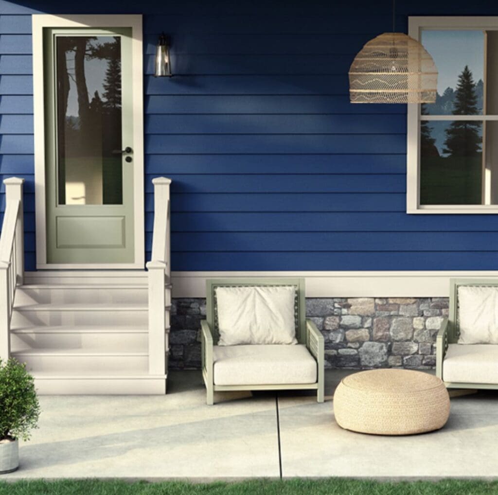
- Outdoor Spaces: Don’t forget about your outdoor areas! Encore can be a stunning choice for exterior doors, shutters, or outdoor furniture. Its rich, saturated tone can create a striking contrast against natural surroundings, making your outdoor spaces feel more polished and inviting.
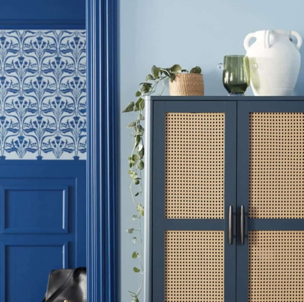
Valspar’s selection of Encore as the Color of the Year for 2025 indicates that blue is not just a passing trend but a color that will continue to influence interior design for years.
Encore embodies depth and richness. It is not just a passing trend but a color that will continue to influence interior design for years.
Encore embodies the depth, richness, and versatility that have made blue a favorite in homes worldwide. Whether you want to make a bold statement or create a calming retreat, Encore offers endless possibilities for transforming your space.
At Mondoro, we’re excited to see how home decor and home furniture designers will incorporate Encore into their product designs in 2025 and beyond. Its unique blend of deep blue with a hint of violet makes it a color that is both timeless and modern, bridging the gap between digital and physical spaces.
As we move forward, we’re confident that Encore and other blue tones will continue to play a central role in creating beautiful, functional, and inspiring home decor and furniture.
Find out more about how Mondoro can help you create, develop, and manufacture excellent home decor and home furniture products – don’t hesitate to contact me, Anita. Check out my email by clicking here or become a part of our community and join our newsletter by clicking here.
Mondoro gives out a FREE Lookbook to anyone interested. You can receive a copy of our latest Lookbook by clicking here.
Listen to our Podcast called Global Trade Gal. You can find it on all major podcast platforms. Try out listening to one of our podcasts by clicking here.
Subscribe to our Mondoro Company Limited YouTube Channel filled with great videos and information by clicking here.
Related Content
How To Tell The Difference Between Alabaster And Marble?
Alabaster and marble can sometimes look similar, but they have distinct differences. Alabaster is a softer stone, and marble can be highly polished. Alabaster cannot be used in any outdoor applications, but marble is used a lot outdoors for buildings and sculptures.
You can discover more by reading How To Tell The Difference Between Alabaster And Marble? by clicking here.
How Durable Is Alabaster?
Alabaster is usually considered a soft stone, and it is not as durable as other stones such as marble. Some types of alabaster can be pretty soft, and you can even scratch the alabaster with your fingernails. Alabaster is also not suited to be used outdoors and can only be used indoors.
By clicking here, you can discover more by reading How Durable Is Alabaster?
What is Alabaster? Alabaster for Home Decor Product Development
Alabaster is medium-hard gypsum or calcite mineral that is usually white and translucent and has a fine uniformed grain. When Alabaster is put up to the light, you can see the small fine natural grain of the stone. As Alabaster is a porous mineral, it can be dyed in various colors.
You can discover more by reading What is Alabaster? Alabaster for Home Decor Product Development by clicking here.

