Once again, in December, Pantone announces what they see as the color for the upcoming year. Their predictions of the color are not just about the color but also about the direction they see the world heading for the upcoming year.
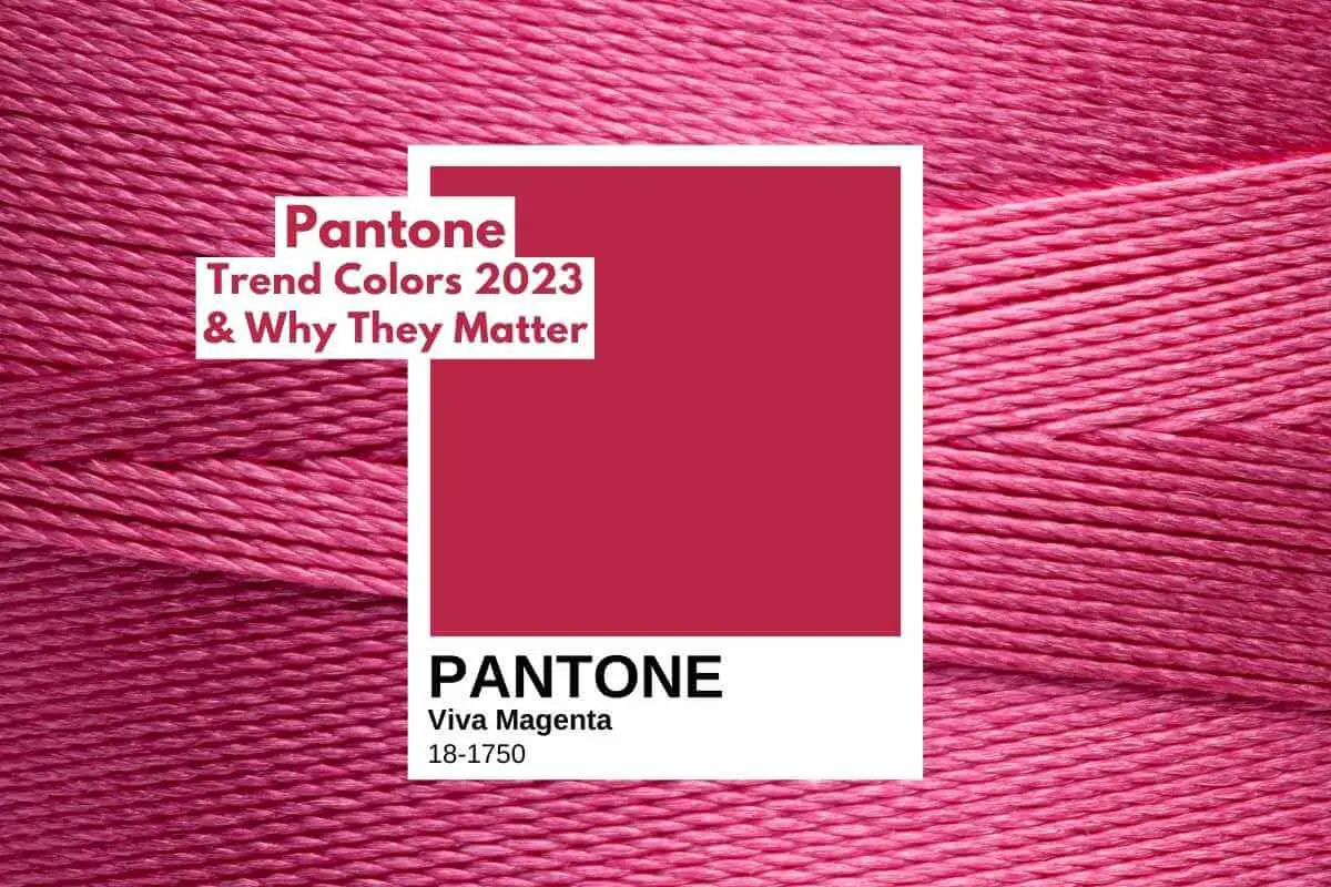
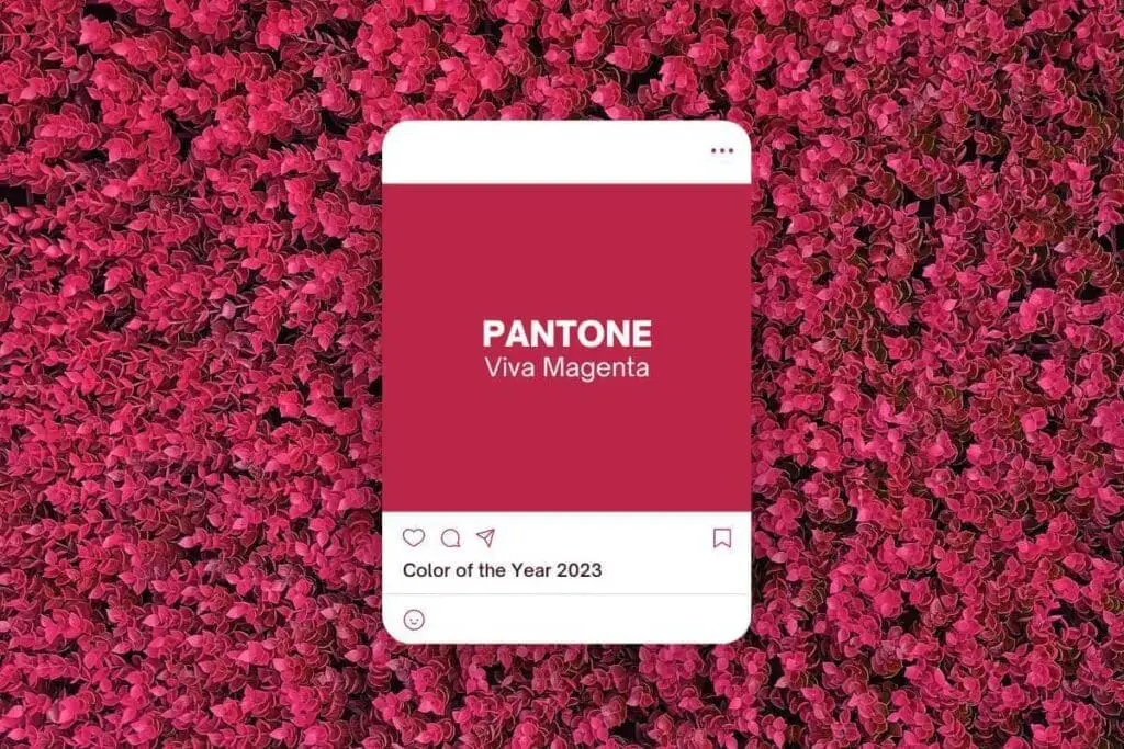
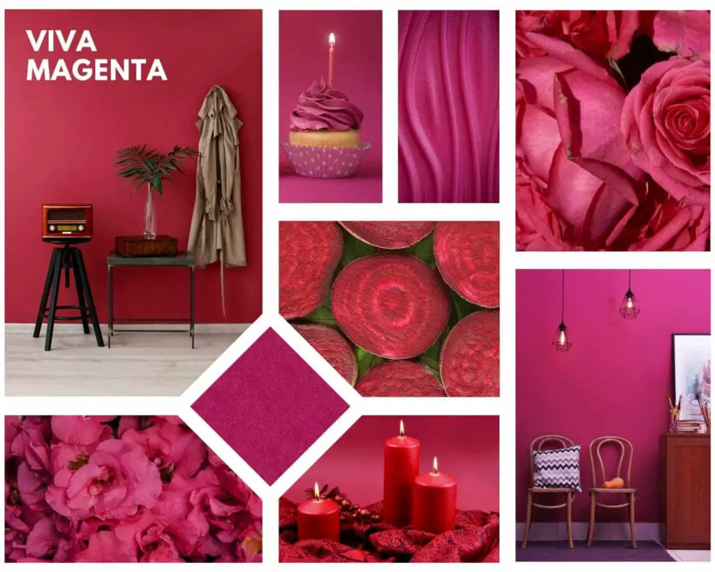
Pantone’s Trend Color is Viva Magenta, a powerful bright color that shows the change and shift in the world. Pantone’s color of the year matters as their color choices continue to show the moods and transformations of the world and help us predict what trends and colors will continue to be necessary.
Table of Contents
- Pantone’s Color For Is Viva Magenta
- Why Pantone’s Color Of The Year Matters
- Related Content
Pantone’s Color For Is Viva Magenta
Color is all around us. It’s part of our lives and part of the world that we live in. Color helps to express mood and emotion: colors and the colors we are surrounded with will make a difference.
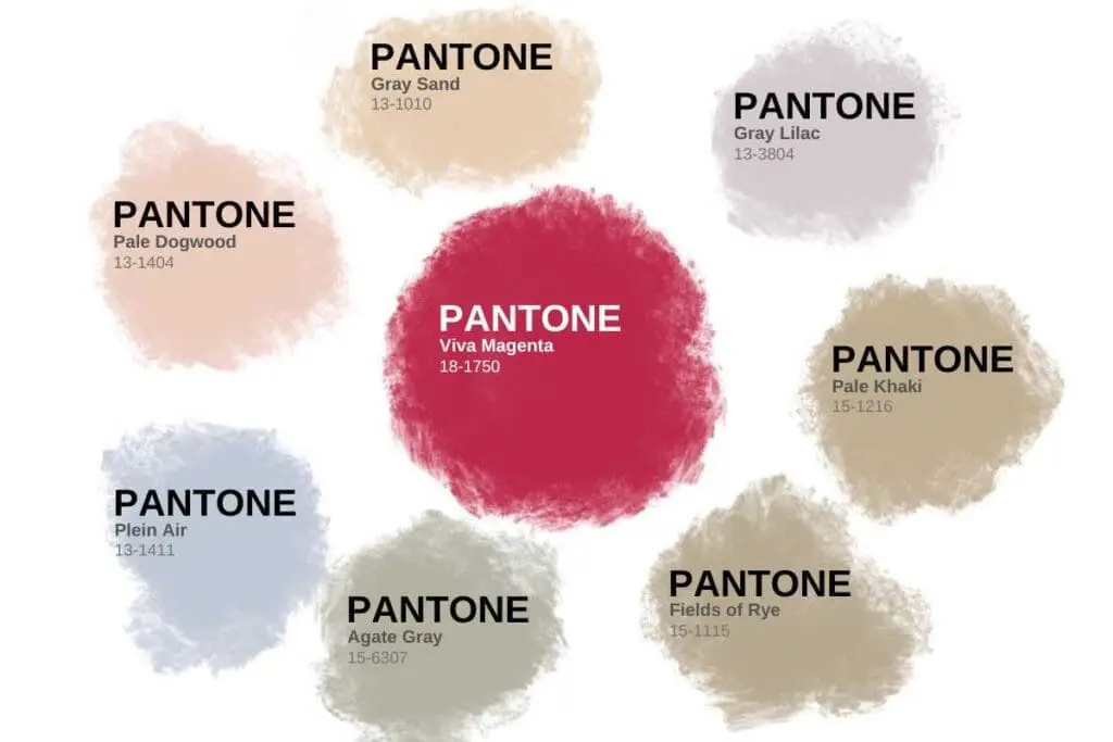
Pantone’s Choice of Viva Magenta Or Pantone Color 18-1750
Pantone’s color of the year is a call to courage and an invitation for the world to experiment and share; it is a call for the world to get past the darker years of the pandemic to find ways to live our lives exploding with color.
Pantone has said they recognize that we live in an unconventional time as life changes. Most of us refuse to return to the life we once had and focus on living life differently.
Pantone sees this color as a cheerful color that can also give strength. A bright color is bursting with energy and giving our lives a new outlook.
Pantone’s Viva Magenta Refers To Nature And A Natural Dye
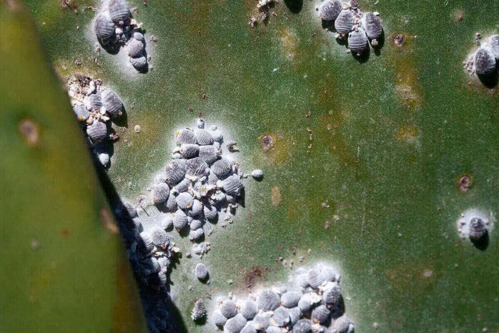
One of the core aspects of the Viva Magenta color is that it received inspiration from nature. The fact that the color refers to nature shows that nature and the natural aspects of life will continue to be an essential part of our lives.
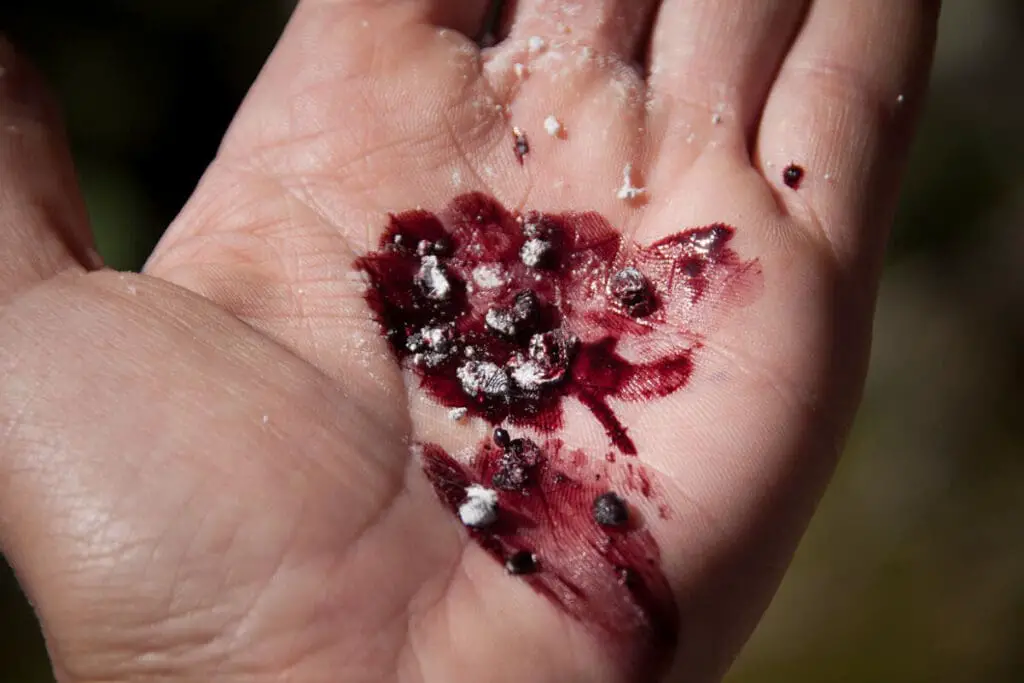
The cochineal insect inspires the Viva Magenta; the cochineal is natural to South and Central America and parts of the United States and has been used as a magenta dye for fabrics for centuries.
Pantone’s Viva Magenta Is Used In Technology
Pantone has collaborated with Motorola to use color in technology products. Motorola has designed a phone using the Magenta color.
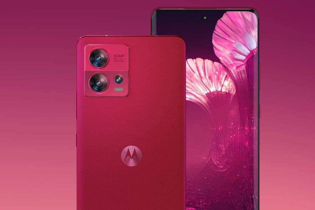
The phone that Motorola has designed with the Viva Magenta color is the Motorola Edge 30 Fusion phone.
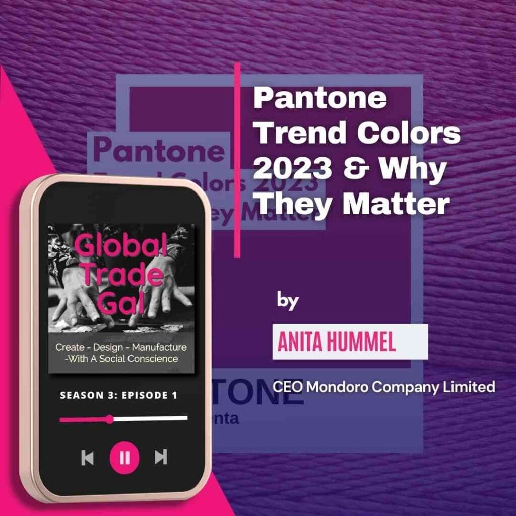
Listen To Our Podcast Pantone Trend Colors 2023 and why They Matter below or by clicking here.
Pantone Has Partnered With Artechouse For AR Experience Via Magenta-verse
Pantone has partnered with Artechouse to give viewers an AR Experience called Magenta-verse. Artechouse is an expert in the immersive art experience.
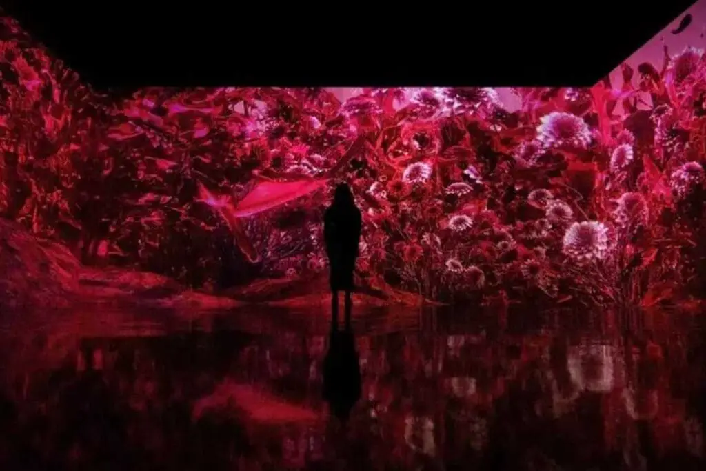
The Magenta-verse will use AR glasses for viewers to walk through an AR Universe filled with Pantone’s Viva Magenta color. The Magentaverse will immerse you in the new Viva Magenta color like never before.
You can find out more about Artechouse and the Megentaverse art exhibit, but go to the Pantone website by clicking here.
Why Pantone’s Color Of The Year Matters
Pantone has been in business for over 60 years; it is undoubtedly the world’s color expert. So when Pantone lists what their color of the year will be, people listen. Major news outlets will report on Pantone’s chosen color and why it is essential.
Pantone does not just randomly pick a color; their color experts will spend thousands of hours deciding on the year’s new color.
Pantone looks for their colors of the year look at some of the following areas:
- Color that highlights the world’s change and perspective.
- Look at the mood and attitude of the consumers.
- The colors they see cross in all areas of designs and products.
- A color that will resonate around the world.
- A color that reflects what people are looking for and what they feel they need.
The Color In Our Lives Has Power
Color and the use of color in our lives and with brands are powerful. Color can help to make a statement about who we are and what we stand for. Color can also help define the look and trend of a brand.
Color is one of the ways that we each express ourselves, either as individuals, a company, a brand, or even a country. Color and the colors we choose can help to define who we are.
Colors Can Be Symbolic Of The Times We Live
Pantone has e shown us that color can define the times in which we live. Especially over the last ten years, Pantone has chosen colors that represent the world’s mood.
Many, during the worldwide pandemic, people started to use blacks, greys, and other colors. As the world opened, color exploded. Pantone shows the world’s attitude and what the world is like today; that is why Pantone’s Color of the Year continues to be so important.
Color Can Change The World
At the core of what Pantone believes is that color can change the world. We have seen how Pantone felt the world was dark and dreary during the dark years of the pandemic, but today, with the new color, Pantone is showing us the world’s mood is opening and changing.
People are looking to embrace color, even bright colors, as part of their lives.
Color Intersects With Technology
Pantone has partnered with Motorola and Lenovo to show that color can become a part of a person’s life through their smart devices. Over the years, our communication tools have become part of who we are and our lives.
Our technologies have become a part of our self-expression, and color is being used throughout technology.
Pantone is at the forefront of color and what colors will continue to be necessary, but Pantone is also at the forefront of how color will be used in our lives; this ensures Pantone’s color of the year is an essential announcement of color and color changes for the world.
Find out more about how Mondoro can help you create, develop, and manufacture excellent home decor and furniture products – don’t hesitate to contact me, Anita. Check out my email by clicking here or become a part of our community and join our newsletter by clicking here.
Mondoro gives out a FREE Lookbook to anyone interested. You can receive a copy of our latest Lookbook by clicking here.
Listen to our Podcast called Global Trade Gal. You can find it on all major podcast platforms. Try out listening to one of our podcasts by clicking here.
Subscribe to our Mondoro Company Limited YouTube Channel with great videos and information by clicking here.
Related Content
The Tre Natural Color Trend For Home Decor And Home Furniture
Tre is the Vietnamese word for bamboo. Bamboo symbolizes strength and flexibility, as the bamboo plant incorporates strength and flexibility. Bamboo is also known to have the resilience to withstand winds, rains, and harsh weather.
You can learn more by reading our blog, The Tre Natural Color Trend For Home Decor And Home Furniture, by clicking here.
How Do I Change The Color Palette In Procreate? Designing With Procreate
The iPad Procreate app makes it very easy to add, delete, or move around colors on your color palettes. We love the Procreate app because it is easy to pick and organize trend colors for your designs. This is especially important for a designer who needs ready access to all their current trend colors.
You can discover more by reading our blog about How Do I Change The Color Palette In Procreate? Designing With Procreate, by clicking here.
How To Use Faux Animal Skins In Home Decor Design And Product Development?
Faux animal skin is a great look to develop home decor and home furnishing products. The faux animal skins can be used with various product sizes and shapes and combined with other materials. This technique is also versatile and can be used on furniture, boxes, trays, mirrors, wall art, and bathroom accessories.
You can learn more by reading the blog Using Faux Animal Skins in Home Decor Design and Product Development by clicking here.