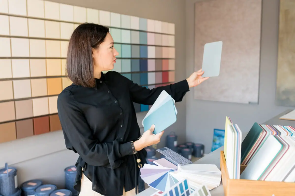
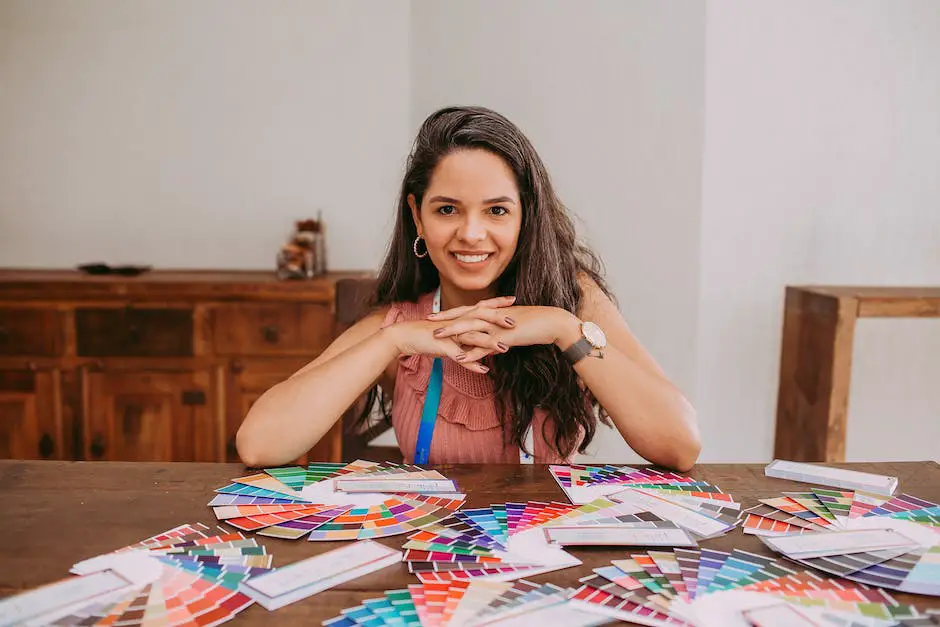
Surrounding ourselves with color, we often overlook its profound impact on our minds and moods. Much like a secret language, hues speak to us, transmitting silent messages that shape our perceptions, whisper our feelings, and craft our spaces. This is the realm of interior design where color usage is both a science and an art of intertwining psychology, aesthetics, and current trends.
A canvas to be painted, each room presents an opportunity to evoke certain moods, conjure balance and harmony, and reflect contemporary tendencies. A thorough comprehension of color psychology forms the bedrock of transforming interiors and mastering the elusive art of color harmony. The cherry on top is staying up-to-date with trending color palettes, ultimately applying our knowledge practically and confidently.
Table of Contents
- Understanding Color Psychology in Interior Design
- Importance of Color Harmony in Interior Spaces
- Trending Color Palettes in Contemporary Interior Design
- Practical Tips for Implementing Colors in Interior Design
- Related Content
Understanding Color Psychology in Interior Design
Subtle yet robust, color significantly influences our perceptions, emotions, and decision-making processes. Within interior design, understanding and utilizing color psychology is essential to determining how beautiful a space appears and how it feels. Color psychology’s impact is experiential and lasting, transforming an ordinary room into an environment brimming with intent and emotion.
Delving into the heart of color psychology, it’s riveting to discover the profound effects of individual colors. For instance, consider the vibrancy of red, often symbolizing passion and energy. Imagine a room surrounded by nuances of this fiery hue. The space is immediately energetic, full of life and energy. Red stirs intense emotions, injects vitality, and stimulates the senses.
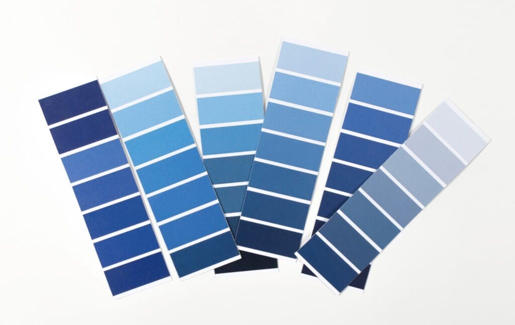
In contrast, the calming tones of blue are calm and serene. They evoke feelings of ease, peacefulness, and tranquility. They can dial down temperatures in a room, both figuratively and perceptively, fostering an environment of relaxation. A room designed with blue undertones is akin to stepping into a tranquil sea or gazing into an endless sky, enveloping the viewer in serenity.
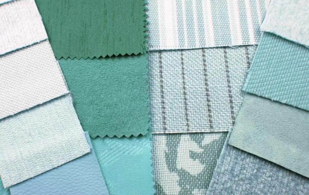
Embracing green richness simulates nature’s effervescence indoors, promoting balance, harmony, and rejuvenation. It is the color of life and growth, prompting a sense of prosperity, freshness, and tranquility. Accentuating interior spaces with varying shades of green can connect us with the natural world, ever nurturing and soothing.
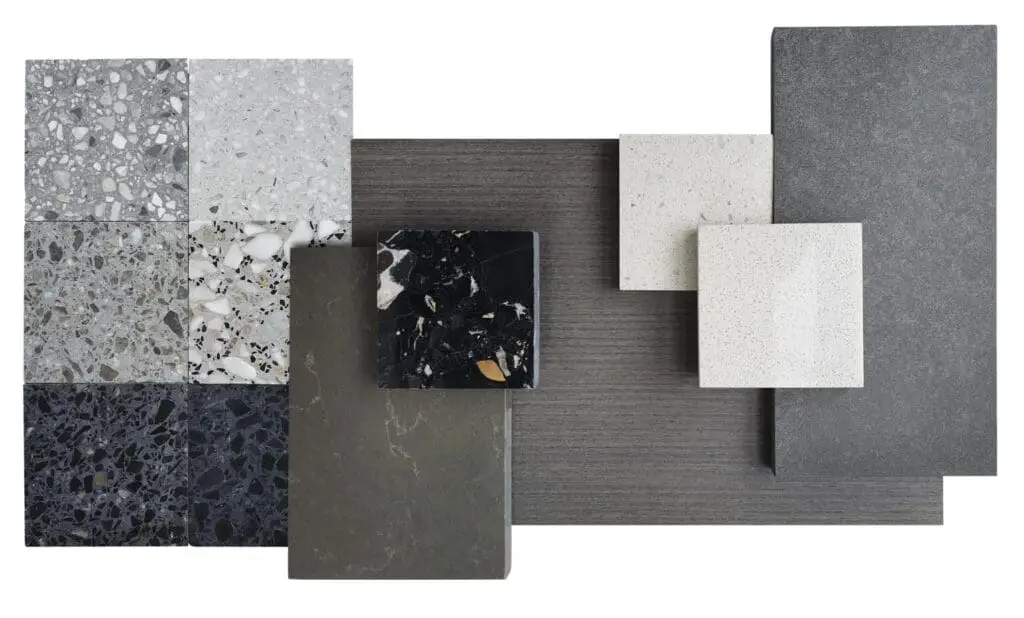
Segue into the pristine simplicity of white. It is expansive and airy – bits of nothingness, yet full of potential. White is ideal for creating a sense of space, minimalism, and neutrality. It’s like an empty canvas waiting to be imbued with splashes of hues, textures, and patterns.
On the other hand, black exudes sophistication empowers with its boldness and stimulates a sense of potential and possibility. When deftly used, it adds depth – a richness that anchors an interior space, imbuing it with an aura of elegance and mystery.
Choosing a suitable color scheme for interior design is not a whimsical decision but a calculated strategy based on the desired emotional impact. It’s about deciding how a space looks and how it makes you feel.
An affinity for a particular color is often based on our experiences, cultural influences, personal preferences, and physiological reactions. Understanding the psychology behind color and how it affects our emotions lays the foundation for successful interior design.
Exploring the depth of color, we, as creatives, approach with a sensitivity and respect that shouldn’t be overlooked. Our respect and understanding of color psychology allow us to compose spaces that resonate with our viewers, instill a specific ambiance, and evoke desired emotions.
Breathtaking. How can we manipulate color, a seemingly straightforward design aspect, to stir such deep feelings and reactions? It is a reminder that art, in every form, is a powerful conduit of emotion.
Strive to harness the potency of color psychology in every artistic endeavor, anchoring emotion and intention in every interior space. In doing so, one can genuinely paint with purpose and design with intention. Indeed, a phenomenal journey awaits in the gloriously vibrant world of interior design.
Importance of Color Harmony in Interior Spaces
Having infused our canvas with hues imbued with emotional resonance, touched on the role of individual colors, and woven in the complexities of personal and cultural preferences, we now delve into the intricacies of color harmony in interior design.
This mysterious term represents skillful design and exquisite visual storytelling — an essential painterly narrative that unfolds within the four walls of our domestic galleries.
Color harmony might be considered an elusive, nuanced concept, yet its principles lie in the heart of art itself. The interplay, balance, and musical arrangement of colors speak to our senses, attracting us like bees to the nectar of a beautifully blooming flower. It is what makes a space not just appealing but intrinsically captivating.
Harmony in color is critical in shaping the perceived temperature of a room. Cool blues, greens, or violets can evoke a sense of freshness, while warm shades such as red, orange, and yellow can cozy up an ambiance and transform a bleak winter’s day into a sun-sprinkled summer afternoon.
Yet, the dance of color harmony is not only about the colors themselves but also their intensity and tonal values — their ability to create the ultimate symphony of warmth or frosty kiss of coolness.
Next, the equilibrium created through color harmony plays a pivotal role in defining the visual weight and balance in interior design. Without it, our eyes might unconsciously bounce around, seeking a restful place to land in a fierce concert of clashing hues.
For instance, while a thing of undeniable beauty, a deep cobalt sofa calls for neutrals or soft shades in its supporting cast of furniture to maintain balance and avoid a visual uproar.
Furthermore, mastering color harmony can define space and volume, contouring and bending our perceptions in ways that architecture alone cannot muster. A carefully chosen color gradient can create an illusion of expanded space in smaller abodes or a sense of inviting coziness in more generous dimensions.
Color harmony also guides our journey through a house, subtly nudging us along a sensory path from one space to the next. Harmonious transitions incorporate not only compatible color palettes but also careful considerations of mood, lighting, and the functional themes of each room.
Just as a symphony relies on harmonious arrangements of tones and keys or a poem on the balance of rhythm and theme, interior design is gilded by the unsung hero that is color harmony.
It is what transforms a house from a mere shelter to a living, breathing work of art – an ode to the myriad human emotions it encloses. This is the heart and soul of good design, where every stroke of color resonates with the inhabitants, creating a perfect, harmonious symphony and adding an unparalleled richness to the tableau of everyday life.
Trending Color Palettes in Contemporary Interior Design
It’s an age-old truth: colors aren’t just colors. They are tones integrated into every aspect of our lives, shaping our perceptions and daily interactions. And nowhere is this true and more impactful than within the boundary of our homes – our retreats, our safe havens, our very own art canvases.
Our exploration of color usage now brings us to the heart of this article – exploring current trending color palettes in interior design.
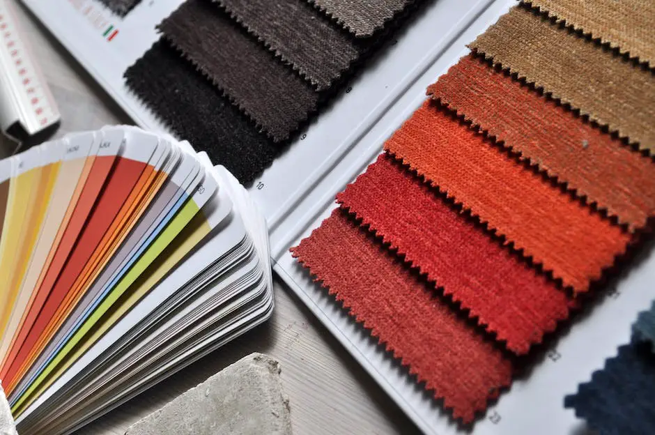
At the front line of design palettes, we see a strong leaning toward earthy and organic hues. Inspired by Mother Nature, earth tones provide a grounding effect in a space, bringing tranquility and a sense of well-being. Think desert browns, forest greens, sky blues, and sunset oranges. This palette exudes calm and serenity, perfect for those seeking a retreat from clutter and chaos.
Simultaneously, there’s a vibrant evolution towards bold and saturated jewel tones. Think royal blue, ruby red, emerald green, amethyst purple, and topaz yellow. When balanced with neutral hues, these rich and intense colors lend a stimulating and opulent flair to any room. They express personality, taste, and a zest for living with vivacity.
A rather intriguing trend nuzzling its way is the Color-Blocking palette. Borrowed from the fashion world, this approach involves pairing multiple solid colors to create high-contrast, dynamic spaces. Magenta with teal, burnt orange with cobalt blue, or lime green with plum – the options are only limited by one’s creativity. The result, chosen wisely, is a room brimming with energy and cheerfulness.
Monochromatic palettes remain a timeless favorite, continually finding a place in current trends. The power of using varying shades, tones, and tints of a single color, coupled with textures and patterns, can make a space feel cohesive, expansive, and sophisticated. Monochrome is far from boring if done correctly – it becomes a bold statement.
Lastly, and perhaps most delicately, is the soft pastel trend. In a world where stimuli are abundant, many are branding their spaces with tranquil and pale colors that whisper rather than shout.
Pastel pinks, blues, greens, yellows, and purples, when paired with neutral whites, grays, or beiges, can create a calming, charming, and whimsical atmosphere. These are spaces that hold the promise of relaxation and contemplation.
In the grand symphony of interior design, colors are the notes that resonate with our hearts, kindling myriad emotions. As the trends evolve, remember this: design, at its core, must tell a story. And there is no better way to weave that story than with the threads of colors that speak to you. So, splash on! Empower your spaces with color – leave it with your signature, your essence.
Whether titillating with jewel tones or whispering with soft pastels, the alchemy of artful interior design lies in the hands of every color enthusiast. So, when it comes to the canvas of one’s abode, always remember – it’s not just a home; it’s a masterpiece in the making.
Practical Tips for Implementing Colors in Interior Design
Harnessing the canvas of interior design, each color and each shade paints a pathway; it sketches a story. Unearthing the trend of earthy and organic hues within interior design can provide tangible warmth and a sense of natural serenity.
Drawing inspiration from sun-bleached stones, lush leaves, and rich soil, these colors can ground space, making it feel open and inviting.
The bold and saturated jewel tones are on the opposite end of the palette spectrum. With their vigorous presence, these hues lend strength and richness, bringing life to an interior space like a vibrant peacock feather or a twinkling sapphire gem. The use of such dramatically sophisticated hues imbues a space with an abundance of character.
Moreover, the trend of color-blocking—pairing up several solid colors in one area—exhibits a progressive perspective in interior design. It extends an opportunity to generate a high-energy setting effortlessly. Colors don’t have to blend or fade into each other; instead, they can stand next, projecting a modern minimalist aesthetic.
In contrast, monochromatic palettes celebrate unity with their subtle play on light and shadow. They utilize varied tones, shades, and tints of one hue to create a harmonious and cohesive composition. The consistency in tones softly details and seamlessly connects an entire space, whispering an understated elegance.
Soft pastels evoke a softer dialogue within spaces. The trend is quickly gaining momentum. Pastels speak a language of tranquility and romance combined with youthful rejuvenation. These subtle hues, reminiscent of early spring blooms or soft sunset skies, emit a soothing aura, creating a serene and feminine ambiance in any space.
Understanding the emotional depths each color can reach is critical in interior design, as colors have the captivating ability to echo emotions and weave narratives. Upon entering a space, each color has a voice, interacting with an individual’s emotions and subtly inspiring their mind.
As designers, embracing the power of color in interior design can provide an essential medium for orchestrating the concert of emotions within a space. Not only do colors set the mood, but they also define the rhythm of a room, serving as the primary storyteller of the space.
The role of color within the space-sculpting domain of interior design is an exhilarating journey. At its heart, it’s an act of empowering spaces with the subtleties and vigor of hues.
Designing interiors becomes a harmonious blend of art and psychology, playing and experimenting with colors on the complex canvas of spaces, marrying the science and artistry of interior design.
Soak in the world of hues and tones, and allow them to shape your spaces and craft your moods. Learn and understand the subtle language of colors, the psychology that lets you wield their power.
Achieve the desired harmony, striking the perfect balance within your indoor spaces. Keep a finger on the pulse of current color trends, enabling your spaces to reflect modern aesthetics and mindsets.
Lastly, dip your toes and dive deep into actual implementation, applying theoretical knowledge to create bold, beautiful, and meaningful spaces. With colors at your command and interiors as your canvas, unleash your creativity, designing spaces as unique as yours.
If you want to manufacture home decor products in Asia, we would love to discuss how Mondoro can help you. We can produce for you a variety of home decor products.
Find out more about how Mondoro can help you create, develop, and manufacture excellent home decor and furniture products – don’t hesitate to contact me, Anita. Check out my email by clicking here or become a part of our community and join our newsletter by clicking here.
Mondoro gives out a FREE Lookbook to anyone interested. You can receive a copy of our latest Lookbook by clicking here.
Listen to our Podcast called Global Trade Gal. You can find it on all major podcast platforms. Try out listening to one of our podcasts by clicking here.
Subscribe to our Mondoro Company Limited YouTube Channel with great videos and information by clicking here.
Related Content
What Is Interior Design?
Interior design is a creative field that requires an understanding of the interior, architecture, decoration, products, design, and art. An interior designer must understand all the colors, materials, textures, furniture, lighting, and anything that will go into the interior space. They must also be able to work with their clients and be able to work within an assigned budget.
You can discover more by reading What Is Interior Design? by clicking here.
Minimalist Interior Design Explored: Embracing The Trend
Interior design, like fashion, is cyclic, swinging between extremes: lavish extravagance and understated simplicity. Of late, Minimalist Interior Design has gained traction, appealing to those who appreciate a clean, streamlined aesthetic.
By clicking here, you can learn more by reading Minimalist Interior Design Explored: Embracing The Trend.
What Is The Coastal Interior Design Style?
The Coastal Interior Design style combines coastal and traditional design into one design trend. The coastal interior design style is a tranquil and soothing trend that remains popular today. Even though the technique is used in many houses near a beach or lake, it continues to be a popular look and interior design that can be used anywhere.
You can learn more by reading our blog What Is The Coastal Interior Design Style? by clicking here.