The subtle tranquility of light blue whispers of early morning skies and gentle ocean breezes possesses an innate ability to soothe the senses and clear the mind. In the vast spectrum of hues, light blue holds a special place in color theory, where it is more than just a shade—it is an experience, a feeling, and a psychological tool. This exploration into light blue delves into its calming essence and how this seemingly simple color carries weight in art and design.
As we peel back the layers of light blue, we’ll discover the science behind its serene implications and understand how it harmonizes with many other colors to elicit specific emotional responses. Whether applied to canvas or incorporated into the latest design trends, light blue reveals its power to create an atmosphere of peace and expansiveness.
Table of Contents
- Understanding Light Blue in Color Theory
- Combining Light Blue with Other Colors
- Creating a Light Blue Color Palette
- Inspirational Light Blue Palette Showcases
- Related Content
Understanding Light Blue in Color Theory
Light Blue: A Tranquil Whisper in the Artist’s Palette
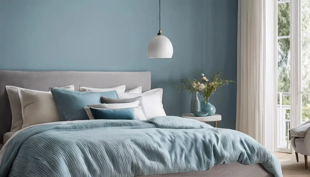
Light blue, the color of a clear sky on a gentle spring morning, holds a unique position on the artist’s palette. With its serene and calming resonance, this hue is vital in setting a piece’s emotional tone and atmosphere. The delicacy of light blue can induce a sense of peace and tranquility, softly navigating the viewer’s emotional response and shaping the artwork’s narrative.
The Emotive Power of Light Blue
Delving into the psychological impact of light blue, one discovers its association with openness, inspiration, and serenity. It’s no coincidence that this hue is often dominant in spaces meant to soothe, such as bedrooms and hospitals. When incorporated into art, light blue can evoke a similar emotional quality, lulling the viewer into a state of contemplative repose or reflecting the boundless expanse of sea and sky.
Crafting Atmosphere with a Cool Caress
With a brushstroke of light blue, artists can modify the very atmosphere of a scene. The sheer versatility of this hue allows for the depiction of a crisp winter morning, the smooth surface of a tranquil lake, or the faded backdrop of a distant mountain range. The ethereal quality of light blue layers depth into a canvas, inviting the onlooker to peer through veils of mist or the whisper of a breeze.
Composing Balance and Harmony
Light blue plays well with others, often as a harmonious partner to warmer tones, providing a counterbalance that delights the senses. It’s the calm to the vibrancy of yellows and oranges, a refreshing calm against the drama of reds and purples. Light blue melts disparate elements within a composition, creating harmony and fostering a visual symphony that resonates with the soul.
Dynamic Light Blue: From Pastel to Profound
While light blue can be delicate in pastel form, its saturation can also lend gravity to a piece. A more profound light blue might border on the edge of turquoise or teal, bridging the softness of the sky with the mystery of deeper waters. With thoughtful application, light blue transitions from a mere whisper to a statement, guiding the emotional journey from a gentle narrative to a compelling tale.
In Conclusion: The Artful Use of Light Blue
It utilizes light blue to wield the power of atmosphere and emotion in visual form. An artist intentionally selects this color, aware of its potential to communicate volumes through subtlety.
Each creation infused with light blue becomes part of a grander conversation—one of tranquility, harmony, and the profound quiet that speaks to the depths of the human experience. Whether it gently hums in the background or stands at the forefront, light blue remains a testament to the expressive power of color in the artist’s world.
Combining Light Blue with Other Colors
The Palette Partners of Light Blue: Creating Visual Symphony
In the realm of design and art, light blue is a color that speaks in hushed tones of the sky at dawn, hinting at the possibilities of a new day. Its gentle hue invites the eye into a dance across the canvas. Yet, pairing complementary colors transforms a mere collection of shades into a cohesive masterpiece.
For those seeking to complement light blue’s serene essence, consider the warm embrace of soft coral or peach. These hues, reminiscent of a sunset’s blush, provide a delightful contrast that invigorates light blue’s tranquil base. Together, these colors craft an engaging dialogue between warmth and coolness, offering a visual experience that is both comforting and lively.
Embracing the natural world as a source of inspiration, pairing light green with light blue can cultivate a space of growth and freshness. Light green echoes the newness of spring leaves, creating a partnership that feels organic and full of life. It’s a coupling that pairs well visually and embodies the vibrancy of nature’s palette.
For those looking to weave in sophistication and mystery, darker shades such as navy or charcoal can be exquisite counterparts to light blue. The depth of these colors acts as a grounding element, allowing light blue to confidently stand out, the way the evening sky’s deepening colors boldly outline clouds. This juxtaposition results in a rich and luxurious aesthetic, perfect for spaces that aim to convey a sense of elegance and strength.
In the delicate dance of color harmony, neutrals play a crucial role. The crisp cleanliness of white creates a crisp canvas that frames light blue, amplifying its airy quality. Alternatively, the subtle sophistication of light grey offers a more understated support, facilitating a smooth transition across the color spectrum and making the overall design approachable and harmonious.
Venturing into the bright and spirited, a zesty lemon yellow infuses designs with cheerful electricity when paired with light blue. This combination sings with the joyfulness of a sunny day and is sure to infuse any piece with an optimistic vibrancy. These two colors create a lively visual that exudes positivity and warmth when they come together.
For those enchanted by the romance of complementary colors, soft lavender or lilac brings out a whimsical side of light blue. This duo swirls together in a sweet symphony, reminiscent of the twilight hours when the sky is a canvas of soft purples and blues. It’s a match that speaks of dreams and welcomes viewers into a soothing embrace.
Choosing the right colors to pair with a light blue can turn a simple design into an expression of emotion, atmosphere, and style. Whether one aims to evoke the soft beginnings of morning light or the hushed tones of a dusk-laden landscape, the proper color companions for light blue are waiting to be discovered and displayed.
As one explores these harmonious partnerships, remember that the final touch in every piece of art or design is the part of oneself that is poured into the creation. It is this personal infusion that makes the work genuinely sing.
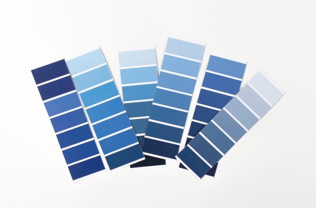
Creating a Light Blue Color Palette
Diving deeper into exploring a custom light blue palette, it’s essential to understand the techniques that bring a nuanced range of hues to life. In pursuing a comprehensive light blue palette, the alchemy of mixing and the measured approach to saturation can reveal colors that sing with uniqueness and intention.
Begin With the Basics: White and Blue Foundation
The journey towards a personalized light blue palette starts with the foundational colors: white and pure blue. To sculpt variations of light blue, introduce white incrementally to achieve the desired lightness. This step is all about control—adding too much white too quickly can wash out the vibrancy of blue.
Incorporating Tints, Tones, and Shades
To uncover the full potential of light blue, integrate tints (adding white), tones (adding gray), and shades (adding black). These subtle adjustments allow the creation of light blue that provides diversity within the palette. Remember, the slightest amendment can result in significant perceptual differences.
Embrace the Warmth: Adding Warm Colors
Warm colors may seem an unlikely ally to cool light blue, but a touch of red or yellow paint can shift the palette towards a more complex spectrum. By blending these warm nuances, one can craft hues that resonate with the warmth of dusk or the subtle blush of dawn.
Exploring Temperature and Contrast
Light blue’s versatility lies in its ability to either recede as a calming background or step forward with a crisp presence when placed next to contrasting colors. To establish such dynamics within a palette, work with blues that border on turquoise for a warmer tilt or introduce a slight gray to cool the tone down further.
Creating a Cohesive Palette
Consider each new hue as a character in an ensemble, ensuring they work in sync and convey a straightforward visual narrative. Test color interactions on a neutral canvas, keeping in mind the light source and context where the palette will be showcased. Under various conditions, these previews can refine the palette into a well-orchestrated assembly.
Documentation and Replication
Throughout the process, meticulous note-taking is critical. Record each step and the proportions used in mixing. Consistency is vital for replicating the palette, enabling these personalized light blue hues to be a signature element across varied works.
Building a custom light blue palette is a creative expedition laden with experimentation, an invitation to engage intimately with color. Through these methods, artists and designers can construct a palette that captures the essence of light blue and carries a unique fingerprint of their artistic vision. Harness these steps and let the bespoke journey of blue begin!
Inspirational Light Blue Palette Showcases
Nature’s Own Palette: Sky and Sea Reflections
Artists across times have continually looked to the greatest muse of all: Mother Nature. The boundless sky on a clear day offers an array of light blues ranging from a soft, pale azure to a more bottomless sky blue. Reflections on water surfaces, whether a gentle stream or the ocean’s expanse, can capture light blues mingled with greens, whites, and grays. These natural scenes provide perfect samples for artists to draw from, inviting a sense of calm and openness into their artistic work.
Historical Art Movements: Renaissance to Impressionism
The art of bygone eras stands eternal, inspiring contemporary creators with timeless aesthetics. Artists seeking light blue inspirations can examine the works of Renaissance painters, where the delicate blues adorned the robes of nobility and the divine.
Moving forward to the Impressionist period, one finds light blues manifesting the ephemeral qualities of light and shadow, showcasing how this hue can be manipulated to evoke different times of day and atmospheric conditions.
Global Cultures and Light Blue Symbolism
Cultural exploration can unearth a plethora of light blue inspirations. Consider the iconic blue tiles of Moroccan architecture or the pastel-hued houses lining the streets of Chefchaouen. Observe how different cultures use light blue in art, textiles, and even in the urban palette of their cities. These diverse influences expand an artist’s palette and infuse their work with a story and significance that spans the globe.
Transitory Moments and Ephemeral Experiences
Lastly, artists must be attentive to the fleeting moments that life presents. The blue of a morning sky just after dawn, the frosty hue of winter air, or the pale blue of early spring flowers are transitory experiences that one can translate onto the canvas. Such fleeting glimpses of color are often the most poignant, capturing the essence of a mood in an infinitely personal way and unique to each artist’s touch.
Thus, inspiration for light blue color palettes is all around; it only requires artists to observe with an open heart and to transpose these encounters onto their chosen canvas, allowing the light blue to whisper its narrative through their creations.
A journey through light blue’s nuances reveals this favored hue’s depth and versatility. From the psychology behind its calming presence to the dynamic ways it can blend with a spectrum of colors, light blue remains an ever-evolving tool in the artist’s palette.
The inspiration gleaned from celebrated works is a testament to its timeless appeal and adaptability. As you step back into the world, let the light blue skies above or the intricate compositions you encounter remind you of the profound simplicity and complexity captured in this color’s various shades, tints, and tones.
Light blue, a color that whispers serenity, has a voice as powerful as any other in the artist’s lexicon—captivating, versatile, and endlessly inspiring.
Find out more about how Mondoro can help you create, develop, and manufacture excellent home decor and furniture products – don’t hesitate to contact me, Anita. Check out my email by clicking here or become a part of our community and join our newsletter by clicking here.
Mondoro gives out a FREE Lookbook to anyone interested. You can receive a copy of our latest Lookbook by clicking here.
Listen to our Podcast called Global Trade Gal. You can find it on all major podcast platforms. Try out listening to one of our podcasts by clicking here.
Subscribe to our Mondoro Company Limited YouTube Channel with great videos and information by clicking here.
Related Content
12 Living Room Home Decor Wall Ideas For Your Empty Walls
Filling the void with the right blend of style, function, and personality is crucial for setting the tone of your living room; this is where wall décor comes in, offering endless possibilities to transform your blank walls into an enticing visual narrative. Read on as we delve into twelve creative ideas for your living room wall decor, incorporating elements such as wall art, mirrors, artifacts, hanging plates, and more.
You can discover more by reading 12 Living Room Home Decor Wall Ideas For Your Empty Walls by clicking here.
Rattan Furniture And Asia and Southeast Asian Colonization
When colonizers came to the new countries, they found materials that they were not used to working with, such as rattan, palm, and bamboo. They used this to create something that can bring comfort to our home, such as chairs to sit on, and they had to start creating an event for furniture that would use local resources and materials.
To learn more about loading a dry shipping container, you can read our blog on Rattan Furniture And Asia and Southeast Asian Colonization by clicking here.
Why Do People Like To Have Nice Furniture?
People want to have nice things in their homes, including furniture, as it will improve their surroundings and boost their mental health and mood. Nice furniture will help show others that you have good taste and care about your home. It can feel good to have nice furniture in your home.
You can learn more by reading our blog Why Do People Like To Have Nice Furniture? by clicking here.