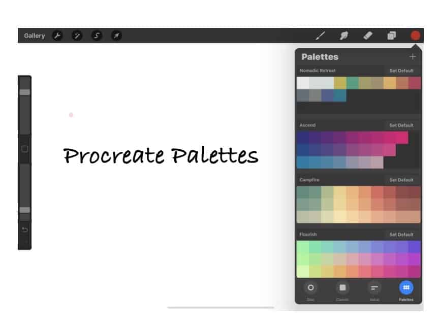
One of the very lovely features of Procreate is how it allows you to set up your color palettes while giving you valuable information about the palette colors themselves. This easy-to-use feature means that you do not need to find the exact color repeatedly, but it can be easily found and organized to find it quickly.
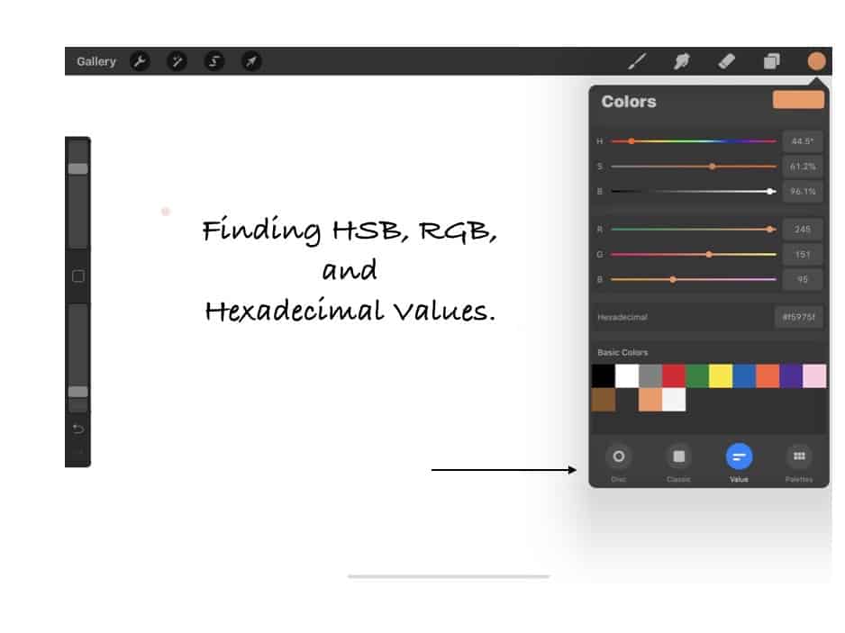
The Procreate App for Apple iPad has a palette feature that easily sets up color palettes. This great tool helps you organize the colors you need when designing products by Procreate. The palette tool will organize the palettes and show you the RGB, HSB, and Hexadecimal Value of your color, along with the exact position of the color on the color wheel. You can use several methods to find your palette colors, but one of the easier ones is photographing the color and importing the photo into Procreate.
Table of Contents
- What is the Procreate palette feature?
- Setting up a Palette in Procreate
- How can I convert Pantone colors to a Procreate palette?
- Frequently Asked Questions:
- Related Content
There are many things that we love about the Procreate palette feature. These are frequently asked questions and other inquiries about using the palette feature on Procreate.
What is the Procreate palette feature?
Procreate has a feature called palettes. This palette feature is similar to if you had a palette with paint colors, but it will always keep the colors on the palette for you with the Procreate software.
Here are some great things that we love about the Procreate palette feature:
- It comes with preset palettes. When you purchase the Procreate software from the Apple App Store, the Procreate software will come with three preset palettes: Ascend, Campfire, and Flourish. If these are the only colors you need, you will not need to set any more palettes. But most artists will want to be able to have other colors for their artwork.
- Easily set up new palettes – Procreate allows you to set up your palettes easily. You can name the palettes any name you choose. We love this feature as it helps us to keep the palettes organized.
- Thirty colors per palette – Procreate allows each palette to have 30 color choices per palette.
- You can quickly move and change colors – Moving or changing the palette colors is effortless. This can allow you to organize them just as you want them or need to use them.
Why use the palette feature in the Procreate app?
The palette app in Procreate is a simple yet easy way to organize the colors you may need for any design. This is one of the great features of Procreate.
For example, do you use many different white tones, from pure white to off-white to cream? You could set up one palette with all the white colors you use to place them all next to each other and easily see the colorways.
Each year, Mondoro looks at the color trends for the year and then sets what we feel will be the year’s color trends. We will use these color trends to design our product in Procreate, so it is crucial to have them organized and easy to use.
Here are other things we like about the Procreate palette feature:
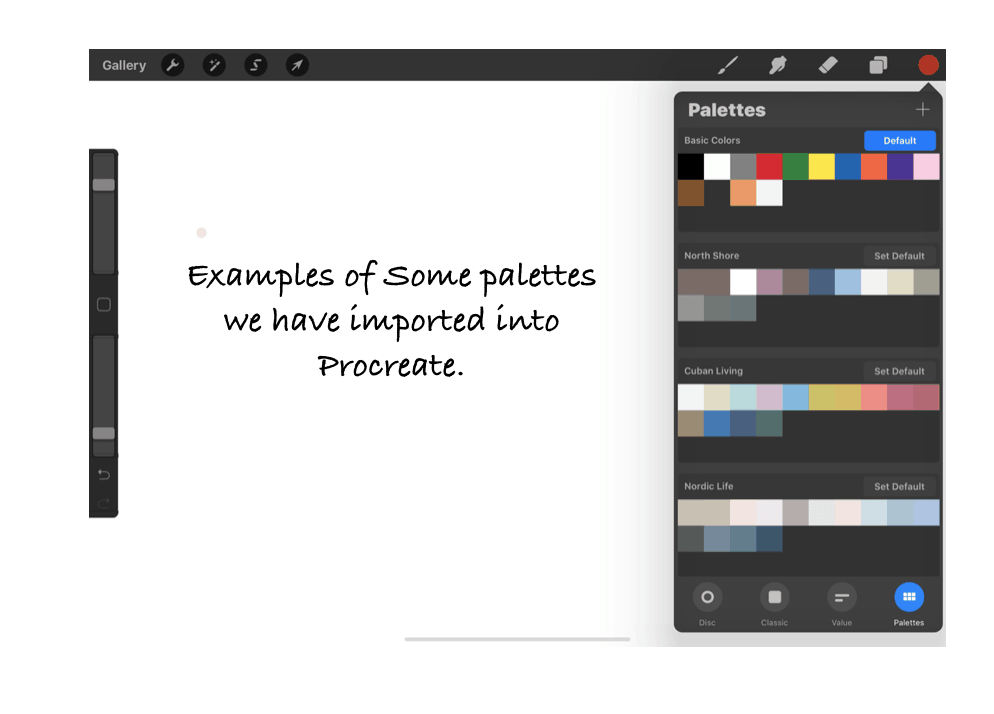
- Can set up palettes by a name – We love how you can set up the palettes by a name. We find this helps to keep the palettes easy to use and organized. For example, we have several trends each year: a Nomadic Retreat, Nordic Life or Cuban Living, or North Shore trend. Each palette can have its name.
- It makes finding colors very easy – By setting up a color palette, you can use precisely the colors you want, and you do not need to keep finding the various colors for your design or project needs. This feature makes finding the colors you need to use for a project.
- You can easily find the colors – Procreate gives you several ways to find the colors, from photographing the color to importing a photo from your iPad. We love how it is easy to import the colors you need.
- Set up a default palette – If you use one palette a lot and want to be sure that the palette is always front and center, you can set up that palette as a default palette. We have set up a default palette called “Basic Colors.” As we use the color black a lot with our sketching, a basic black is the first color on the palette next to a primarily white color.
Setting up a Palette in Procreate
There are several ways that you can set up a palette in Procreate. The first step you must do is to locate the color you want to put on the palette; here are the basic ways to do this:
- Photograph the color – you can photograph the color and then import that photo into Procreate to locate the color.
- Locate the color online – We often use this to find a color, then import that photo into Procreate to find the color we need.
- Find the RGB, HSB value, or Hexadecimal Value – Procreate allows you to set the HSB or RGB value to find the color or the Hexadecimal value to find the color.
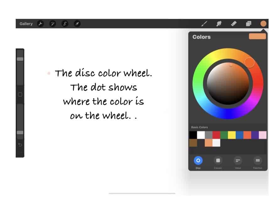
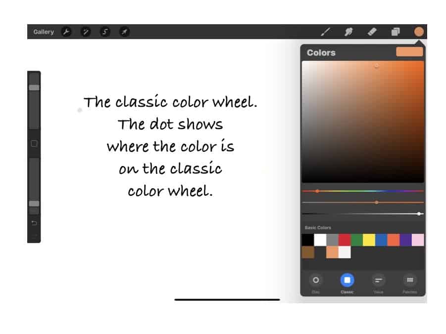
- Find the color on the color wheel – Procreate gives you two ways to find the color wheel color. One is on the color wheel disc, and the other is on the classic view, which is a more detailed view of the color.
You will notice that two of these methods are to import a photo of the color into Procreate. Using photos to import into Procreate to find the color value is straightforward.
Importing a photo to find a color value for a Procreate palette
One of the easier ways to find a color to use on your color palette for Procreate is to find a photo of the color and then import the photo in Procreate. Getting used to doing this takes a bit of time, but it is pretty easy once you do it.
Here are the steps that you must take to do this:
| Steps | Tool/Action | Other Actions |
| 1 | Blank Canvas | Start with a blank canvas on Procreate |
| 2 | Tools – Photo Insert | Go to tools and import a photo or take a photo |
| 3 | Press on Color | Press down on the color until it appears in the top right-hand corner. |
| 4, | Place on Palette | Place the color in the palette you desire. |
You need to always start with a canvas. If you do not want to keep the canvas, you can permanently delete it, but to import any photos into Procreate, you must start with a blank canvas.
Here are a few things to remember when importing a photo to use to get a color for your palette:
- Make the light of the photo good quality. Light can make a difference as to what shade the color will ultimately be. Procreate will read the color exactly as it sees the color, so if there is shading, it will read it as darker than the actual color.
- Check or photograph the color in sunlight – One of the best ways to check the true color of something is to look at the color in sunlight. Many light bulbs can change their color tone.
- Check the color on your screen – when checking a color on a screen, the Apple Retina screens can make a difference and give you a more true color reading than some other screens.
- Where you press, Procreate will read the color value – Where you press on the photo, Procreate will read the value. If some parts have shaded areas, it will read it as darker and then other places as lighter, so be sure where you press is the color value you want.
We have tried to use both the Apple Pen and our finger to find the color, and we have found that pressing down with our finger onto the iPad screen is a much easier method to find the color value than using the Apple Pencil. We are not sure why this is the case, but we recommend using your finger to press on the screen to find the color value.
How can I convert Pantone colors to a Procreate palette?
Using Pantone colors is the standard in many industries, especially ours, working on product development. But despite the fact it is an industry standard, I have not easily found any method or conversion tool to convert a Pantone color to a Procreate palette.
One way you can do this is to find the RGB value of the Pantone color. But most of the reputable conversion tools I have found will convert RGB color to a Pantone color and not a Pantone to an RGB value. This is a problem as you need the RGB value of the Pantone color.
Besides this, one Pantone color can have a few different RGB values associated with it, as different Pantone colors can show different values or look different. For example, we have several Pantone books, and the color values can be slightly different, even between a coated and uncoated one. The color is the same, but the topcoat or shine can make a difference.
In general, matching colors can be a very tricky thing as there are so many variables that can affect how the colors match up. So I have found that training your eye to see color and color differences is one of the best ways.
To match up a Pantone color, we will use this method
- Find the Pantone color online – Pantone has an excellent website; you can click here to go to the website and find the Pantone colors on their website. Alternatively, do a Google search for the Pantone color you want and then look under images to find the shade.
- Match the actual Pantone swatch with the online color – I have found when matching a color I have found online for Pantone many times, several colors can show up, so it is best if you have the actual Pantone swatch in front of you so that you can match the color as close as possible.
An important point to remember with this method is that you see how Procreate will see the color. So if you need an exact match, you may need to check it carefully, use several methods, and use your eye to be sure the color is what you want.
Some final words on color matching with Procreate
Matching color is always a very tricky thing, especially for product development. We have found that even slight changes as changing a color finish from a shiny to a matt top coat, can change how the color looks on a product.
This is no different than working on Procreate. For this reason, when designing products to get the exact color and finish, we need to do an actual color chip for the product we create. In other words, I would never design or develop a product and think I would match the color off Procreate; instead, I would match that color off a finished color chip.
The reason is that, at least for home furnishing and home decor design, I see Procreate as a great tool for us to easily get our designs, color trends, and other finishes on paper.
But once we have designed them on paper, our next step would be to have a color finish color chip that we would make and get confirmed before manufacturing the entire product. Even what is shown on paper can always look different from an actual produced product or design.
The Procreate palette is a feature of Procreate that a product designer should not overlook. It is easy to use and has many great features that make it an essential part of the Procreate App and product design.
Find out more about how Mondoro can help you create, develop, and manufacture excellent home decor and furniture products – don’t hesitate to contact me, Anita. Check out my email by clicking here or become a part of our community and join our newsletter by clicking here.
Mondoro gives out a FREE Lookbook to anyone interested. You can receive a copy of our latest Lookbook by clicking here.
Listen to our Podcast called Global Trade Gal. You can find it on all major podcast platforms. Try out listening to one of our podcasts by clicking here.
Subscribe to our Mondoro Company Limited YouTube Channel filled with great videos and information by clicking here.
Frequently Asked Questions:
Are there color palettes I can import into Procreate?
There are a lot of color palettes that you can import into Procreate. If you quickly search on Google or Pinterest for “Free Palettes Procreate,” you will find many palette options.
As the home furnishing and home decor industry is a fashion industry, we usually must set our palettes and colors each year. If you download our current lookbook, you can find the Pantone colors and trends we have set each year and easily import them into Procreate.
How can I cross-reference between Pantone color guides?
Pantone has a perfect cross-reference tool on their website that can be found here. This cross-reference tool is between one Pantone book and another Pantone book.
We have found that the color may not be the same even when cross-referencing one Pantone number to another. For example, a cross-referenced color in the Fashion Home & Interiors Guide to the Formula Guide may not be 100% the same.
For this reason, if you need to match a color exactly from Pantone, you should have the exact color chip from the exact Pantone guidebook and use that to match the color.
What is Procreate?
Procreate is a popular digital illustration app designed exclusively for iOS, known for its intuitive interface and extensive range of artistic tools. Professionals and hobbyists widely use it for creating digital artwork.
Can Procreate be used on devices other than the iPad?
Procreate is specifically designed for the iPad. However, Procreate Pocket is a version for iPhone users. There’s currently no version available for Android or Windows devices.
Do I need an Apple Pencil to use Procreate?
While Procreate can be used with your finger or third-party styluses, the Apple Pencil offers the best experience due to its pressure sensitivity and precision, enhancing the drawing and painting process.
How much does Procreate cost?
Procreate is a paid app, available for a one-time purchase. The price can vary slightly based on your location. Check the App Store for the current price in your region.
Does Procreate support layers, and if so, how many?
Yes, Procreate supports layers. The maximum number of layers depends on the resolution of your canvas and the model of your iPad. Higher resolution and more complex projects will typically allow for fewer layers.
Can I export my Procreate artwork in different formats?
Yes, Procreate allows you to export your artwork in various formats, including PSD, PNG, JPG, and TIFF, making it easy to share your work or transfer it to other software.
Does Procreate update regularly with new features?
Yes, Procreate frequently updates its software to include new features, enhancements, and bug fixes. Updates are generally free for users who have purchased the app.
Can I print my artwork made in Procreate?
Yes, you can print your Procreate artwork. To get the best quality, ensure your canvas size and DPI settings are high enough for print purposes (typically 300 DPI for professional-quality prints).
Is Procreate suitable for professional work?
Yes, Procreate is highly suitable for professional work. Many professional artists and designers use it due to its powerful features, high-quality output, and ease of use.
Related Content
What Is Alabaster? Alabaster For Home Decor Product Development
Production is about manufacturing goods from raw materials to finished products. Productivity is considered part of the production process. Productivity is about how efficient a country or company is. Productivity is an economic principle; a formula is used to calculate productivity.
You can discover more by reading What Is Alabaster? Alabaster For Home Decor Product Development by clicking here.
Natural Agate Stone Beads For Home Decor Products
Agate is a natural rock formation used as a decorative element for centuries. It can be found in many parts of the world, and there are many different kinds and colors of agate stone. In the Asia practice of Feng Shui, it can help us strike a balance in life and for good luck.
By clicking here, you can discover more by reading Natural Agate Stone Beads For Home Decor Products.
What Is The Difference Between Rattan, Wicker, And Cane Furniture?
Rattan is a type of palm or vine that grows in the jungles of Southeast Asia. Rattan refers to a kind of natural material. Wicker is a type of weave using rattan materials. Cane also refers to a type of weave that is usually woven using rattan material.
You can learn more by reading our blog What Is The Difference Between Rattan, Wicker, And Cane Furniture? by clicking here.

