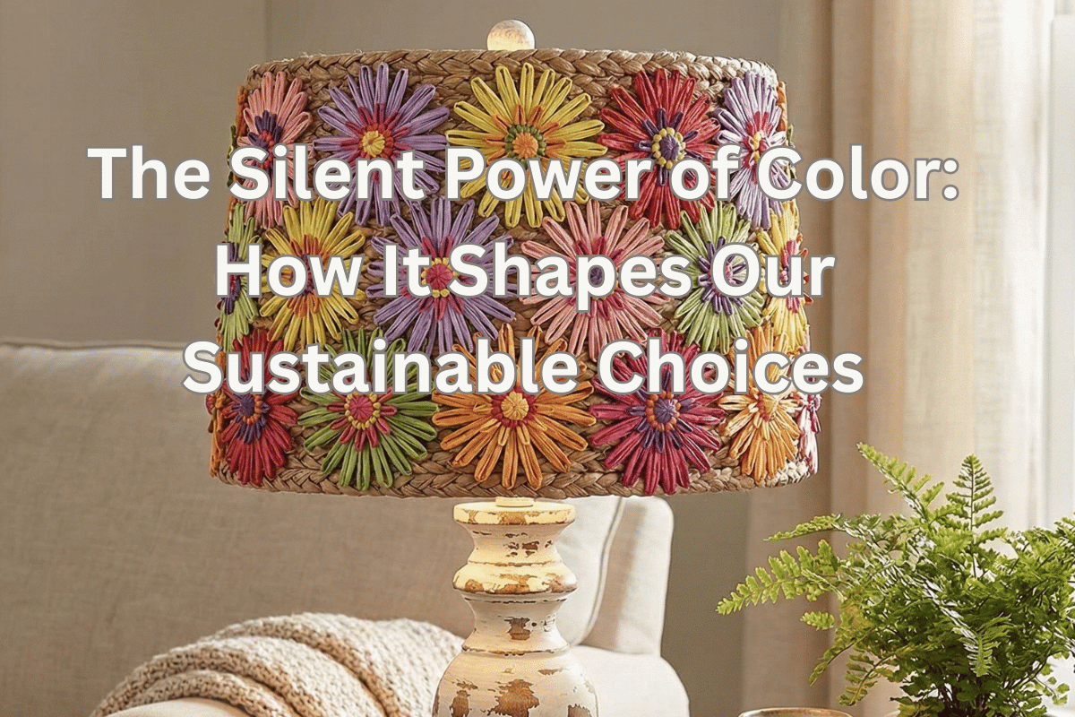
Forget what you thought you knew about “green” marketing. What if I told you that a bright, unexpected color might actually make you more likely to buy a sustainable product than a traditional earthy tone? Prepare to have your perceptions challenged as we unearth the surprising ways color manipulates your desire for conscious consumption.
Color is everywhere in our lives, influencing decisions we don’t even realize we’re making. From the clothes we wear to the products we buy, color wields a silent yet powerful influence on our emotions, preferences, and even our values. In marketing, this phenomenon is known as color psychology—the study of how colors affect consumer behavior. When applied to sustainability, color becomes even more fascinating, as it can either reinforce or challenge traditional notions of eco-friendliness.
Table of Contents
- Color Psychology in Marketing: A Brief Introduction
- Tips for Using Color in Your Home
- Earth Tones: Grounding Our Green Choices
- The Bold & The Eco-Conscious
- Color’s Impact on Price Perception & Durability
- Designing for a Greener Tomorrow
- Deep Dive Podcast
- Related Content
Let’s dive into the silent language of sustainable hues and explore how colors shape our choices, especially when it comes to sustainable consumption and home decor.
Color Psychology in Marketing: A Brief Introduction
Color psychology is the science of how colors affect human emotions and behaviors. In marketing, brands use color to evoke specific feelings, create associations, and influence purchasing decisions. For instance, red is often associated with excitement and urgency, while blue conveys trust and stability.
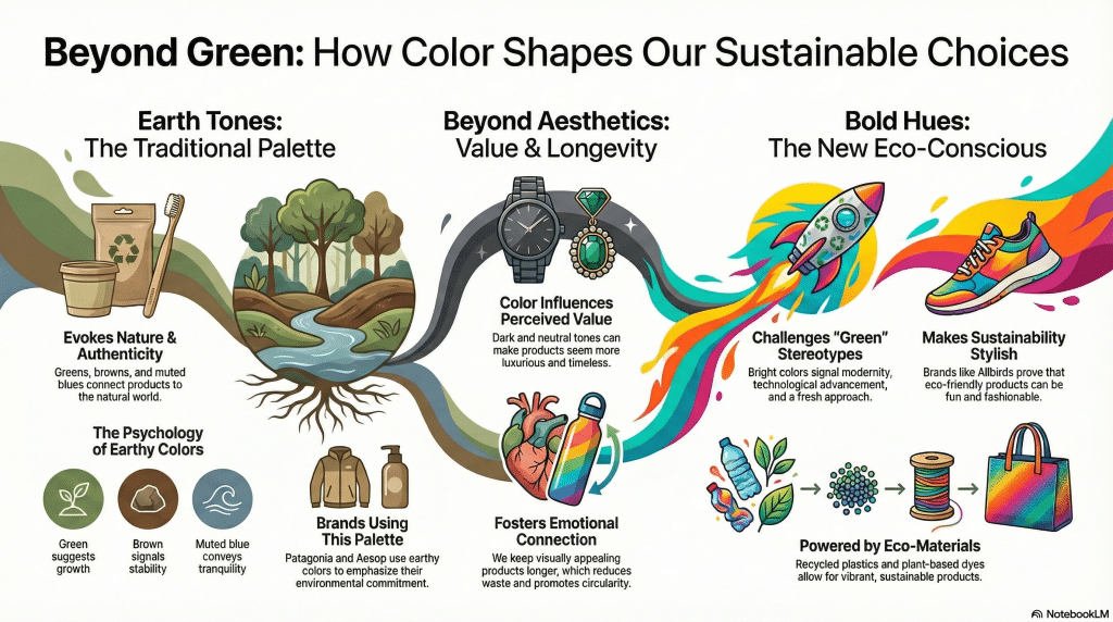
When it comes to sustainability, earthy tones like greens, browns, and muted blues have traditionally dominated the visual landscape. These colors evoke nature, authenticity, and responsibility—qualities that align well with eco-friendly values.
However, as sustainability becomes more mainstream, brands are starting to experiment with bolder, unexpected hues to challenge stereotypes and attract attention.
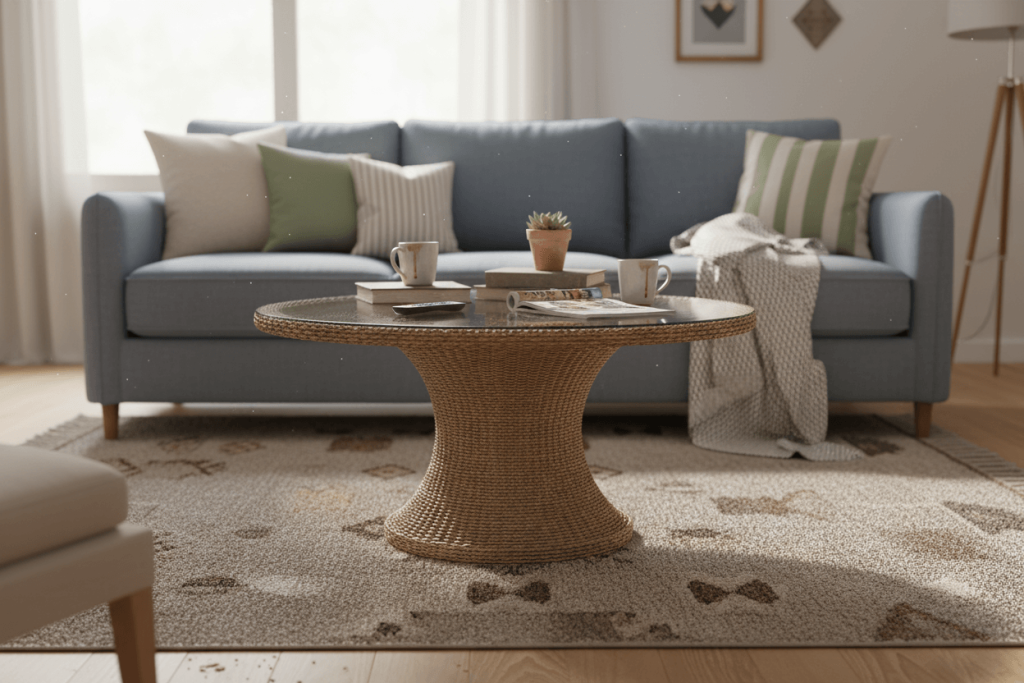
In the context of home decor, using a balanced color palette can create harmony and comfort. This often involves combining complementary colors, contrasting accents, or blending neutrals with bold hues to avoid overwhelming the senses. But how does this translate to sustainable choices? Let’s explore.

Tips for Using Color in Your Home
Designing a sustainable and visually appealing home starts with understanding how colors impact your mood and perception. Here are some tips to help you use color strategically:
- Start Small: Experiment with color in accessories, pillows, or a single accent wall before committing to larger areas. This allows you to test your preferences without overwhelming your space.
- Test Samples: Paint swatches or use fabric samples to see how colors look in different lighting throughout the day. Natural light can dramatically alter how a color appears.
- Use the 60-30-10 Rule: Allocate 60% of the room to a dominant color, 30% to a secondary color, and 10% to an accent color for balance. This ensures a cohesive and harmonious design.
- Consider Flow: Ensure colors transition smoothly between rooms to create a cohesive feel in your home. A disjointed color scheme can disrupt the overall harmony of your space.
By understanding how color influences mood, perception, and functionality, you can design spaces that feel comfortable, inviting, and reflective of your personality—all while making sustainable choices.
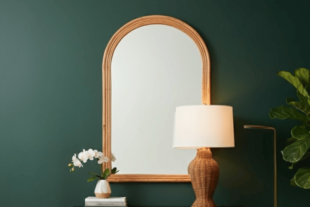
Earth Tones: Grounding Our Green Choices
Earthy tones like browns, greens, and muted blues have long been the go-to colors for promoting sustainability. These hues are deeply rooted in nature and evoke feelings of calmness, authenticity, and responsibility.
The Psychological Power of Earth Tones
- Greens: Often associated with growth, renewal, and harmony, green is the quintessential “eco-friendly” color. It reminds us of lush forests and healthy ecosystems, reinforcing the idea of sustainability.
- Browns: Representing stability, reliability, and grounding, brown connects us to the earth and evokes a sense of authenticity and trust.
- Muted Blues: These shades suggest tranquility and balance, often reminding us of clear skies and clean water—two essential elements of a sustainable world.
Brands Embracing Earth Tones
Many eco-conscious brands leverage earthy palettes to signal their commitment to sustainability. For example:
- Patagonia: Known for its outdoor gear, Patagonia uses greens and browns in its branding to emphasize its connection to nature and environmental responsibility.
- Aesop: This skincare brand incorporates muted tones and minimalist packaging to convey a sense of natural simplicity and sustainability.
While these colors are effective, they also reinforce traditional ideas of what “green” should look like. But what happens when we step outside this palette?

The Bold & The Eco-Conscious
Who says sustainability has to be subtle? In recent years, a growing number of brands and designers have embraced vibrant, attention-grabbing colors to promote eco-friendly products.
Breaking the Mold with Bold Hues
Bright colors like electric blue, neon orange, and vivid yellow are being used to challenge the assumption that sustainable products must look “natural” or “earthy.” These colors signal modernity, technological advancement, and a fresh approach to sustainability.
For example:
- Allbirds: Known for its eco-friendly shoes, Allbirds has introduced vibrant color options like flamingo pink and canary yellow, proving that sustainability can be stylish and fun.
- Parley for the Oceans: This organization creates products from recycled ocean plastic and often uses bold blues and whites to represent the ocean and innovation.
Innovative Eco-Materials in Bright Colors
Advances in eco-materials have made it possible to produce sustainable products in a wide range of colors. For instance:
- Recycled plastics: Brightly colored furniture and decor made from recycled plastics are both sustainable and visually striking.
- Plant-based dyes: Vibrant hues created from natural dyes challenge the notion that “natural” must mean muted.
These bold colors not only attract attention but also signal a new era of sustainability—one that is innovative, exciting, and forward-thinking.

Color’s Impact on Price Perception & Durability
Color doesn’t just influence how we feel about a product; it also affects how we perceive its value, durability, and quality.
The Link Between Color and Perceived Value
Studies have shown that certain colors can make products appear more expensive or durable. For example:
- Dark colors like navy blue and charcoal gray are often associated with luxury and longevity, making them ideal for high-end sustainable products.
- Neutral tones like beige and taupe convey timelessness, suggesting that a product is worth investing in because it won’t go out of style.
Emotional Attachment and Circularity
Color also plays a role in fostering emotional attachment to products. When we find a product visually appealing, we’re more likely to value it, take care of it, and keep it for longer. This emotional connection can reduce waste and promote circularity, as we’re less likely to discard items that we love.
For example, a brightly colored reusable water bottle might spark joy every time you use it, encouraging you to choose it over disposable plastic bottles.
Designing for a Greener Tomorrow
So, what are the “ideal” color palettes for promoting sustainable consumption? The answer lies in balance. While earthy tones remain effective for evoking nature and authenticity, bold colors can challenge stereotypes and attract new audiences.
Actionable Tips for Designers and Consumers
- Blend Earthy and Bold Hues: Combine traditional earthy tones with vibrant accents to create a fresh, modern look that still feels grounded in sustainability.
- Leverage Color for Storytelling: Use colors to tell a story about the product’s origins, materials, or purpose. For example, blues for water conservation or greens for plant-based materials.
- Consider Context: Think about where and how the product will be used. Bright colors might work well for reusable items, while muted tones might be better suited for home decor.
- Experiment with Eco-Materials: Explore innovative materials that allow for a wider range of colors without compromising sustainability.
A Call to Action
As consumers, we have the power to look beyond stereotypes and embrace the full spectrum of sustainable design. By understanding the psychology of color, we can make more conscious choices that align with our values and preferences.
So, the next time you’re shopping for a sustainable product or redesigning your home, take a moment to consider the colors in front of you. What story are they telling? How do they make you feel? And most importantly, how can they help you create a brighter, greener future?
Color is more than just a visual element—it’s a silent language that shapes our perceptions, emotions, and decisions. By harnessing its power, we can redefine what sustainability looks like and inspire a deeper connection to the products and spaces that surround us.
Let’s paint a greener tomorrow, one hue at a time.
Deep Dive Podcast
Check out our Deep Dive Podcast.
Find out more about how Mondoro can help you create, develop, and manufacture excellent home decor and furniture products – don’t hesitate to contact me, Anita. Check out my email by clicking here or become a part of our community and join our newsletter by clicking here.
Mondoro gives out a FREE Lookbook to anyone interested. You can receive a copy of our latest Lookbook by clicking here.
Listen to our Podcast called Global Trade Gal. You can find it on all major podcast platforms. Try out listening to one of our podcasts by clicking here.
Subscribe to our Mondoro Company Limited YouTube Channel with great videos and information by clicking here.
Related Content
Sweet Romance Trend: A Revival of Floral Elegance and Charm
As we observe the latest catwalks in Europe and the United States, it’s clear that flowers and floral motifs are again capturing the spotlight. This resurgence signals a return to the charm and elegance of the past, where soft, romantic colors and intricate designs create an atmosphere of nostalgia and warmth. This revival inspired our “Sweet Romance” trend, bringing the essence of romance back into our homes and everyday lives.
You can learn more by reading our blog, Sweet Romance Trend: A Revival of Floral Elegance and Charm, by clicking here.
Nature’s Embrace Trend: A Harmonious Coexistence With Nature
At Mondoro, we’re excited to share our latest trend: “Nature’s Embrace.” The Nature Embrace trend draws inspiration from the raw beauty of bamboo, rattan, wood, soil, and roots, crafting a palette that mirrors nature’s elegance and encourages a harmonious coexistence with the environment.
You can learn more by reading our blog, Nature’s Embrace Trend: A Harmonious Coexistence With Nature, by clicking here.
The Retro Resurgence Trend: What’s Old Is New Again
We call this the Retro Resurgence Trend, a trend movement that brings back old favorites with a contemporary twist. It’s a testament to the cyclical nature of fashion and design, where what was once popular finds its way back into the mainstream. Retro design significantly influences modern aesthetics, from color palettes to patterns and materials.
You can discover more by reading our blog about The Retro Resurgence Trend: What’s Old Is New Again, by clicking here.