Each year, the announcement of Pantone’s Color of the Year sparks excitement, speculation, and discussion across industries ranging from fashion to interior design. For 2026, many people were convinced that Pantone would follow the trend set by other paint and design companies, who have overwhelmingly embraced shades of green as their go-to color. Transformative Teal, a captivating greenish-blue hue, was widely predicted to take the crown. In fact, I myself participated in a poll, and the majority of voters were confident that Pantone would choose a green or teal shade to reflect the current global mood.
But, in true Pantone fashion, they surprised us all with a choice that goes beyond expectations: Cloud Dancer. This serene, versatile shade has captured my heart, and I believe it perfectly encapsulates the emotions, aspirations, and mindset of 2026.
Table of Contents
- Why Pantone’s Color of the Year Matters
- The Emotional Power of Cloud Dancer
- The Versatility of Cloud Dancer
- Cloud Dancer: A Reflection of 2026
- Deep Dive Podcast
- Related Content
Why Pantone’s Color of the Year Matters
Pantone’s Color of the Year is not just about aesthetics. It is a global phenomenon that reflects the cultural, emotional, and societal pulse of the moment. Pantone’s team of experts looks at a wide range of influences when deciding the color, including art, fashion, technology, social media, and even world events.
They consider the collective mood of society and aim to choose a color that resonates with our emotions and aspirations.
The name of the color is also significant. It’s not just a label – it’s a message. The name Cloud Dancer evokes a sense of freedom, lightness, and tranquility, perfectly aligning with the themes of this year.

The Emotional Power of Cloud Dancer
In a world that feels increasingly uncertain, with the rapid rise of AI and technological advancements creating both excitement and apprehension, people are yearning for simplicity, truth, and connection. Cloud Dancer symbolizes a breath of fresh air, offering a sense of contentment, harmony, and peace.
This soft, airy white hue represents a desire for a fresh start – a blank slate to reimagine our lives. It encourages us to reconnect with what truly matters: human connection, authenticity, and the beauty of the natural world. Cloud Dancer feels like an invitation to step away from the constant noise of technology and rediscover the joys of living in the present moment.
A Shift in Color Trends
Looking back at Pantone’s recent Colors of the Year, it’s clear that Cloud Dancer marks a significant shift.
Pantone’s decision to select Cloud Dancer marks a shift from the understated elegance of Mocha Mousse (2025) and the soft optimism of Peach Fuzz (2024). These previous selections reflected themes of quiet luxury and gentle warmth, while Cloud Dancer pivots toward a foundational tone of clarity and renewal.
For 2026, Cloud Dancer stands out as a symbol of clarity and renewal. It’s a color that feels timeless yet modern, understated yet impactful. It’s a reminder that amidst the chaos of the world, there is always room for simplicity and grace.
The Versatility of Cloud Dancer
One of the most remarkable aspects of Cloud Dancer is its versatility. It’s a neutral tone that can be paired beautifully with a wide range of colors, making it a favorite for designers and creatives across industries.
Pantone has curated several color palettes that complement Cloud Dancer, each offering a unique way to incorporate this shade into our lives.
1. Powdered Pastels
This palette features soft, understated hues that create a calming and elegant atmosphere. Think of delicate blush pinks, muted lavenders, and creamy neutrals. These colors work harmoniously with Cloud Dancer to evoke a sense of serenity and sophistication.
2. Take a Break
For a more playful and vibrant approach, Pantone’s “Take a Break” palette includes colors inspired by our favorite foods and drinks. Shades like Ice Coffee, Mango Mojito, Cocoa Crème, Pink Lemonade, Tea, and Papaya bring a sense of joy and indulgence. These colors remind us to pause, savor the moment, and enjoy life’s simple pleasures.
3. Atmospheric
This palette draws inspiration from the sky, with colors that remind us of sunny days and clear horizons. Soft blues, gentle yellows, and airy whites create a dreamy, uplifting vibe. It’s a perfect match for Cloud Dancer’s ethereal quality.
4. Comfort Zone
For those who prefer earthy, organic tones, the “Comfort Zone” palette offers a range of natural colors like Shifting Sands, Coral Haze, and Rose Brown. These shades create a warm, grounded ambiance that feels both cozy and inviting.
5. Tropic Tonalities
If you’re looking to add a pop of color, the “Tropic Tonalities” palette delivers. Bright, cheerful hues like Kiwi Colada, Bright Marigold, Paradise Pink, and Blazing Yellow bring energy and vibrancy to any space. Paired with Cloud Dancer, these colors create a dynamic and lively contrast.
6. Light and Shadow
For a more sophisticated and moody aesthetic, the “Light and Shadow” palette combines softened hues like Baltic Sea, Golden Mist, Quiet Velvet, and Blue Fusion. These colors add depth and dimension, making them ideal for creating a sense of drama and intrigue.
7. Glamour and Gleam
Finally, the “Glamour and Gleam” palette offers a touch of luxury and elegance. This palette pairs Cloud Dancer with bold black tones, rich reds like Scarlet Smile, and metallics such as Graphite and Satin Slipper. The result is a striking, high-contrast look that exudes sophistication.
Watch Our Video About Pantone’s Color of 2026 – Cloud Dancer
Watch our video about Pantone’s Color of the Year 2026, Cloud Dancer! Discover the meaning behind this elegant, timeless shade and why it’s set to define the year. Don’t miss out—click to explore!

Check Out The Pantone Cloud Dancer Lookbook
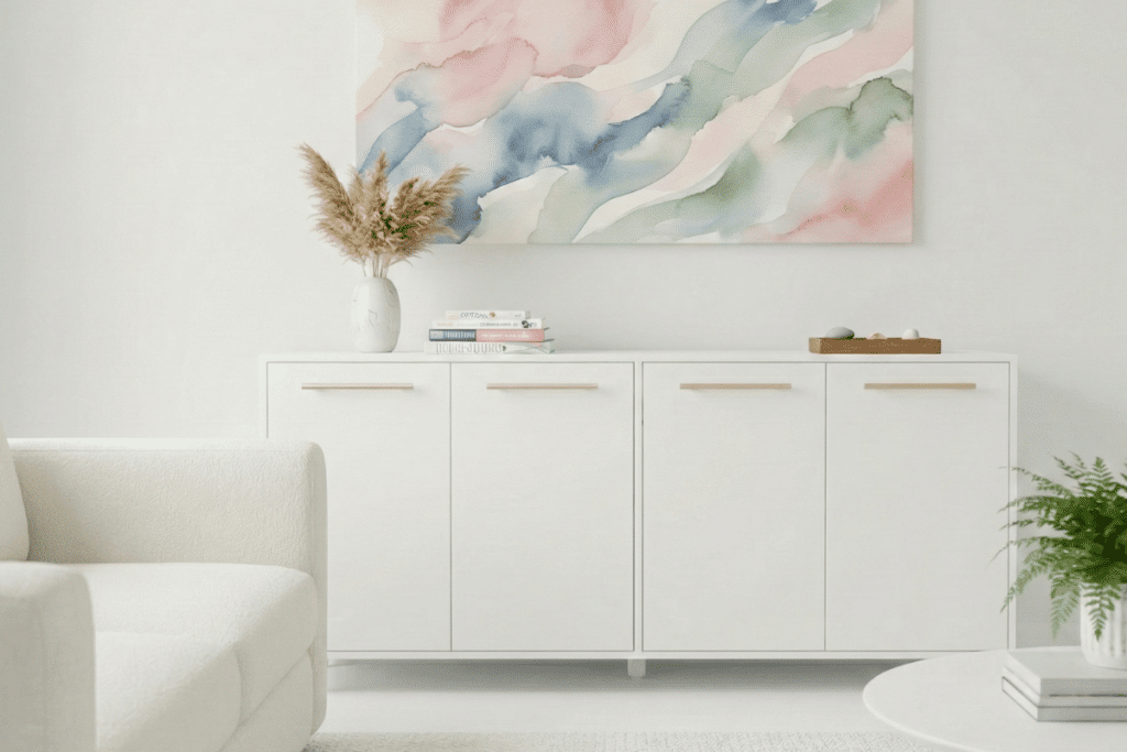
Pantone’s Color of the Year for 2026, Cloud Dancer, is a delicate and versatile off-white hue that exudes serenity and timeless elegance. Perfect for crafting tranquil and sophisticated interiors, this shade seamlessly complements home decor and furniture collections.
Scan the QR code below to explore our exclusive Cloud Dancer Lookbook, filled with inspiring ideas and designs!

Cloud Dancer: A Reflection of 2026
What makes Cloud Dancer such a brilliant choice for 2026 is how well it reflects the current mood and trends. As we navigate a world shaped by rapid technological advancements and societal changes, this color offers a sense of balance and grounding.
It’s a reminder to slow down, breathe, and reconnect with what truly matters. It’s about finding harmony in a world that often feels overwhelming and chaotic. Cloud Dancer encourages us to embrace simplicity, authenticity, and the beauty of the present moment.
A Personal Perspective
As someone who follows Pantone’s Color of the Year closely, I have to say that Cloud Dancer feels like a perfect choice. It’s a versatile, timeless shade that works in so many contexts – from fashion and interior design to branding and art. But more than that, it resonates on a deeper emotional level.
In a time when many of us are seeking clarity, truth, and connection, Cloud Dancer feels like a beacon of hope. It’s a color that invites us to start fresh, to let go of the noise and distractions, and to focus on what truly matters.

Thank You, Pantone
Once again, Pantone has surprised and delighted us with a choice that goes beyond trends and expectations. By selecting Cloud Dancer as the Color of the Year for 2026, they’ve shown their commitment to understanding the emotional and cultural pulse of the moment.
Pantone didn’t follow the crowd this year – they didn’t choose green or teal, as many predicted. Instead, they chose a color that reflects their own research and vision. And for that, I am grateful. Cloud Dancer is more than just a color – it’s a statement, a mood, and a vision for the future.
As we move into 2026, I’m excited to see how Cloud Dancer will inspire creativity, connection, and a renewed sense of purpose.
Thank you, Pantone, for giving us a color that truly speaks to the times.
Deep Dive Podcast
Discover a fresh perspective on Cloud Dancer by tuning into our podcast!
Find out more about how Mondoro can help you create, develop, and manufacture excellent home decor and furniture products – don’t hesitate to contact me, Anita. Check out my email by clicking here or become a part of our community and join our newsletter by clicking here.
Mondoro gives out a FREE Lookbook to anyone interested. You can receive a copy of our latest Lookbook by clicking here.
Listen to our Podcast called Global Trade Gal. You can find it on all major podcast platforms. Try out listening to one of our podcasts by clicking here.
Subscribe to our Mondoro Company Limited YouTube Channel with great videos and information by clicking here.
Related Content
Pantone Color of the Year 2025: Mocha Mousse – A Nod to Quiet Luxury
If you’ve ever delighted in chocolate mousse’s smooth, creamy texture, the Pantone Color of the Year for 2025, Mocha Mousse, will feel like a familiar indulgence.
Pantone’s Color for 2025 is a rich and inviting shade of brown that has taken center stage. This color signals a departure from the bold and brighter hues of years past. With its understated elegance, Pantone’s 2025 color Mocha Mousse positions brown as the new trendsetter in the design world.
Read our blog Pantone Color of the Year 2025: Mocha Mousse – A Nod to Quiet Luxury by clicking here.
Sweet Romance Trend: A Revival of Floral Elegance and Charm
As we observe the latest catwalks in Europe and the United States, it’s clear that flowers and floral motifs are again capturing the spotlight. This resurgence signals a return to the charm and elegance of the past, where soft, romantic colors and intricate designs create an atmosphere of nostalgia and warmth. This revival inspired our “Sweet Romance” trend, bringing the essence of romance back into our homes and everyday lives.
You can learn more by reading our blog, Sweet Romance Trend: A Revival of Floral Elegance and Charm, by clicking here.
Nature’s Embrace Trend: A Harmonious Coexistence With Nature
At Mondoro, we’re excited to share our latest trend: “Nature’s Embrace.” The Nature Embrace trend draws inspiration from the raw beauty of bamboo, rattan, wood, soil, and roots, crafting a palette that mirrors nature’s elegance and encourages a harmonious coexistence with the environment.
You can learn more by reading our blog, Nature’s Embrace Trend: A Harmonious Coexistence With Nature, by clicking here.
The Retro Resurgence Trend: What’s Old Is New Again
We call this the Retro Resurgence Trend, a trend movement that brings back old favorites with a contemporary twist. It’s a testament to the cyclical nature of fashion and design, where what was once popular finds its way back into the mainstream. Retro design significantly influences modern aesthetics, from color palettes to patterns and materials.
You can discover more by reading our blog about The Retro Resurgence Trend: What’s Old Is New Again, by clicking here.