
The need for user-friendly technological interfaces is paramount as the world becomes increasingly digitized. One aspect of interface design that is gathering considerable interest is the use of dark color palettes. Dark color schemes do not just involve a simple inversion of colors but require a nuanced understanding of color theory, principles of contrast, and readability rules.
They have been gaining attention due to their unique aesthetic appeal, potential power-saving attributes, and a perceived reduction in eye strain. This discourse navigates through the complex web of principles guiding the use of dark color palettes, their applications in UI/UX design, and the benefits and drawbacks that they present. It further discusses current trends and prospects of such color schemes, enriched by examining case studies from popular applications and websites.
Table of Contents
- Principles of Dark Color Palettes
- Application of Dark Color Palettes in UI/UX Design
- Benefits and Drawbacks of Dark Color Palettes
- Trends and Future of Dark Color Palettes
- Related Content
Principles of Dark Color Palettes
Embracing the Dark Side: Core Principles Governing Dark Theme’s Use in Technology
Change is a technological constant, and creativity blends function and design in an ever-evolving dance. In recent years, the transition to dark color schemes or ‘Dark Mode’ in technology has been making significant waves, and rightfully so.
It’s not just a trend; it’s a revolution, enhancing user experience and transforming how technology is perceived. So, what are the core principles that govern its use? Let’s dig in.
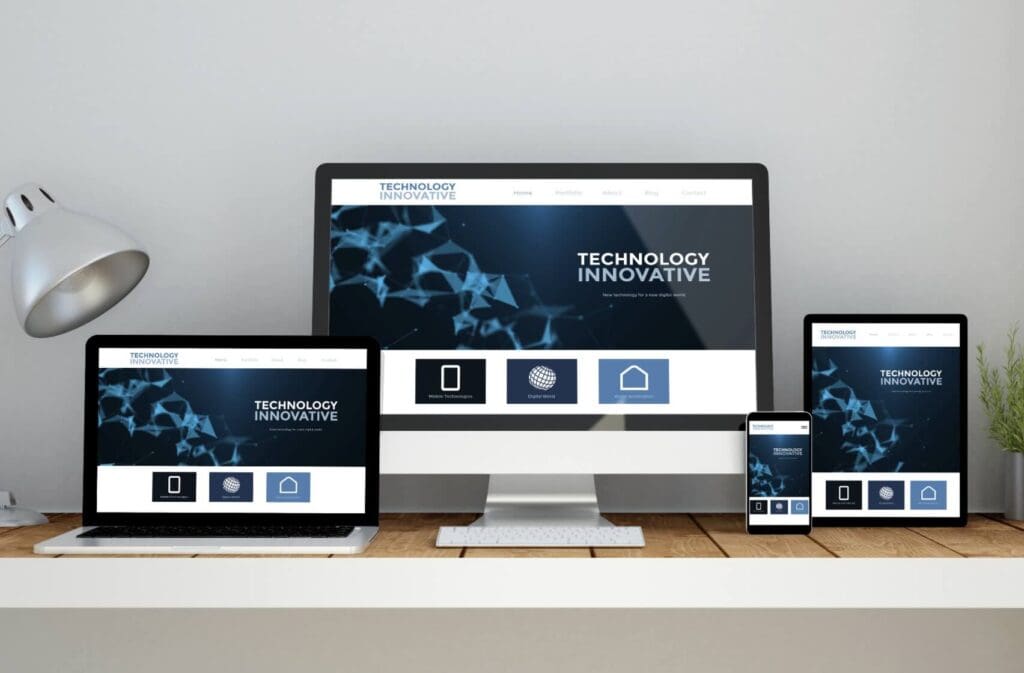
Dark Mode: What Is It?
Introduced under the auspice of top tech giants like Apple and Google, Dark Mode is a setting that adjusts the color palette of software applications, websites, operating systems, and other digital media.
It switches what we know as default bright themes into shades of gray, black, and darker colors. One must examine the central principles governing its use to understand its design philosophy.
- User Comfort and Eye Strain Reduction
- Power Efficiency
- Minimalism and Focus
- Universal Usability and Customization
Foremost in Dark Mode design considerations is user comfort. Bright screens at night or extended durations can lead to digital eye strain, affecting millions daily. Dark Mode mitigates this, offering a visually relaxing alternative that reduces eye fatigue, making tech devices more comfortable for night-time or prolonged use.
An underrated yet significant advantage of Dark Mode surfaces with OLED and AMOLED screens. Dark pixels switch off individual LEDs, contributing massively to energy conservation and longer battery life, a crucial aspect considering the constant tug-of-war between device performance and power optimization.
Another guiding principle is the minimalist aesthetic that Dark Mode provides. It strips away the unnecessary bright elements, letting users focus on the content. This critical aspect is significant in applications where visual hierarchy and content readability are vital, such as text editors and UI design tools.
A significant allure of Dark Mode lies in its flexibility. As technology becomes increasingly personalized, offering Dark Mode as an optional theme gives users the freedom to customize their digital environment in terms of aesthetics and comfort.
Despite these guiding principles, the Dark Mode application isn’t a monolithic dark paintbrush stroke across all technology. Designers must balance visual hierarchy, color, contrast, and typography to prevent washout, where dark colors quite literally fade into the background, making for a circuitous experience.
In embracing the Dark Mode revolution, understanding these core principles allows leveraging its benefits while skillfully navigating potential pitfalls. It is an exciting shift acknowledging our technological reality, a world that doesn’t flip a switch at sundown and begins a new code of color in the virtual digital dusk.
Application of Dark Color Palettes in UI/UX Design
Transitioning to the Dark Side: The Role of Dark Color Palettes in Contemporary UI/UX Design
In the website and app creation world, evoking specific emotions and conveying particular messages via interfaces can be daunting. However, among the numerous visual tools available to developers, one is gaining significant friction: the dark color palette.
Beyond power efficiency and user comfort, these darker hues are contributing unprecedentedly to contemporary UI/UX design evolution.
Versatility is one of the attributes that has led to the rising popularity of dark color palettes. They offer a dynamic range that lends well to visual aesthetics: hyper-modern, minimalist, artistic, or even dramatic. These contrasting elements can be effortlessly manipulated to create visual interest, heightening the user experience.
The psychology behind color plays a significant role in gearing towards darker shades. Dark palettes have been associated with luxury and sophistication, effectively utilized by big brands like Apple or Gucci.
This isn’t limited to high-end brands; smaller companies find value in applying dark color schemes to elicit similar emotions. Therefore, opting for a darker interface may be a strategic move for businesses striving to establish a solid brand image.
Interestingly, dark palettes could also positively affect user performance. A study by the Nielsen Norman Group suggests that users demonstrate improved cognitive performance under low-lighting conditions. When transferred to web design, this could mean enhanced focus, better processing of information, and improved user productivity.
Advancements in technology add another layer to the surging preference for dark themes. OLED and AMOLED screens – increasingly prominent in today’s high-end devices – have better contrast ratios and less after-image effect with dark interfaces, offering an immersive viewing experience.
There’s a consideration, though, for incorporating dark design. When leveraging darker colors, designers must be extra vigilant about ADA compliance. Employing high-contrasting shades (light text on a dark background or vice versa) ensures accessibility.
Lastly, intelligent applications of dark design also revolve around spatial organization. Striking a balance between light text and dark backgrounds often results in a more pronounced content hierarchy, guiding users effortlessly through the interface journey.
A word of caution: implementing a dark mode isn’t merely replacing white with black. It’s a complex process requiring thoughtful color harmonization, proper contrast ratios, and thorough testing to ensure an optimal user experience. Overlooking any of these elements could tarnish the user-friendly reputation only the best dark-themed designs have managed to acquire.
Dark Mode is no longer just a trend – it’s the technological manifestation of our constantly evolving needs and preferences.
Benefits and Drawbacks of Dark Color Palettes
Enhancing Perceived Aesthetics
Notably, dark color palettes have enhanced perceived aesthetics in tech. Thanks to color theory, humans perceive dark shades as more appealing, stylish, and sophisticated.
This allure naturally extends to tech tools that utilize dark color palettes, making them more aesthetically pleasing to users – a decisive persuasion factor for product uptake and retention.
Driving User Productivity
As a product of this aesthetic appeal, user productivity is reported to improve when using dark themes. The sensibility of the dark theme design, often combined with vibrant accent colors, spurs high-contrast interfaces that allow users to focus better. Consequently, it increases efficiency in users’ tasks and interactions with the application.
Superior OLED and AMOLED Screen Experience
Modern OLED and AMOLED screens display dark colors differently than traditional LCD screens. Dark themes are more visually impactful on these screens due to deeper blacks and more vibrant colors, providing a superior visual experience for the user. Notably, dark themes extend the battery life of devices equipped with OLED screens, enhancing the overall tech experience.
Compliance with ADA Regulations
Compliance with the Americans with Disabilities Act (ADA) is essential for tech-related products and services. Dark color palettes can aid in fulfilling some of these requirements, enhancing readability and overall usability for persons with visual impairments.
Enhanced Spatial Organization
Dark color palettes can also underscore spatial organization and content hierarchy within interfaces. They allow for a clear differentiation between different workspace areas, making it easier for users to navigate and interact with the application effectively.
The Downside of Dark Colors
While the benefits are enormous, dark color palettes also have some shortcomings. The implementation of dark Mode requires meticulous thoughtfulness in design to avoid pitfalls. An improperly rendered dark scheme might make reading more strenuous, negatively impacting users with astigmatism or those using tech in well-lit conditions.
Lack of Standardization
Tech adopts Dark Mode designs at an increased rate, but there’s still a conspicuous absence of standardization. Users often face inconsistencies across applications, making the overall user experience fragmented. Until cross-platform standardization is achieved, these inconsistencies are likely set to persist.
In conclusion, while deciding to integrate a dark color palette into UI/UX design isn’t without its challenges, the benefits range from aesthetic appeal, user productivity, superior OLED experience, enhanced spatial organization, and potential ADA compliance. It’s a high-reward investment that matches contemporary user needs and sets the stage for a thrilling tech future.

Trends and Future of Dark Color Palettes
Beyond the scope of an aesthetic choice, the trend toward leveraging dark themes in technological interfaces persistently establishes itself within the fabric of future possibilities. Fundamentally, dark themes are no longer merely a reflection of luxury and sophistication.
From their gripping relevance in web and mobile app development, there’s an indisputable acknowledgment of the synergistic relationship between aesthetics and productivity. A well-executed dark theme augments visual processing, fosters an environment for intense focus and empowers a productivity-enhanced user experience.
While the future of dark themes is still grappling with growing pains, some technological breakthroughs have paved the way for their success. For instance, the recent advancements surrounding OLED (Organic Light Emitting Diodes) and AMOLED (Active Matrix Organic Light Emitting Diodes) displays are game-changing.
These screen types inherently excel at projecting deeper black color palettes by illuminating individual pixels to render images. Essentially, they breathe life into dark themes and present them in the most appealing light.
Moreover, in a world where adherence to the principles of the ADA (American Disabilities Act) is paramount, dark themes offer up exciting avenues for full compliance. Dark themes can satisfyingly cater to senses more prone to sensitivity by mitigating glare and harsh brightness, aiding users with visual impairments.
The role of spatial organization and content hierarchy also can’t be overstated. Dark themes provide a unique contrast that empowers these features for an elevated user experience, helping to distinguish crucial elements and subconsciously guiding the user’s attention where it matters.
However, it’s essential to recognize that embracing dark themes isn’t without challenges. Issues such as potential readability problems due to improper color contrast and lack of standardization remain significant hindrances to widespread adoption.
Overall, the continued growth of the utilization of dark themes drives toward a symbiotic relationship between design aesthetics, user comfort, and environmental consciousness. While challenges persist, it’s palpable how indelibly dark themes are shaping and influencing the future of interface design. As tech enthusiasts, watching and participating in these evolutions is thrilling.

From exploring color theory to real-world applications, dark color palettes significantly influence user experience and interaction. The challenge lies in striking the right balance between aesthetic appeal, contrast guidelines, and color distortions.
The future of dark color schemes looks promising, with advancements in OLED technology and other indicators paving the way for increased application.
However, its use has drawbacks, with visibility issues and incorrect use leading to subpar user experiences. Therefore, while accepting dark themes is likely to grow, its implementation demands careful attention to the principles and guidelines discussed to maximize its potential while mitigating the associated risks.
Find out more about how Mondoro can help you create, develop, and manufacture excellent home decor and home furniture products – don’t hesitate to contact me, Anita. Check out my email by clicking here or become a part of our community and join our newsletter by clicking here.
Mondoro gives out a FREE Lookbook to anyone interested. You can receive a copy of our latest Lookbook by clicking here.
Listen to our Podcast called Global Trade Gal. You can find it on all major podcast platforms. Try out to listen to one of our podcasts by clicking here.
Subscribe to our Mondoro Company Limited YouTube Channel filled with great videos and information by clicking here.
Related Content
Mastering Furniture Painting: A Comprehensive Tutorial
Revitalizing old furniture through painting or tailoring a new acquisition to blend into your space seamlessly can be immensely satisfying.
However, as with many DIY endeavors, the outcome’s success largely hinges on the groundwork that precedes the core activity. In this guide, we’ll meticulously walk through every phase of the furniture painting journey to help you attain a flawless, expert-grade finish each time.
You can discover more by reading Mastering Furniture Painting: A Comprehensive Tutorial by clicking here.
The Pros And Cons Of Brass And Nickel Finishes
Brass and nickel finishes have been popular choices for home décor for centuries. They offer various colors, finishes, and textures that add elegance and luxury to any home. However, like any other material, they also come with their own set of pros and cons.
By clicking here, you can discover more by reading The Pros And Cons Of Brass And Nickel Finishes.
Bright White Light Bulbs: A Complete Guide To Lighting Your Space
Bright white light bulbs can help to lighten up a space and make it appear brighter than it is. For this reason, there may be places you want to use a bright white light bulb for a specific lamp or space. Whether you want to improve visibility and productivity in your workspace or create a cozy atmosphere in your home, bright white bulbs are the perfect solution.
You can discover more by reading Bright White Light Bulbs: A Complete Guide To Lighting Your Space by clicking here.